How This Perfectionist Learned to Paint More Loosely by Adam Clague

NOAPS Clague Lincoln                          NOAPS Clague Micah

Left: An early student drawing of mine

Right: A more recent oil painting

I’ll be transparent – I’m a perfectionist.  I iron my jeans.  I have a have a hard time focusing in a cluttered studio.  I quintuple-check these lessons for typos (and kick myself when one gets past me).  For years, my perfectionism was a huge hindrance to my painting – by the time I got everything just right, it was way too tight!

Now, please don’t misunderstand me – there is nothing wrong with fully rendered or “tight” paintings.  Just look at the masterpieces of artists like William-Adolphe Bouguereau, Lawrence Alma-Tadema and Lord Frederic Leighton!  Tight painting is only an issue if you want your paintings to look loose.

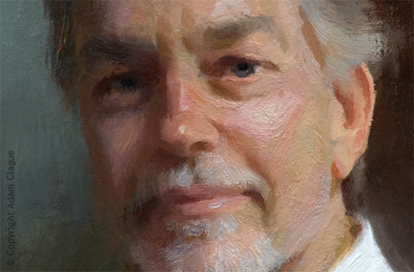
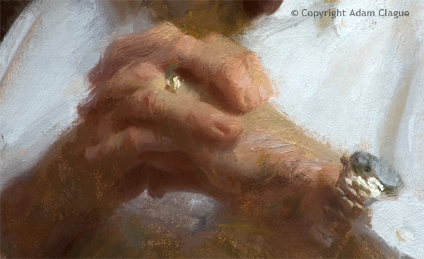
And man, did I want to paint loosely like Sargent and Schmid! My paintings may never be on a par with those masters but my work finally developed the looseness I desired.

This perfectionist learned to paint more loosely by disciplining myself to adopt these 6 practices:

NOAPS Clague

1. Stand up.  Sitting will keep you from frequently backing away from your work – an essential habit, as problems are much more evident at a distance.  If you’re unable to stand while painting, sit in a chair with wheels.

2.  (Following from the last point) Adopt the 10-Foot Rule: If it reads well from 10 feet away, it’s good; don’t touch it!

NOAPS Clague 2

3.  Envision your subject made up of shapes like mosaic tiles.. As much as possible, try to paint these shapes with one stroke each.  If you need to adjust a shape, do so with a separate, deliberate stroke instead of continuing to dab at it.  Painting a shape with a single stroke often requires a generous amount of paint on your brush, which leads me to the next point…

4. Mix up large batches of paint on your palette with your palette knife.  One of the biggest culprits of tight painting is not using enough paint – when your brush is hungry for paint, multiple strokes are needed to cover an area and this can cause the surface to look overworked.

NOAPS Clague 3

5. Use a brush slightly too big for the job (I can’t remember what artist said this, but if you know, please remind me!) 

6.  Continuously ask yourself, “How do I want this to look?”  Having at least a semi-clear vision for your brushwork can keep you from falling into the trap of slavishly copying your subject.

I demonstrate my loose painting technique from start to finish in my online video course, “Learn to Paint Dynamic Portraits & Figures in Oil.”  For more information, please visit http://ClagueFineArt.com.

NOTE: Adam Clague will be conducting a 2-1/2 day workshop during Opening Week at the National Oil & Acrylic Painters’ Society 28th Best of America National Juried Exhibition in Cincinnati, Ohio.  For more information and to sign up for the workshop, click here.

About the Artist

Adam Clague’s work has received international awards and press.  The artist lives near Kansas City, Missouri with his wife and fellow artist Andrea Orr Clague and their son Gideon.  Adam paints in an impressionistic manner and works from life as much as possible to produce the most life-like results.  The artist seeks to faithfully capture the beauty of Gods creation and to share that beauty with his viewers. 

Adam’s work is represented by Ward & Ward Fine Art (Kansas City, Missouri), Hudson Fine Art (Hudson, Ohio), and Gallery Augusta (Augusta, Missouri).

To see more of Adam’s paintings visit http://AdamClague.com, to read his blog posts visit http://AdamClagueFineArt.blogspot.com and Facebook at http://Facebook.com/ClagueFineArt.

Posted in Uncategorized | Leave a comment

Lisa Fricker: A Path of Her Own

OLYMPUS DIGITAL CAMERA  “Unbridled”, Oil on Linen, 18×18, Second Place Winner at the 1st Spring Best of America Small Painting Exhibition at the Richland Gallery, Nashville, TN.

Exuberance amidst chaos is what comes to mind in the playful portrait by Lisa Fricker.  The backlit portrait appears almost dreamlike, with a quality of solidity and energy, seen yet unseen.  Inspired by light and guided by scientific principles of geometry, the artist has abstracted realism to embrace the random beauty of color, shape, texture and line.

NOAPS Fricker Oil on Panel 12x12 In the Studio  “In the Studio”, 12×12, Oil on Panel, Collection of the Artist

Lisa Fricker began drawing and painting portraits publicly and the tender age of 16, when she was employed by a theme park to paint portraits from life.  She later went on to art school, first in Nashville and then at the Paier College of Art in Connecticut.  Her study continued at the Scottsdale Artist’ School, where she studied with Bettina Steinke.

Fricker’s work has always centered around portraits and figures, and she has compiled an amazing list of commissioned works to her credit, not the least of which is the 92 portraits of inductees to the Astronaut Hall of Heroes at Kennedy Space Center.  Many of her works hang in other esteemed locations, including health care centers and the M.D. Anderson Cancer Center.

The artist often works in series, each focusing on experiences, theories of compositional geometry, exploration of color, and the balance of “chaos and control”.  Children are among her favorite subject matters; “they are fresh, passionate and raw: unique yet incomplete, continually experimenting with self-creation.  I am drawn to capturing small moments and finding ways to expand them into more universal experiences.”

NOAPS Fricker progress 1 of This Changes Everything  NOAPS Fricker progress of this changes everything 1st drawing  NOAPS Fricker progress of this changes everything 2nd drawing    NOAPS Fricker progress of this changes everything  NOAPS Fricker This Changes Everything Oil on Linen 24x24  Step by step process of “This Changes Everything”, 24×24, Oil on Linen, Collection of the Artist.

Fricker’s paintings begin with thumbnails, which she then works into her ‘fractal diagram’, which is the division of space based on principles of geometry.  She then lays in a value pattern, and combines that with areas of emphasized color.  Working over an underpainting, she draws in her compositional diagram rather than transferring her drawing to the canvas.  She uses a palette knife to apply the paint in areas of value and color focusing on the large shapes and forms, saving details for late in the process.  Her palette consists of Titanium-Zinc White, Cadmium Yellow Medium, Cadmium Red Light, Quinacridone Violet, Viridian, Phthalocyanine Blue, and Burnt Umber; occasionally adding Manganese Violet, Cadmium Yellow Light, Gold Ochre, Quinacridone Magenta Cadmium Barium Yellow and Ultramarine.  Her supports are Galician Linen and smooth panels.  Fricker never seems to limit herself though, and now experiments with glazing and cold wax.

NOAPS Fricker Don't Be Scared oil on linen 16x20 Exempla St Joseph Hospital, Denver CO  
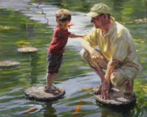
“Don’t Be Scared”, 16×20, Oil on Linen, Collection of  Exempla St. Joseph Hospital, Denver, CO

Lisa Fricker has gained many accolades, and is a Signature Member not only of NOAPS, but also the American Impressionist Society, Oil Painters of America, the Pastel Society of America, just to mention a few.  This very recognized artist has gone her own path; she has been able to maintain her unique vision while working under others’ constraints.  She gives us this insightful quote to ponder: “There is a vitality, a life force, a quickening that is translated through you into action, and because there is only one of you in all time, this expression is unique, and if you block it, it will never exist through any other medium, and be lost.  The world will not have it.  It is not your business to determine how good it is, not how it compares with other expression.  It is your business to keep it yours clearly and directly, to keep the channel open.” –Martha Graham.

To see more work by Lisa Fricker, visit her website at www.lisafricker.com

To see more work from the 1st Spring Best of America Small Painting Exhibition, visit www.noaps.org

Written by Patricia Tribastone, NOAPS Blog Director

Posted in Uncategorized | Leave a comment

Don Reed: Finding Your Voice

NOAPS Reed Morning Along the River 8x24

“Morning Along the River”, 8×24, Oil on Canvas.  Winner of ‘Best Impressionism’ at the 1st Spring Best of America SMALL PAINTING Exhibition at the Richland Fine Art Gallery, Nashville, TN.

The style of Impressionism is easily, and at once, visible in Don Reed’s painting.  What the casual observer might not necessarily take note of, however, is the careful crafting of the image that has taken place.  The artist chose his colors to gradually shift complements; he placed the values at uneven intervals to guide the viewer along the scene and show spacial relationships.  The drawing is accurate and the composition well planned.  He has achieved his own style of impressionism, by placing notes of color side by side, layer upon layer, with a tactile sense that can only be produced with confidence.

NOAPS Reed 40x30 Ally with Green Windows sm  
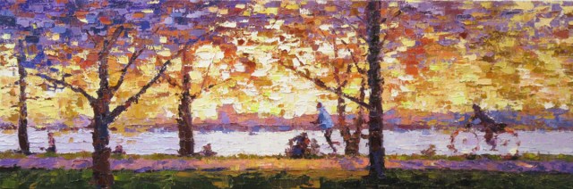
“Alley with Green Windows”, 40×30, Oil on Canvas.  Available through Reinert Fine Art, Charleston, SC.

The painter has arrived at his own style by searching his own aesthetic, and with easel time and risk he found his unique approach.  His first oil painting class began in Maine, when at the age of 12, his step-father Wilbur Bullock, a well-known cartoonist and advertising artist, enrolled him in a class with Edwin Booth.  As Don recalls, “The laughter of children happily painting and the distinctive smell of linseed oil remains one of my favorite childhood memories.”

NOAPS reed 24x24 Awakening sm  “Awakening”, 24×24, Oil on Canvas.  Available through the Blue Heron Fine Art Gallery, Wellfleet, MA.

Don attributes much of his success to his step-father, and also to Stan Moeller, one of New England’s acclaimed plein air artists.  Mr. Reed has taken art classes and workshops, but is primarily self-taught.  His initial attempts in a traditional type of painting were moderately successful, but after much experimentation, he found a style that both satisfied his creative desires and was met with commercial success.

NOAPS Reed 24x24 Lakeview Traffic sm  “Lakeview Traffic”, 24×24, Oil on Canvas.  Private Collection.

Dramatic lighting is an inspiration to the artist.  Much of his work is done from photos he has taken, which he adjusts and alters on his computer.  The image is then viewed upside down, and the painting is actually done upside down as well.  He starts out with an underpainting that mirrors the mood he wishes to create, and works the paint with only a palette knife.  He steps back often to check his progress, using a hand mirror above his head to view the painting right side up.

NOAPS Reed work in progress  Work in progress.

Working exclusively in oils, his paints are a variety of mineral and modern colors including Prussian blue, Phthalo blue (green shade), Ultramarine blue, Utrecht Brilliant blue, Quinacridone magenta, Dioxazine purple, Quinacridone red, Phthalo green, Cadmium green, Permanent green light, Indian yellow, Titanium white, Cadmium yellow, Cadmium orange, Cadmium red, Holbein bright red, and Alizarin crimson.  His surface is usually a 1-1/2 inch cotton canvas, or a cradled board and as mentioned, only palette knives for paint application.

NOAPS Reed 24x18 First Snow sm  “First Snow”, 24×18, Oil on Canvas.  Private Collection

Don’s quest for his unique style has led him to a universal truth of relevance to all artists: “Find your own voice, and don’t stop searching until you discover it….Certainly learn all the basics…but don’t be afraid to take a walk on the wild side once in a while.  Love what you do and others will love it too.”

Don Reed is represented by The Reinert Fine Art Gallery in Charleston, SC and the Blue Heron Gallery in Wellfleet, MA.  To view more of Don’s work, visit his website at http://www.fineartbydonreed.com.

To view the 1st Spring Best of America SMALL PAINTING Exhibition, visit www.noaps.org

Written by Patricia Tribastone, NOAPS Blog Director

Posted in Uncategorized | Leave a comment

Diane Reeves: Simple Joys

NOAPS Reeves, Diane Simple Joys 14x11 Oil on Canvas

“Simple Joys”, 14×11, Oil on Canvas was the winner of ‘Best Still Life” at the 2018 1st Spring Best of America SMALL PAINTING Exhibition held at the Richland Gallery, Nashville, TN.

“Simple Joys” by Diane Reeves is anything but simple.  Painting flowers, with all their complexity and fragility, is a daunting task.  The colors must remain fresh, yet the shadows must be convincing.  The brushwork must be confident, yet the petals must appear delicate and translucent.  The abstract shape of the light and shadow on the flower, in all its various positions, is difficult to capture before it moves…it is a living thing after all.  But looking at Diane’s work, the viewer can feel the soft ethereal petals, and let the eyes dance through the subtle variations of light and shadow.

NOAPS Reeves_For the Asking 8 x10 oil  “For the Asking”, 10×8, Oil on Canvas, available through the artist.

Diane Reeves began drawing at a young age, and her passion for art was ignited as a teenager visiting various European art museums, including the Louvre.  Masters of the past, such as Sargent, Arkhipov, Latour, Thayer, Zorn and Sorolla, among others, fueled her desire to paint, and in 2007 she began attending workshops.  Learning from many of today’s most prominent artists, including Rose Frantzen, Daniel Gerhartz, Johanna Harmon, Casey Childs, Daniel Keys, Kathy Anderson, Mike Malm and Michelle Dunaway, she has been able to supplement her self-directed study.  Her fresh, yet defined style has been molded not only by these instructors, but also by many hours devoted to the easel.

NOAPS Reeves_Choosing Joy - Detail Image 18 x 36 oil  Detail of “Choosing Joy”, 18×36, Oil on Canvas.  See Artist’s website for full view.  Available through the Artist.

Diane’s focus in the last few years has been floral still life, however she also has an affinity for portraits and plein air.  Her day in the studio begins early, as she sets up her still life, looking for a subject that creates excitement.  She places the objects with a keen sense of composition, light and shadow, and begins with a thin layer of paint to place her objects on the canvas.  Then, working in the alla prima style from life, she works to capture the beauty that presents itself.  She looks for the lightest and darkest elements in her composition, where to place bright color and dull color, and where to lose an edge.  Working en plein air is the same sort of process, with the added challenge of chasing the light.

NOAPS Reeves_Joy in the Morning 12 x 24 oil  “Joy in the Morning”, 12×24, Oil on Canvas, currently on exhibit, available through the Artist.

Reeves’ materials include Rosemary Brushes, oil primed linen canvas and panels, and a variety of oil paint brands.  She most commonly works with transparent oxide brown, ultramarine blue deep, cobalt blue light, viridian, yellow ochre pale, terra rosa, transparent oxide red, cadmium red deep, cadmium red medium, cadmium red light, cadmium orange, permanent alizarin crimson, quinacridone violet, cadmium yellow deep, cadmium yellow pale or Winsor yellow, cadmium lemon, Naples yellow light, titanium white, and the Gambin line of radiant colors.

NOAPS Reeves_The Look 12 x 16 oil  “The Look”, 12×16, Oil on Canvas, Collection of the Artist.

Through hard work and study, Diane has been able to achieve enough technical skill to now confidently experiment, to “take risks…not to play it safe, which in turn provides a boldness and sense of freedom.”  She also enjoys teaching others; helping other artists as she was so generously helped.

NOAPS Reeves_Reflections 16 x 20 oil  “Reflections”, 16×20, Oil on Canvas, available through the artist.

With an intense passion for her new career, Diane reminds us of the need for balance: “It is easy for me to become obsessed with working on a painting, so I have to remind myself the painting will always be there.  It’s important to be with family and friends, to relax…enjoy a full life”.

Diane Reeves is a Signature Member of the National Oil & Acrylic Painters’ Society, and is a member of numerous other national art organizations.  She has won awards at the national level, and has been featured in American Art Collector and Southwest Art.  To view more of Diane’s work, and to sign up for her newsletter or learn about her workshops, visit her website at www.dianereevesfineart.com.

To view the entire SMALL PAINTING Exhibit, visit http://www.noaps.org/events.

Written by Patricia Tribastone, NOAPS Blog Director


Posted in Uncategorized | Leave a comment

Winners All

NOAPS 2018 Spring online Best of show Wang

“Yi Nationality Old Woman”, 18×24, by Kun Wang, winner of the Best of Show in the NOAPS 2018 Spring Online International Exhibit.

The energetic brushwork and inquisitive expression are just two of the factors that may have propelled this painting to the top of the judge’s choices.  The work is confident, clearly giving the viewer the sense of the model’s personality.

NOAPS 2018 spring online 2nd place D'Amico

“The Peninsula”, 16×20, by Tony D’Amico is the Second Place Winner in the NOAPS Spring Online International Exhibition.

Tony D’Amico’s rendition of a busy city street corner is a well-constructed painting with a variety of lines, edges and values.  The composition easily leads us around, from the dark lines near the top, to the light post, then around to the orange arrows, keeping the viewer locked into the painting.

NOAPS 2018 spring online 3rd place Thompson

“Brimming with Personality”, 20×30, by Carol Lee Thompson, winner of the Third Place Award in the NOAPS 2018 Spring Online International Exhibition.

Expression is the key element in this painting by Carol Lee Thompson.  Each carefully painted dog has its own unique countenance, with overlapping shapes and lost edges to pique the viewer’s interest.

Each painting entered into the Spring Online Exhibition, as with all NOAPS exhibitions, is carefully assessed by an anonymous  jury of selection.  The top scoring paintings, in this case 150 out of 891 , are then chosen to be part of the exhibit.  The paintings are then further reviewed by an impartial judge of awards, who chooses those that he/she feels are most deserving of special recognition.  The subjectivity in judging is impossible to eliminate, but our jurors use key fundamentals and their personal experience to make the most objective choices.

Objectivity and subjectivity aside, what does the artist gain by entering these competitions?  One of the tag lines of NOAPS is ‘Get Recognized’, and that is certainly one of the benefits of showing in an exhibition.  It is also a learning experience.  Just as Michelangelo stated at age 81, “I am learning yet”, we are all still learning.  It is helpful just to see our artwork next to other work, to see how and where we fit in, to see where we can improve, and where we want to go with our work.  When we get rejected, as we all do at times, we can take a step back, and assess what this painting in particular lacked, and where we might improve.  Another benefit is just to see all the creativity and remarkable talent, and enjoy one image after another.  And although we won’t all win awards, in the end it’s really not about the awards at all, but the joy and need to express ourselves in our art, and share it with others.

So Congratulations to the Award Winners, and to all who were accepted, and all who entered.  It takes courage to voluntarily expose ourselves to judgement, and we at NOAPS hope that in so doing, you have gained from the experience.

To view the entire exhibition, visit www.noaps.org and click on the 2018 Spring Online International Award winners/accepted artists.

Written by Patricia Tribastone, NOAPS Blog Director


Posted in Uncategorized | Leave a comment

Beth Marchant: Painting the Light

Forgotten

“Forgotten”, 12×16, Oil on Wood Panel, Winner of Best Use of Light and Color at the NOAPS 1st Spring Best of America SMALL PAINTING National Juried Exhibition at the Richland Gallery of Fine Art, Nashville, TN.

Artists are constantly looking for new subject matter; something that hasn’t been done, something new, something different.  But what if the artist took a common subject, and painted it with such feeling, atmosphere, and beauty, that no matter how familiar the subject, the painting is just remarkable?  That is the way with “Forgotten” by Beth Marchant.  When viewing this painting, one instantly feels the character of the subject, that it is calling to be noticed in the waning afternoon light.

Beth Marchant is largely a self-taught artist.  Though she was a studio art major in college, she has gained most of her skill from workshops and art reference books.  Until recently most of her work was commissions for architectural paintings, but she now is focusing on her landscape work.  Her ability to capture the light, combined with her experience in rendering architecture, has led her to create stunning scenes.

Tuckahoe Creek Farmhouse  
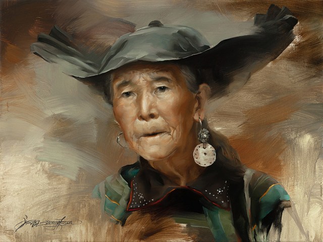
“Tuckahoe Creek Farmhouse’, 16×20, Oil on Linen, Brazier Gallery.

Beth has been influenced by several artists of the past, including Winslow Homer and John Singer Sargent, but she also gives credit to Loryn Brazier, a well-known portrait artist and gallery owner.  Brazier has mentored Marchant for over 15 years, providing encouragement, and representation in her gallery.

Waiting  “Waiting”, 12×16, Oil on Linen, Private Collection.

Most of Marchant’s paintings are landscapes, many with an architectural component, as well as animal and figurative work.  She works both en plein air and in the studio, and her process is nearly the same for both situations.  In the studio, she uses a photo (edited) or her plein air study for reference.  Starting with a small value drawing, she transfers her drawing to a toned canvas with a central axis on both as a reference point.  She then plots the points of the drawing on the canvas, and completes the drawing in thinned paint.  Following this, she paints in the values with the same thinned paint, making sure her values read.  Then the final stage is color, working from dark to light.  When working outside, time constraints may mean she skips the initial value sketch, but the rest of the process remains the same.

NOAPS marhcant in progress   Lakenvelder

“Lakenvelder”, in process and finished, 16×20, Oil on Linen, Brazier Gallery.

Marchant’s palette consists of Cadmium yellow light, Cadmium yellow medium, Cadmium red light, Alizarin Crimson, Ultramarine blue, Viridian, Yellow ochre, Transparent oxide red and Titanium White.  She works mostly on linen, but has recently moved to working on wood panels.  She uses a variety of brushes, from Rosemary sables and synthetics to Silver Brush extra long bristle filberts.

NOAPS Marchant - How Now... (Brown Cow)  “How Now…” 12×12, Oil on Linen Panel, Brazier Gallery.

Beth Marchant has enjoyed great success with her paintings, and notes that her recent award at the National Oil & Acrylic Painters’ Society SMALL PAINTING Exhibit was her greatest professional achievement.  She has some sage advice for all painters:

“1. Learn to draw and understand values.  2. Make a space and time to do your art on a consistent basis.  3. Don’t let fear get in the way.”

Beth Marchant is represented by Brazier Gallery in Richmond VA; Cabell Gallery in Lexington, VA; and Beach Gallery in Virginia Beach, VA.  To view more of Marchant’s work, visit www.bethmarchant.com.

To view more artwork in the NOAPS SMALL PAINTING Exhibition, visit www.noaps.org/events

Written by Patricia Tribastone, NOAPS Blog Director

Posted in Uncategorized | Leave a comment

What’s AGE Got To Do With It? by Joseph Orr

NOAPS Orr Beyond the Sandbar 11x14

“Beyond The Sandbar”, 11×14, Acrylic, by Joseph Orr.  This painting has been juried into the 1st Spring Best of America SMALL PAINTING Exhibit, Richland Fine Art Gallery, Nashville, TN.

At some point in an artist’s career he/she looks forward to fame and fortune as a possibility, but for most the cold truth begins to be revealed as age comes upon them.  At some point fame fades as a goal and the simple privilege of being able to create becomes more valuable.  That is when the true artist emerges.  Recently I read an article which stated the peak age-to-death, in terms of an artist’s price and reputation peak, is about 70 years.  That is the golden age when one is ‘old’ enough to have garnered critical acclaim, but not so ‘old’ that he/she has been forgotten.

If that magic age truly is 70, then I should be nearing the summit of my career.  For myself, reaching that milestone is only a state of mind.  Consider though, that maybe the study mentioned in the article didn’t review enough facts about the artist, or only studied artists who had “The Emperor’s New Clothes” syndrome, so to speak.  The point was made, however, that if an artist is ‘lucky’ enough to reach the age of 90, and beyond, then the age-to-death factor was not a factor.

NOAPS Orr Diamond in the Marsh 12x16 Red Piano Gallery  “Diamond In The Marsh”, 12×16, Acrylic, Private  Collection.  This painting was sold through the Red Piano Gallery, Hilton Head Island, SC.

Of course prices are usually determined by the interactions between demand, quantity and quality.  In the part of the art world I’m familiar with, quality is, as beauty, in the eye of the beholder.  In the REAL art world, demand for an artist’s work seems to be influenced by many factors such as critical or popular acceptance, gallery and art museum exhibitions, which collectors or institutions own works by the artist, and, most importantly, what art movement, organizations or colonies the particular artist has started or been a part of.

Everyone knows that an artist who is ‘hot’ today can be cold as ice tomorrow.  I offer a study of the venerable Albert Bierstadt’s (1830-1902) life as an example.  A giant in the art world, in his time, whose talent and output was as monumental as his subject matter.  Bierstadt was one of those rare artists who witnessed sales of his work in the six figure range while he was alive and then experienced its plummet.  Sadly, in the end, he was left destitute and bewildered at the specter his life had become.

NOAPS Orr Fishing the Delaware 9x12 Highlands art gallery Lambertville NJ  “Fishing The Delaware”, 9×12, Acrylic, Private Collection.  This painting was sold through the Highlands Art Gallery, Lambertville, NJ.

In the halls of the School of Thought there are those who believe that restricting supply of an artist’s work during his/her lifetime, gains merit above over-producing the same image or subject again and again.  An artist can be especially tempted if that image is commercially popular, but changing one’s style, subject or approach to painting serves to limit the amount of work in any one period of the artist’s life.  Adjustments result, quite naturally, as an artist grows or passes through the process of his/her career.  Additionally, and testifying to my own creative desires, artists paint different subjects, and sometimes in different styles because, that is what artists do!

So the bottom line I think, is, if an artist wants to gain the maximum from a career, enjoy the ride and paint the best you can because, in the end, nothing insures against destitution, quality trumps quantity and it is a superb life nonetheless.  Keep the mediocre in the closet and let the market have only your very best.

Joseph Orr is one of the Founders of the National Oil & Acrylic Painters’ Society.  He is represented by the Castle Gallery, Ft. Wayne, IN; Eisele Fine Art, Cincinnati, OH; the Highlands Art Gallery, Lanbertville, NJ; Kodner Gallery, St. Louis, MO; the Red Piano Gallery, Bluffton, SC; and Joseph Orr’s Studio, Osage Beach, MO.  To view more of Joseph’s work, visit his website at www.josephorr.com, and sign up for his newsletter.

This article first appeared in the Orr’s Free Newsletter, April 17, 2018.

Posted in Uncategorized | Leave a comment

On the Edge

NOAPS D'Amico the yellow farmhouse 10x8  
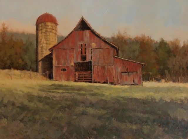
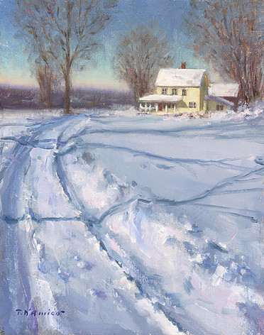
“The Yellow Farmhouse”, 10×8, Tony D’Amico.  This painting has bee juried into the 1st Spring Best of America SMALL PAINTING Exhibition in Nashville, TN

When faced with the blank canvas, perhaps edges are not foremost in the artist’s mind.  We focus on the composition, the values, the drawing, the colors, but the power of the edge is just as important.

Observe the soft edges in Tony D’Amico’s painting.  These edges tell the viewer that the background has a great distance from the house; the uppermost branches of the trees are thin and hard to see; and the snow on the rooftops is bouncing light back into the atmosphere.  The hard edges tell you the tracks in the snow are close by, newly made.  The edges in Tony’s painting take you through the scene, to inform, to give you rest, and make you feel part of the landscape.

NOAPS Raikhline Harmless Landing 21x 14.5  “Harmless Landing”, 21×14.5 by Igor Raikhline, from the 1st Spring SMALL PAINTING Exhibit

The edges in Igor Raikhline’s painting have a different purpose.  Here the edges give the sense of softness, delicate beauty, and the gentle nature of the subject.  He has used the edges to complete the description of the subject matter.  Notice the edges are slightly crisper exactly where the artist wants the viewer to look: at the butterfly on the child’s shoulder, hence the title.

NOAPS La Rock Still Life with Lemon 9x16  “Still Life with Lemon”, 9×16 by Tom LaRock from the 1st Spring SMALL PAINTING Exhibition

The painting by Tom LaRock gives us a different take on edges.  The painter has used hard edges again to enhance the focal area, but the soft edges created on the dish have a different purpose.  The soft edges are formed not only by their vague outline, but also with values that are very similar.  The effect of these edges is to create a mystery; to make the viewer look more deeply into the painting, and perhaps finish the edges with their own eyes. This use of edges helps make a viewer linger in a painting with greater interest perhaps, than if all the edges are clearly defined.  The artist also used the edge of the lemon to bounce light back into the atmosphere, to make the object truly live within the space.

The edges in a painting can have a powerful impact.  The way that the artist uses edges can help to identify distance relationships, identify the focal area, create a mood or feeling, and enhance mystery and interest in a painting.

To view more paintings in the 1st Spring Best of America SMALL PAINTING Exhibition, click here

To see the Exhibition in person, visit the Richland Fine Art Gallery, 4009 Hillsboro Pike #203A, Nashville, TN 37215. Phone 615-292-2781.

Written by Patricia Tribastone, NOAPS Blog Director

Posted in Uncategorized | Leave a comment

Ann Kraft Walker: Quiet Beauty

NOAPS Walker_White on White_20x24

“White on White”, 20×24, Oil, Private Collection

The quiet calm and muted colors of paintings by Ann Kraft Walker emanate a sense of peace and well-being.  These carefully painted scenes of everyday objects are soothing to the eye, with just the right amount of detail.  The composition leads the viewer around the painting easily, and the closer one looks, the more interesting the painting becomes.  A sense of atmosphere contains the objects giving the scene a unified presence.  Her inspiration comes, as she states, “without conscience thought.  Is inspiration something intuitive? Are artist born with eyes and heart inherently sensitive to beauty?” A question to ponder; perhaps the only answer is in the art.

NOAPS Walker_Pieces of Autumn  “Pieces of Autumn”, 24×20, Oil, Private Collection

Ann Kraft Walker began her interest in art at an early age, and studied art throughout her schooling, majoring in art history in college.  After years of nurturing her family, her art became her primary focus after becoming an ’empty nester’ and the passing of her mother in 2009.  A workshop with artist Casey Baugh was a turning point for Ann, as she states, it was “a paradigm shift”.  Since then she has taken other workshops, all adding to the wealth of knowledge that is obviously imparted in her work.

NOAPS Walker Mo and Spidey  “Mo and Spidey”, 12×24, Oil,  Collection of the Artist

Today Ann paints mostly in oil, and also in graphite and charcoal.  She focuses on still life, but is also proficient in portraiture, and is working on landscape painting as well.  She currently uses ArtFix linen, Rosemary brushes and the Silver sable cats tongue brushes.  Her palette consists of Flake White, Lead Tin Yellow, Yellow Ochre Pale, Raw Sienna, Cadmium Orange, Vermilion, Tuscan Red, Permanent Alizarin, Transparent Oxide Red, Transparent Oxide Brown, Raw Umber, Van Dyke Brown, Sap Green, Viridian, Cobalt Blue, Ultramarine Blue, Permanent Violet and ivory Black. After coffee and a prayer, Ann begins painting her still life from the scene she has set up.  She starts with “a rough drawing on paper, and then does an oil transfer to the panel or canvas.  After the color block in, (she) usually makes about three passes and then finishes with some tweeks and glazes.”  Portraits are also painted from life, and photos when necessary.

NOAPS Walker In Progress_20160722_090211   Still life work in progress

NOAPS Walker_The Hidden Person of the Heart  “The Hidden Person of the Heart”, 20×16, Oil, Private Collection

Ann’s tranquil paintings are in contrast to the often intense and tumultuous art world.  As she states: “It’s a loud, busy, clamoring art world.  The sources to view others’ work, and opportunities to learn are overwhelmingly abundant.  I think it’s important to find a balance between learning all you can from the sources available and shutting out that loud world to quietly paint from your heart.”

NOAPS Walker_Of Sand and Sea  “Of Sand and Sea”, 12×24, Oil, to be exhibited at the Oil Painters Of America Show, Steamboat Springs, CO in June, 2018

Among Ann’s many awards and distinctions, she is a Signature Member of the National Oil & Acrylic Painters’ Society, a Signature Member of the Oil Painters of America, and a Signature Member of the American Women Artists.

Walker’s artwork is represented at Haynes Galleries in Nashville, TN, and Insight Gallery in Fredericksburg, TX.  To view more of Ann’s work, visit her website at www.annkraftwalker.com.

Written by Patricia Tribastone, NOAPS Blog Director


Posted in Uncategorized | Leave a comment

Loren DiBenedetto: Contemporary Realist

NOAPS DoBenedetto_acorns and green glass14x18

“Acorns and Green Glass” 14×18, Oil on Linen.  This painting has bee juried into the 1st Spring Best of America SMALL PAINTING Exhibition in Nashville, TN.

The exquisite detail in paintings by Loren DiBenedetto are a hallmark of her work.  Her sensitive handling of her subject matter, the harmonious color palette, and the graceful compositions create a sensation of quiet beauty.  She often sets her subjects against a neutral background to bring forward their importance, and carefully directs the light and shadow.

NOAPS DiBenedetto_first pf spring 18x24  
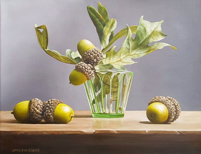
“First of Spring”, 18×24, Oil on Linen, Tree’s Place Gallery, Orleans, MA

Loren DiBenedetto grew up in a creative household, where both parents were amateur artists, and encouraged her creativity.  She holds a degree from the DuCret School of the Arts in New Jersey, and her art instruction continued at the prestigious National Academy of Design (now the National Academy Museum and School) and the Art Students League in New York City.

NOAPS DiBenedetto_dance of the daffodils 24x36  “Dance of the Daffodils”, 24×36, Oil on Linen,The Art Cellar, Banner Elk, NC

Inspired by Master Artists such as DaVinci and Sargent, contemporary artists Daniel Sprick, Daniel Keys and Kathy Anderson, DiBenedetto has skillfully created her own brand of realism.  Using nature as her muse, she most often works in the still life genre.  Inspiration comes easily from the simple effect of light hitting an object, or the display of fruit at the local grocer.  Her depictions of natural objects focuses on their form and color, and she arranges them in compositions that include elements of texture, line and often a bit of unpredictability.

NOAPS DiBenedetto_bag of cherries 16x20  “Bag of Cherries”, 16×20, Oil on Linen, Private Collection.

Her process begins by setting up the still life in natural light, often in morning or late afternoon to get the best shadows.  She takes many photos, and after sorting through the photos, she chooses her best options, often working from multiple shots.  Working on a neutral-toned canvas, she chooses whether to do an underpainting.  Her palette consists of titanium white, cadmium yellow light and medium, cadmium orange, cadmium red light and dark, alizarin crimson, yellow ochre, raw sienna, burnt umber, raw umber, burnt sienna, sap green, ultramarine blue, cobalt turquoise, and ivory black.

NOAPS DiBenedetto_gourds and bittersweet 12x24  “Gourds and Bittersweet”, 12×25, Oil on Linen, The Art Cellar, Banner Elk, NC

Though DiBenedetto has won numerous awards, she states that her greatest accomplishment is the ability to paint every day.  The common thread of advice running through all successful artists is the importance of practice.  As Loren states: “Paint, paint, paint.  Being successful in any endeavor takes time and practice, painting is no exception.  Make a commitment to what you would like to accomplish and go for it!”

Loren DiBenedetto is represented by Tree’s Place Gallery, Orleans, MA; Anderson Fine Art Gallery, St. Simon Island, GA; Art Cellar Gallery, Banner Elk, NC; Warm Springs Gallery, Warm Springs, VA; and Hughes Gallery, Boca Grande, FL.

To view more work by Loren DiBenedetto, visit her website at www.lorendibenedetto.com

To view more work from the 1st Spring Best of America SMALL PAINTING Exhibition, visit www.noaps.org/events.

Written by Patricia Tribastone, NOAPS Blog Director


Posted in Uncategorized | Leave a comment