
“Color has been explored throughout human history and it is a uniquely human experience. A study of the color theory will actually confirm that color is an illusion caused by reception of light wavelengths by our eye, which form colors in our brain. The yellow of a lemon is not a property of the skin itself but the capacity to absorb and reflect specific spectral light which our eye perceives as yellow. Color does not exist without a person or animal to receive the light/color information being transmitted.” – from the Color Workbook

Almost-cheesecake by Shirley Fachilla- oil 24X22
In visual art, color is not only an important, wide, and rich element, but it is also extremely complex due to the possibilities of color variation. Throughout time artists have pursue color harmony as a way to visually unify their creations.
One of the ways to achieve that harmony is by the use of a very limited palette. A three color palette of one red, one yellow, one blue plus white is the array I used when I began to paint and again after a thirty-plus year hiatus. It taught and gave me so much that I can recommend it wholeheartedly. Having only a base of the three primary colors taught me three primary keys.
First and perhaps most importantly, it taught me to see. I learned to distinguish grays and to realize that the neutrals found in the real world (especially in its shadows) almost always have a bias. They lean toward one or another of the primary, secondary, or tertiary hues. For example, shadows on a white surface can be grays with a blue, a violet, a pink or a green cast… but they are never, ever just grey.
Second, I learned to mix what I saw from my three primaries. It is truly amazing the number and variety of colors that can be made from red, yellow, blue plus white. If you need convincing, simply create a color chart of greens made from this basic color set. The variety isn’t infinite, but it is more than enough to create real variety in a green landscape.
Third, it helped me remember how I made a color previously used so I could make it again. There is no question of what red was used if there is only one red in the arsenal!
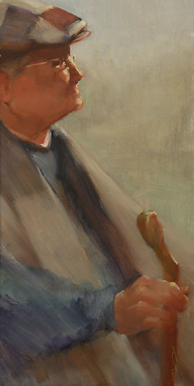
The Resilience of Age by Shirley Fachilla – oil 24X12
The final lesson isn’t a lesson at all but a realization: this limited palette creates color harmony automatically. By using an extremely limited palette, every color will relate to every other. The painter needs not strive for harmony; it is simply handed to him or her on a platter. The platter of the limited palette!
What tube colors should be used for the primaries?
When one thinks of primary hues of the traditional color circle (red, yellow, and blue), these hues usually match our mental and cultural image of pure red, yellow, and blue. However, those are not necessarily the hues I use. For my three primary colors in my limited palette, I use cadmium red deep hue, cadmium yellow light, and ultramarine blue. One of my first teachers recommended these colors and I have used them ever since. I use them for all subjects but they are probably especially suitable for portrait and figure painting.
Many artists advise staying away from hues because they lack the tinting power of the real thing. But real cad red deep is a very expensive color, and I am very accustomed to my hue. In fact, I always return to it eventually wherever I try to substitute another red.
Another primary threesome that many find more suitable for landscape is lemon yellow, Alizarin Crimson, and ultramarine blue. Alizarin has the advantage of being extremely deep in value and thus gives a wide range of possibilities for truly rich darks.
Over time, I have added other colors to my palette. They are additions that help either by lessening mixing time or by allowing some intense colors that are simply too difficult to create from a limited palette. I can easily eliminate these late arrivals, return to my threesome and continue to paint in an unlimited way!
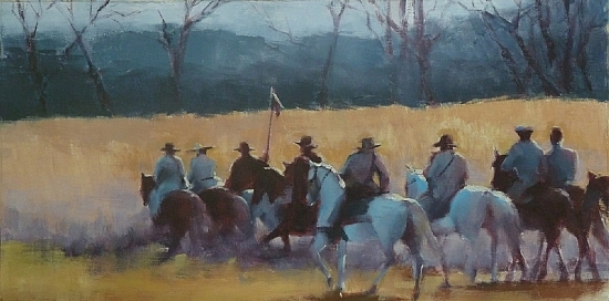
Band of Brothers by Shirley Fachilla – oil – 12X24
ABOUT SHIRLEY
Shirley is an artist from Tennessee and a NOAPS Member. She paints from life, in her studio, or she also enjoys Plein Air. Her paintings have been shown in several exhibitions and as a matter of fact she was juried into the Laumeister Fine Art Competition in Bennington, Vermont starting this coming week-end July 27, 2013. More about her art can be seen at http://www.shirleyfachilla.com

