
A painting is unified by texture and color; therefore, the knowledge of color is crucial to an artist.
Now, what is color in painting? When we talk about color in art terms, we could simply call it “red” or “blue”, or we can refer to color in a more poetic term such as “Shiva Red Crimson” or “Prussian Blue”. Regardless of how we choose to call it, the knowledge of color for an artist does not stop with its name. To understand color, an artist must also need to understand its three attributes:
1. Hue
2. Value
3. Chroma
In non-art terms, these three attributes are known as:
1. Color
2. Darkness/lightness
3. Intensity or saturation
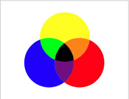 In painting, the hue (color in non-art terms) refers to the pure color without any white, black or gray added. Sounds easy enough, doesn’t it? The problem is that the paint manufacturers complicate the understanding of the word. In paint manufacturing, Hue could often refer to a paint of lesser concentration of pigment, or it can indicate that the paint is made of a combination of different pigments. To further complicate the issue, the use of Hue could indicate that the toxic elements have been removed while maintaining the original color such as in the case of a Cadmium Red and a Cadmium Red Hue.
If Hue refers to the pure color or pigment, what is Value?
Value is like looking at a “black and white painting”. We read a painting through “darks and lights”. A color can be seen lighter or darker according to how the light hits it. A solid blue fabric folded in multiple ways will show lighter and darker blues according to the light source. An artist will need to work with the values of that color to achieve a realistic depiction of that fabric.
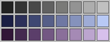
Adding white or black to a color
While value refers to lights and darks, Chroma refers to how pure the hue is. Chroma refers to the saturation or the intensity of the color.
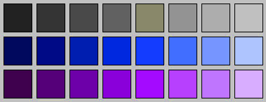
Higher saturation or intensity of the colors
Sometimes, it is hard to separate Value from Chroma because light colors seem to look more intense than they really are. In general we live in a “low chroma world with a wide range of light and dark values.” In other words, the colors in our world are not as intense or saturated (Chroma), but in order to see the shapes and because of the effect of the light source, we see objects with a big range between the darks and the lights (Values)

