
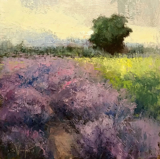
“Lavander” 12×12 by Simon Winegar from the 2017 NOAPS Holiday Small Works Show at the Cathy Kline Gallery, Parkville, MO.
Color is one of the favorite tools for the artist. We use it liberally, or sparingly, splash it on or carefully subdue it. However we choose to handle it, if the values are the framework, the colors are the music. For example, the painting by Simon Winegar, above, illustrates the artist’s choices for bold versus subdued. The violets in the foreground certainly grab attention as the boldest color, and as the scene recedes the artist has suppressed the colors in the background. The main color scheme is that of complements, and the artist has chosen to vary the placement of the warm and the cool, the bright and the dull.
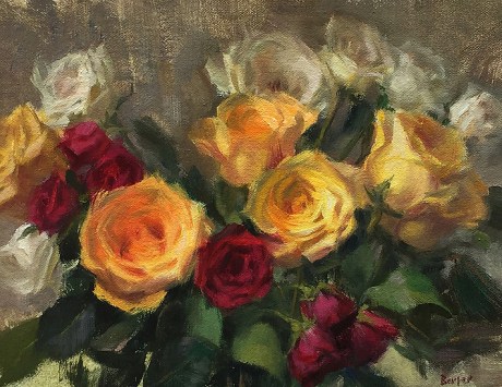
“Symphony in Roses” 8×10 by Stacy Barter from the 2017 NOAPS Holiday Small Works Show
The color scheme of Stacy Barter’s painting plays bold against neutrals. Her focal point is a bold yellow-orange, and the supporting colors of complementary red violets and yellow greens are subdued to let the lead color come forward. The greys are strategically placed around the perimeter of the painting, to keep the viewer in the painting, with little or no color or detail. The center of the main flower has been given warm clean color to direct the viewer deeper into the center of the blossom.
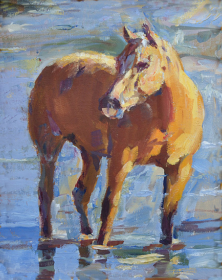
“Montana Gold” 10×8 by Linda Massey from the 2017 NOAPS Holiday Small Works Show
The color scheme for Linda Massey’s painting is at once visible. She has used blue and orange as her color strategy. Compliments can be tricky, though, due to the fact that they at once invigorate and conflict when placed in their purest chroma side by side. So the artist must decide which color will dominate, and which to subdue; where to put notes of pure color and where to keep it neutralized. The blue in this painting clearly dominates, and the orange has been dulled to prevent discord. The colors are also varied in their temperature, creating a mostly cool painting that actually reads as warm.
So the artist will always play with the color. Having the color strategy in mind prior to touching the canvas can free us to employ the even the slightest shifts in value, chroma and temperature to create a painting that engages the viewer, and invites them to investigate these colors that speak both loudly and softly, gently and resoundingly.
To view all of the paintings in the 2017 NOAPS Holiday Small Works Show visit http://www.noaps.org/exhibitions. Visit us on Facebook and Instagram (Natoilandacrylicsociety).
Written by Patricia Tribastone, NOAPS Blog Director

