Artists Who Find the Biggest Joys in the Smallest of Paintings

Would it surprise you to hear that there is literally an entire world of traditional art, with thousands of artists entering hundreds of shows around the world, year round, that you may not know about?

If you have not learned about traditional miniature art, you are missing out. I’m not talking about miniature shows that you see around the holidays where galleries sell “gift priced” studies. I’m not talking about the artists who paint scenes on grains of rice or carve pencil tips into amazing sculptures. These are all beautiful as well. But I am talking about the traditional miniature fine art world.

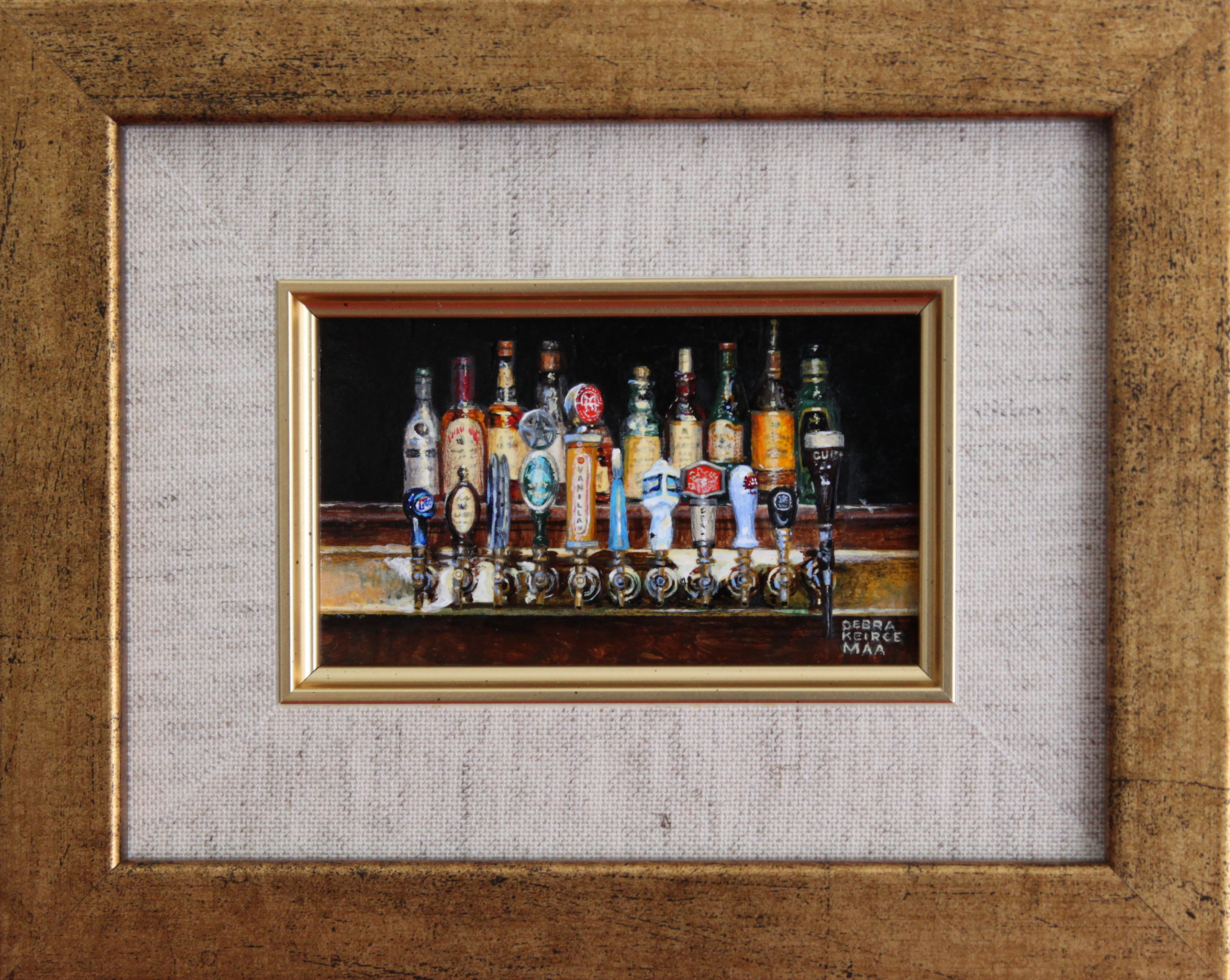
“Vanilla” by Deb Keirce, acrylic, 2.5×4 recently won Best of Show.

In a nutshell, traditional miniature painters adhere to the following rules. We paint objects 1/6 their original size or smaller. For example, a human head is 9 inches tall. You will not see a head in a miniature painting, larger than 1.5 inches tall. We also paint on substrates that are 25 square inches or smaller. This is what sets us apart from other forms of miniature art.

SUBJECT
Collectors of miniature art tend to be very conventional. The best selling work is usually wildlife, landscapes, and florals. In this way, we are not much different than the art world at large. Abstract art is not as prevalent in the miniature world, although most shows do have a category for it.

“Watering Stones” by Deb Keirce, acrylic, 4×6

MEDIUM
Any media is acceptable in miniature art shows. Mixed media, paper sculpture, bronze, clay, oil, acrylic, and watercolor are all common. As a nod to the days of the medieval scribes, where miniature art originated, you will often see gold leaf, silverpoint, egg tempera, Russian lacquer techniques, and other unique media at the shows.

SUBSTRATE
What you will not see in a miniature show is canvas. It is just too textured to paint on in miniature. Try it if you don’t believe me. We paint on smooth surfaces. I personally prefer sanded, gessoed panels. However, many of us paint on vellum, illustration board, polymin (a synthetic form of ivory available in sheets), and wood. You will often see paintings on piano keys, feathers, and other smooth objects as well. While primed copper and aluminum are popular with photorealists who paint very smooth mural sized paintings, I have not seen metals used as a substrate (yet) at the miniature shows.

SPECIAL CONSIDERATIONS
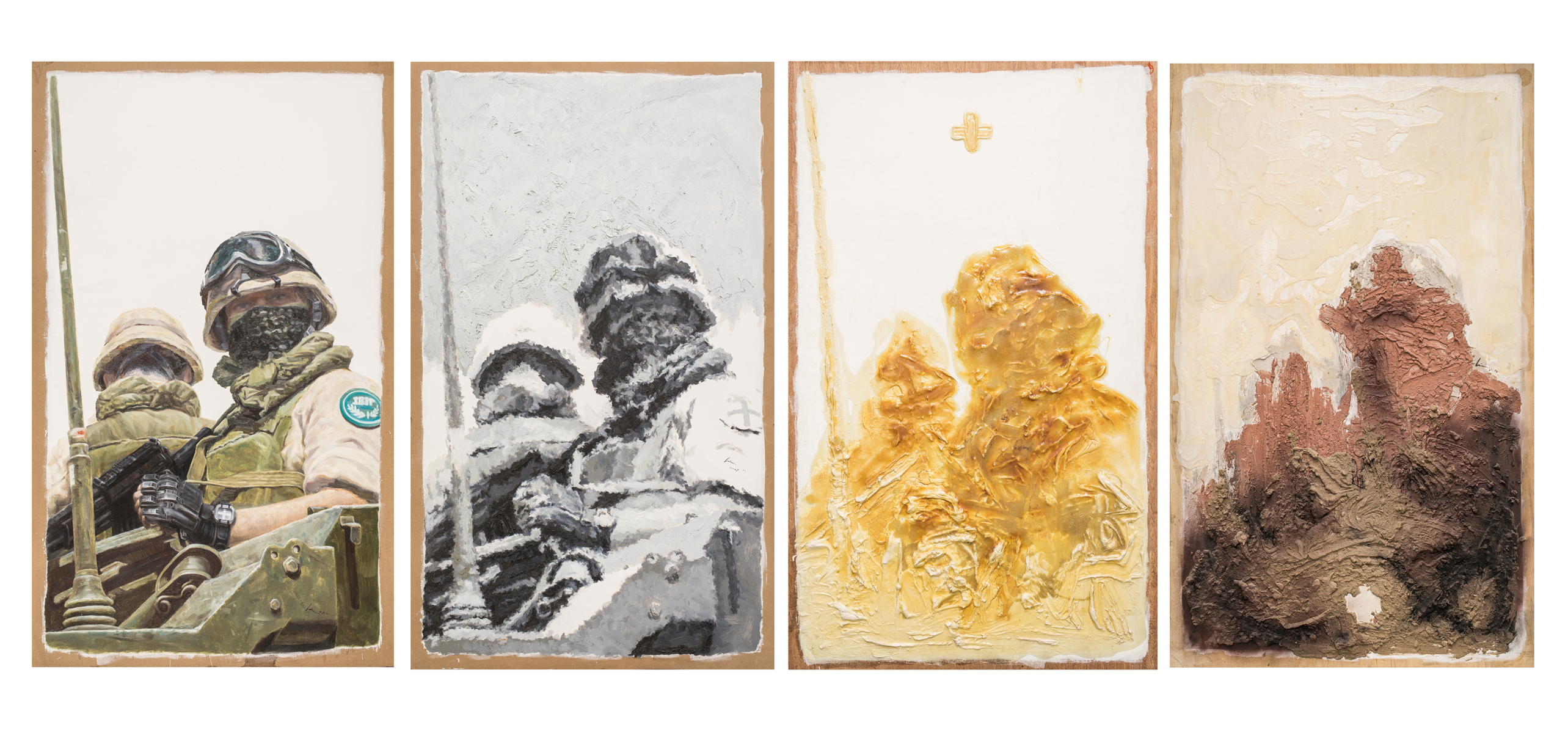
When you paint in miniature, you quickly realize that you need to do things a little differently than you do on larger artwork. For example, to read properly, miniatures are typically more detailed than their larger counterparts. Also, while it is fine to use impasto for highlights, you cannot create texture with brush strokes in the same way you would for a larger piece. Many of us use magnifiers while painting, because at most exhibitions, collectors view the artwork through magnifying lenses.

You need to be certain your art is secure in its frame, with no rattles. Minis are meant to be held. They offer a viewing experience that is more intimate, and thus need to be more durable. Hardware should be delicate, and fine wire is used that will not scratch you when you pick it up.

Hand in Hand by Deb Keirce, oil 6x4

Hand in Hand by Deb Keirce, oil 6×4

Many artists who work in little use stippling to create details. Others cross hatch. Most of us employ tools that are pointy to move the paint around, and achieve a level of detail you don’t get with brushes. While it is important to use pointy brushes to paint miniatures, you need enough bristles to hold paint, and to allow it to flow down to the point. You actually cannot paint with a brush that has only one or two hairs, so you resort to other means to get the paint onto the canvas when it is important to be highly detailed.

FRAMING
Frames are juried along with your artwork, so many miniature artists make their own frames. It is sometimes difficult to find framers with equipment to create frames out of 1 inch moldings for paintings that are 1 to 6 inches tall. For portraits, it is common to use thin metal frames, as was done in Europe, before the days of photography. People commissioned pocket sized portraits of their loved ones, and often kept them on chains like lockets. Mats cannot be over cut and frame corners must be firmly and neatly joined or they will not be juried into shows.

SOCIAL GROUPS AND SHOWS
The miniature world if full of the nicest and most talented people. There are groups on Social Media that support each other. And, there are miniature shows around the world throughout the year.
Have you been assimilated? Have I talked you into becoming a miniature painter? Seriously, once you enter my little world, I doubt you’ll want to leave!

ABOUT  DEBRA KEIRCE
Debra is a NOAPS Member and a Top 150 Finalist in NOAPS On-line International Exhibit. She is an international award winning artist of Contemporary Realism, painting the hauntingly familiar. She connects with fans and collectors through her newsletter.

Debra and her family live in Northern Virginia. Using oil or acrylics, she paints familiar scenes in a realistic style. Debra is inspired by the magic in daily stories of joy, desire, challenge and encouragement.

Painting full size art is fun, but Debra also specializes in small paintings. Part of her process for creating miniature fine art involves the use of magnifying lenses and close range binoculars. She enjoys demonstrating these techniques for art lovers.

More information about Deb and her art can be found at http://www.DebKArt.com

Posted in Uncategorized | 1 Comment

ART: A COMMON DENOMINATOR REGARDLESS OF LOCATION

MEET SOME OF OUR NEW 2015 INTERNATIONAL NOAPS MEMBERS
Artists from different parts of the world working with oil and acrylic bring diverse perspectives and creativity to NOAPS. At the same time, they make us realize that art transcend barriers of distance, culture, and age and connects us in a unique way. Art is a gift of inspiration and creativity bestowed only on the few that are called to pursue it. Artists give back that gift to people through their singular interpretations. Their creations become symbols of remembrances, cultural icons of their times, and emblems proudly displayed for individuals to enjoy at home or in public spaces. Art unifies us. Art, in its infinite manifestations, is a continuous thread found in all civilizations since ancient times. It links us, differentiates us, and pushes us together through its distinctive human touch.

From China: NOAPS Artist member Sha Zhiguo can be seen in a familiar setting: his painting studio

Artist Sha Zhiguo in his studio

Artist Sha Zhiguo in his studio

surrounded by his creations. His presence gives us an idea of the monumentality of the beautiful landscape behind him. Contemporary in concept, yet a reminiscence of great Chinese works of the past can also be seen through the work. The harmony in the colors and composition bring together his pieces of art.

Painting by Cuban artist Yorguis Menendez-Humaran

Painting by Cuban artist Yorguis Menendez-Humaran

From Cuba: NOAPS member Yorguis Menendez-Humaran is an artist with paintings in private collections both in the United States and in Cuba. A participant and Top 150 in the last two NOAPS International Online Exhibits, Yorguis enjoys painting pastoral genre as well as equine art, tobacco farmland, and landscapes from his native Cuba. Some of his paintings are reminiscent of the Dutch Golden Age when landscapes became very important. Favorite subjects were farmland and meadows where cattle grazed such as in the case of Yorguis painting here.
http://pinturasdeyorguis.webs.com/

From China: In a contemporary style, the

Painting by Chinese Artist Zhao Lu

Painting by Chinese Artist Zhao Lu

work of young artist Zhao Lu gives us a subject presented in a series from absolute realism to abstraction. His art grants the opportunity to see his technical skills both in realism and abstraction using the paint thickness and colors to deconstruct the original realistic rendition. Zhao currently lives in Beijing and he graduated from the Oil Painting Department , Art Institute of Tsinghua University. In the last years, he has participated in group and solo exhibitions in China.

Number 3ena chy_resized-1From India: Artist Ena Chy tells us the story behind her “Light Reflection”. “Ritu” means season in the perpetual universal phenomenon. This Ritu is profoundly related to sun light and its beautiful spectra just like the personal characteristics of a being.
Ena explains: “As I traveled along troubled roadways years ago, I would, at times, slow down to rest. I would see a burst of colors from the true nature of light and its reflection in surrounding water bodies. As my trip would end my memory would evoke the dynamics of the suburbs and the happenings all over the world – the seasonality of time, of each of us, and of events. This I have witnessed and I have gratefully enjoyed viewing that part of earth’s splendor.”

Regardless of the corner of the world, there is a common theme among artists that unify us: the ultimate desire to create art and to share that creation. Art transcend culture and time and leads us to pose the question: Why are we drawn to create art?

To contact the artists send a message to Publicity@NOAPS.org

Posted in Uncategorized | Leave a comment

DO YOU EVER WONDER?

Do you ever wonder how some paintings get selected for an art exhibit and others don’t? Artists do wonder! Specially when you start looking at all the accepted art.
How is art selected? We do not know how other organizations do it, but we do know how the art was selected for the NOAPS Spring 2015 International Online Exhibit. It is only fair to share that information with you.

Best of Show

Best of Show “Fortress Cove” by Rick Delanty 40×30 Oil and Acrylic

Is there subjectivity in jurying art? Of course there is! The concept of beauty in art is difficult to determine. One needs to just look at art throughout its history to find out that beauty in art is not only evolutionary within one culture, but it also varies from culture to culture. A piece of art painted in an Impressionistic style in 1860 would have been considered bad art at that time, while a Monet painting today is highly appreciated and valued in millions. An Aztec sculpture of Quetzalcoatl will not generate the same emotional reaction in a 21st century viewer living in New York as it did to an individual rooted in the beliefs and values of the Aztec culture. However, beauty in art is not only evolutionary and attached to the values of a culture, but it is also influenced by individual tastes and personal concepts of beauty. After all, they say that “beauty is in the eye of the beholder.”
Much has been discussed about the concept of beauty in philosophical terms, but much is still being discussed. No certain conclusion has been achieved except, may be, a connection between beauty and a feeling of harmony, balance, and rhythm.

Merit Award:

Merit Award: “They have eyes but do not see ears but hear not” by Marc Chatov, 60×44 oil

Nevertheless, the artist intention might not always be to provoke a feeling of harmony and balance. A lot of the times, the artist’s intention might be to provoke a controversial reaction, to analyze a situation, to depict a critical political or social event, or to simply react to the whim of creativity without a purpose or a goal.
Having said all the above, how was art selected for NOAPS Spring 2015 International Online Exhibit?
In order to eliminate as much subjectivity as possible, seven artist members and non members of the NOAPS organization were asked to select the TOP 150 paintings from the 625 entries received. These seven artists were purposely selected for having different styles of painting. NOAPS prides itself on accepting the high standard of all art styles. Each of the seven jurors individually scored each painting in a scale from 1 to 7. This means, the maximum score a painting could have achieved was 49. Well, not even one painting achieved that score! Not even close! There were only very few paintings in the lower 40’s, but the majority of the paintings fell in the 30’s and 20’s range. The cut-off for acceptance was a score of 34 which means an average score of 5 per judge. This was difficult to achieve! If there was a tie at 35 or 34, then the artist with no entry accepted until that point was given priority over one already accepted. There were only a few cases of two paintings accepted for the same artist. They represent the ones that receive top scores with both paintings
Once the step above was completed, the TOP 150 entries were reviewed by the Awards Judge, Timothy Tyler, who chose the awards in each category.
NOAPS appreciates all eight jurors for their tough decisions and we want to thank all participants. Congratulations to all TOP 150 artists accepted… you have gone through the eyes of eight jurors!

Posted in Exhibitions, General, NOAPS Artist Members | Tagged , , , , , , , , | Leave a comment

HUE, VALUES, AND CHROMA IN ART TERMS

A painting is unified by texture and color; therefore, the knowledge of color is crucial to an artist.
Now, what is color in painting? When we talk about color in art terms, we could simply call it “red” or “blue”, or we can refer to color in a more poetic term such as “Shiva Red Crimson” or “Prussian Blue”. Regardless of how we choose to call it, the knowledge of color for an artist does not stop with its name. To understand color, an artist must also need to understand its three attributes:
1. Hue
2. Value
3. Chroma
In non-art terms, these three attributes are known as:
1. Color
2. Darkness/lightness
3. Intensity or saturation
hue2In painting, the hue (color in non-art terms) refers to the pure color without any white, black or gray added. Sounds easy enough, doesn’t it? The problem is that the paint manufacturers complicate the understanding of the word. In paint manufacturing, Hue could often refer to a paint of lesser concentration of pigment, or it can indicate that the paint is made of a combination of different pigments. To further complicate the issue, the use of Hue could indicate that the toxic elements have been removed while maintaining the original color such as in the case of a Cadmium Red and a Cadmium Red Hue.
If Hue refers to the pure color or pigment, what is Value?
Value is like looking at a “black and white painting”. We read a painting through “darks and lights”. A color can be seen lighter or darker according to how the light hits it. A solid blue fabric folded in multiple ways will show lighter and darker blues according to the light source. An artist will need to work with the values of that color to achieve a realistic depiction of that fabric.

value

Adding white or black to a color

While value refers to lights and darks, Chroma refers to how pure the hue is. Chroma refers to the saturation or the intensity of the color.

Higher saturation or intensity of the colors

Higher saturation or intensity of the colors

Sometimes, it is hard to separate Value from Chroma because light colors seem to look more intense than they really are. In general we live in a “low chroma world with a wide range of light and dark values.” In other words, the colors in our world are not as intense or saturated (Chroma), but in order to see the shapes and because of the effect of the light source, we see objects with a big range between the darks and the lights (Values)

Posted in Uncategorized | Leave a comment

THE JUDGING PROCESS

Artists receive acceptances or rejections into juried exhibitions, but most of the times, they know little about the jurying process. What really happens between application and notification time is the subject of this article.
Once the deadline takes place, all the submitted paintings are set up for individual scoring. A panel of six artists and art connoisseurs score each painting in a scoring scale 1 to 7 with 7 being the top score. Each juror views the art work on their computer screen. The size and the medium for the paintings are displayed, but the name of the artist is not provided making the jurying a blind process. Forty two (42) is the maximum score a painting can received. This is very rare considering the unique perspectives from six different judges. For example, in the NOAPS Fall 2014 International Online exhibit there was not even one painting scoring 42 points. The majority of the top paintings fell between 36 and 38 points. The Top 150 were selected this way out of 709 entries. Multiple entries were accepted for a few artists when scoring in the very top threshold, above 38.
The Top 150 accepted paintings are then moved to a second round of jurying to be performed by the judge of the event. This judge selects the awards for the exhibit. Tom Tierney, the judge for NOAPS Fall 2014 International Online exhibit commented: “Thank you for the chance to view all these beautiful works. I could have flipped a coin on a few selections!!!”

It is definitely not an easy job to make the selections. Judges in the past have described the experience as “demanding, exciting, extremely educational, and a must in an artist or art historian career.” “It is invaluable to be able to see each painting in the context of comparison with 700 other paintings!”

Thank you to all the six jurors in the panel and to Tom Tierney, the judge for NOAPS Fall 2014 International Online Exhibit. Thank you as well to all the participating artists and their 709 paintings. It is not an easy job to select just a few among the many beautiful art pieces.

CONGRATULATIONS TO THE TOP 150 PAINTINGS ACCEPTED INTO NOAPS FALL 2014 INTERNATIONAL ONLINE EXHIBIT AND TO THE AWARD WINNERS.

You went through two rounds of jurying and the eyes of seven individuals to get there!

Fall 2014 Online Exhibit

Posted in Exhibitions, General | Tagged , , , | Leave a comment

UNDERSTANDING CLOUDS by Rita Roberts

UNDERSTANDING CLOUDS by Rita Roberts.

Posted in General, NOAPS Artist Members | Leave a comment

UNDERSTANDING CLOUDS by Rita Roberts

Clouds are an integral part of many landscape paintings, regardless of the media used.
As artists, we want to paint clouds that are more than just interesting and believable.
We want our clouds to add to the emotional impact of a painting; not just realism, but
emotional truth. In order to achieve this, we must visually understand clouds.
To understand anything, we first need to see it as it truly is, without preconceptions. We
don’t need a scientific lecture on what makes clouds, although that’s interesting too.
Simply take a walk. You need not go far if the sky is loaded with clouds. Go out at
different times of day. Take your camera and sketchbook. Notice the colors and shapes
of the clouds in relation to the weather you can feel on your skin. What type of clouds
appear on a warm, humid day, or a cold and blustery evening. How do you feel when
you are in that weather? That’s the emotion which will permeate your painting.
When it comes to painting or drawing clouds, our main objective is to understand the
light, shadows, structure, and mood. You can think it as learning to paint and draw cloud
portraits. I feel each cloud has a distinct personality. Maybe you will notice this too, once
you put your attention on the skies above a landscape.
One of the great qualities of clouds is that they can be a variety of colors and any
shape. The key to painting clouds that a viewer can truly experience is in choosing the
correct values to accurately depict the form, and even create the illusion that the clouds
will continue moving across the canvas, in the same way they float through the sky.
Value is an obvious concern in a drawing, but it is also the primary concern of any
painting. If your values are incorrect, your painting falls apart. Colors can be modified
and work in harmony with values. Value is far more important than color, even in painting.
When your paintings hold together structurally through the use of correct values, they
hold together in color as well. It also makes reproductions in press releases or
catalogues much more compelling and eye-catching. If you’re not sure that your values
are solid just by looking or squinting at your painting, take a photograph of it. Then use
your digital software to convert it to black and white. If the forms are not easily readable
in gray scale, your full color painting won’t be fully successful.

Inviting Darkness - B&W_RRobertsInviting Darkness_RRoberts
This is especially true for quick, loose paintings. To visually express the essence of
clouds and how they impact the landscape, values are the key to capturing everything
you need in broad strokes.
Creating cloud-scapes with impact is not so much about perfecting a technique or
learning to paint with a particular medium. It is about understanding what you are
looking at, perfecting your vision to allow the clouds to inform your painting as a whole.
This is true for any subject matter, but clouds are the perfect model to amplify your
understanding and pay attention to the way you see and interpret your subject matter.
While painting clouds, you can concentrate on and get reacquainted with the basic
principles upon which to build a successful painting, while having some leeway with
capturing an exact likeness. I urge you all to take to the skies! Do some cloud studies.
Any repetitive habits or fearful inhibitions you may experience with subjects which seem
more difficult or complex can be put aside while experimenting with clouds. Allow
yourself some freedom to explore the variety of color, mood, drama, and emotion
through the skillful use of values. Take what you learn and apply it to every other
painting you create.
Turmoil_RRoberts
Rita Roberts is a NOAPS Member and she offers a four-week course through Artists Network University. Her methods can translate to any media and any subject matter and they teach the secrets to creating vivid and evocative cloud-scapes. In 2015, a session of “Understanding Clouds” will be offered every month. Visit ritaroberts.com to see more of the artist’s work.

Posted in General, NOAPS Artist Members | Tagged , , , , | Leave a comment

Re-opening Reception at The Vine Art Gallery

vineAfter two weeks at the beautiful Dunnegan Gallery of Art in Bolivar, Missouri, The 24th BEST of AMERICA Exhibit 2014 is moving to The Vine Art Gallery in Osage Beach, Missouri.  All the art was professionally packed and transported to the very popular The Vine Art Gallery where it will display until November 22, 2014.

What is the story behind this favorite meeting place in the Ozarks area? The Vine started as Sturdevant Art Gallery in 2006, owned by Craig & Ruthi Sturdevant.  The gallery soon became a hub of artistic activity. The difficult economic times between 2006 and 2010 were not kind to art galleries, so Craig & Ruthi decided to include a wine bar along with the art in 2010. Soon, patrons wanted more than wine and cheese and the idea of a full dinner menu became a reality.  Nowadays, The Vine offers elegant dining, a carefully selected list of fine wines, and great art. A palate delight and a delight of visual palette! The art gallery – wine bar – elegant dining concept has worked and the Vine is alive and well today.  The gallery is host to a variety of art and wine events year round including gallery openings and elegant multi-course dinners with wine pairings. Both the wine and art change several times during the year featuring a lot of the Missouri artists but not Missouri wines.

vine4This year, the Grand Opening for the Best of America Exhibit 2014 at The Vine will take place at 6:00 pm on Saturday, November 1 with a free wine tasting reception. There will be a wine connoisseur supplied by Glazier’s to discuss the wines which will be served until gone. The wine bar/restaurant will be open before and during the reception for those who would like to make an evening of the event.  We will have many NOAPS artists on hand to discuss the art at the exhibit.

Join us November 1st., 2014 at 6:00 pm!

See all the art for the exhibit or purchase paintings at http://www.noaps.org/html/boae2014.html
See the exhibit in person or purchase your favorite painting through The Vine Art Gallery till November 22

The Vine
1375 State Road KK
Osage Beach, MO
(573) 302-0066
TheVineGallery@Hotmail.com

vine2

Posted in Exhibitions, General, NOAPS Artist Members | Tagged , , , | Leave a comment

AWARDS OF THE 24th BEST OF AMERICA EXHIBIT 2014

We had a great week of events leading to the opening of the 24th BEST of AMERICA 2014!

Almost $12,000 in cash and merchandise certificates provided by NOAPS and the numerous sponsors were awarded to artists at the exhibit this year.

NOAPS congratulates all the participants in the show and all the award recipients. We thank all the sponsors

award1

awards2

Posted in Exhibitions, NOAPS Artist Members, Uncategorized | Tagged , , , , , , | Leave a comment

The 24th Best of America Exhibit 2014

The 24th Best of America Exhibit 2014.

Posted in Exhibitions, General, NOAPS Artist Members | Leave a comment