The 24th Best of America Exhibit 2014

THE NATIONAL OIL & ACRYLIC PAINTERS’ SOCIETY (NOAPS)
WILL CELEBRATE ITS 24TH ANNUAL “BEST OF AMERICA” EXHIBIT WHICH WILL OPEN TO THE PUBLIC ON OCTOBER 12, 2014 UNTIL NOVEMBER 22, 2014

.
Celebrating its 24th Annual “Best of America” in 2014, the National Oil & Acrylic Painters’ Society (NOAPS) has been showcasing the talents of oil and acrylic painters since 1991. This year, awards have been increased to over $10000 in Cash and Sponsor Certificates and events have been added. A three (3) day workshop by the judge of the exhibit, Todd A. Williams, a morning Fun Paint Out, and an Awards Banquet will be some of the activities prior to the Grand Opening on October 12, 2014 at the beautiful Ella Carothers Dunnegan Gallery of Art and the re-opening three weeks later at the very popular Osage Beach Vine Wine Bar and Art Gallery.
NOAPS was founded on March 14, 1991 by a small but determined group of individuals. The primary purpose for this not-for-profit organization was an annual national juried art exhibition and competition that came to be known as NOAPS annual ‘BEST of AMERICA’ exhibit. For nearly 24 years, NOAPS has been showcasing the incredible talent of both oil and acrylic artists in gallery shows and online competitions. Our annual juried exhibit, the ‘Best of America’ truly attracts some of the best artists from all across North America. Our membership and event participation is experiencing significant growth. Membership growth is coming from all across North America. NOAPS is now a leading art society in North America offering membership to both oil and acrylic artists.

Accepted paintings Best of America 2014For artists, just to be selected into the ‘Best of America’ exhibit has always been an honor. In the past only about 70 paintings were accepted from hundreds of entries, but that number has been increased to one hundred due to our growth. To be accepted is difficult enough, but many of the artists receive additional recognition through the numerous awards bestowed by the society or by the various Suppliers Awards provided by sponsors. This year, the total awards will be in excess of $10,000 in cash and sponsor/patron prizes. Cash Awards include: Best of Show $3,500, Second Place $900 and Third Place $600. The Best of Show includes the honor of having the artist’s winning artwork become the image on the front cover of the 2015 Best of America catalog. In essence, over thirty awards are presented. Among them, the $1000 Best Signature Artist Painting Award, the Best People’s Painting, and several Merit Awards. Our list of sponsors provides an invaluable contribution to our society and to the increase in awards. They have been helping us grow since our founding in 1991 and we greatly appreciate their support.

NOAPS is fortunate to have our 2014 Exhibit in two wonderful art spaces. The magnificent and spacious Dunnegan Gallery of Art in Bolivar, Missouri will host the Awards Banquet on October 11 and the Grand Opening on October 12. This gallery is comprised by a total of 26,000 sq ft. including a beautiful exhibition area for the ‘Best of America’ and an outstanding space for their private collection with valuable pieces of art. The ‘Best of America’ will close at the Dunnegan Gallery of Art on October 26 but it re-opens at the very popular Vine Wine Bar and Gallery of Art in the beautiful Osage Beach area, Lake of the Ozarks Missouri region. The Vine is a vibrant gallery that has become a hub of artistic activity and fine dining.

In this 24th anniversary of the ‘Best of America’ Exhibit, NOAPS and the galleries look forward to showcasing the one hundred or more paintings from artists throughout North America selected from as many as 800 entries ensuring some of the best art in North America. The selection process was completed by September 6, 2014. The “Best of America” Exhibit consistently offers many styles and subject matter, providing attendees a unique opportunity to view and purchase ‘fine art’ in person or through the NOAPS website. Reservations for the events leading to the Grand Opening can also be made through the NOAPS website. The workshop offers a learning experience, the morning Paint Out at the beautiful Dunnegan Memorial Park promises to be fun, and the Awards Banquet is a delightful evening with great company and excellent food where the judge explains his award selections; an evening and an exhibit not to be missed!

Posted in Exhibitions, General, NOAPS Artist Members | Tagged , , , , , , , | Leave a comment

What Does It Take to be a NOAPS Signature Artist?

NOAPS “Best of America” Exhibitions have become a magnet for fantastic art from all over the world. To be chosen from the hundreds of applicants just to participate is an honor. To be chosen for three or more Best of America Exhibits within five years shows a consistent standard of excellence that earns the artist the title of “Signature.” The fact that less than 130 artists have achieved this honor in the 24 years of NOAPS existence speaks to the difficulty of the task.

Evening Chore by Signature Artist William Schneider. This painting illustrated the cover of the 2008 Best of America Catalog

Evening Chore by Signature Artist William Schneider. This painting illustrated the cover of the 2008 Best of America Catalog

NOAPS is now working toward showcasing that level of talent in an annual special show for which only Signature Artists will be accepted. So far, we are looking at venues in the Northeast (Maine), West (California) and Southeast (Florida) to provide the artists not only good venues in which to exhibit, but also give them a great place to visit.

Helen's Iris by Signature Artist Cathy Pearson - Acrylic 28x22

Helen’s Iris by Signature Artist Cathy Pearson – Acrylic 28×22

To underscore the importance of this level of achievement, NOAPS has appointed Cathy Pearson to oversee this segment of our membership with the goal of exhibiting Signature Artists’ work in places that would promote sales and increase the visibility of our most celebrated members. To insure these shows are literally “The Best of the Best”, future Signature shows will be juried by the Board to tailor the number of paintings to the sponsoring gallery’s space and time constraints. Entry fees will remain as low as possible based on the advertising requirements to insure good attendance.

the Prophet by Signature Artist Andre Knez, Narrative Excellence Award 2011

the Prophet by Signature Artist Andre Knez, Narrative Excellence Award 2011

NOAPS successful growth has expanded our reputation. As such, we want those most decorated artists to know what a special place they hold for us and for the art world. Be sure that your personal foot-print continues to enlarge by participating in as many of the competitions and exhibits that you can. NOAPS offers a great forum to show your ability to be among some of the best contemporary artists working today with increasing opportunities for advertising in national publications.

Winter Walk by Signature Artist Lyn Phariss - Best of America 2013

Winter Walk by Signature Artist Lyn Phariss – Best of America 2013

To those who are NOAPS Signature Artists, we thank you for your talent and participation. To those who would like to achieve that status, we hope you’ll continue to paint and apply to all NOAPS events so that we can work even harder to let art lovers see how very special you are.

ADDITIONAL INFORMATION ABOUT NOAPS SIGNATURE ARTISTS

Painting by Master of Art Artist Tom Altenburg, Best of America Exhibit 2012

Painting by Master of Art Artist Tom Altenburg, Best of America Exhibit 2012

The Masters of Art: Within the Signature Artist Group, there are seven artists that have achieved the Master of Art Designation. This honor is given to those artists that received an award in the Best of America Exhibit in three consecutive years. These artists have an special page within our website displaying their art: http://www.noaps.org/html/master_artists.html

The Workshop Grant Application Program:

Favorite Azaleas by Barbara Nuss Oil, 24X30

Favorite Azaleas by Barbara Nuss Oil, 24X30

A benefit for Signature Artists to help them promote their own workshop. NOAPS creates a special page in our website and endorses the workshop through all our Social Media. The process to obtain the grant is easy, free of charge, and NOAPS even contributes toward the cost of advertising in outside venues. Check this benefit in our website at: http://www.noaps.org/html/sa_exhibitions.html#GRANT
Signature Artist, Barbara Nuss, is conducting a workshop in Annapolis, MD the week-end of September 20 and 21. A big opportunity to learn with a great artist winner of several NOAPS recognitions: http://www.noaps.org/html/worshops_md.html#BARBARANUSSWORKSHOP2014

Patriotic Bell by Signature Artist Hebe Brooks - Best of America Exhibit 2012

Patriotic Bell by Signature Artist Hebe Brooks – Best of America Exhibit 2012

The Special Signature Artist Award: This year NOAPS is proud to introduce the Signature Artist Award, a separate $1000 Award sponsored by Blick Art Materials to be given to the Best Signature Artist painting in the Best of America Exhibit 2014.

See the entire list of NOAPS Signature Artists at: http://www.noaps.org/html/signature_artists.html

Posted in General, NOAPS Signature Artists, Uncategorized | Tagged , , | Leave a comment

What is in a Paint Tube Label?

There is a lot to learn by just looking at the label of a paint tube. Of course, the manufacturer’s name can usually be seen right away. Their address, phone number, and/or website is usually listed in smaller print. Whether it is an oil, an acrylic, or another medium is also clearly indicated as well as the volume of the paint tube in milliliters or fluid ounces. However, there is much more to learn by looking at the label that will help any artist in selecting the right paint for their work of art.

PIGMENT

Paint tubes from NOAPS sponsors: Gamblin Artist's Oil Colors and Richeson Oils

Paint tubes from NOAPS sponsors: Gamblin Artist’s Oil Colors and Richeson Oils

Each pigment is identified by a Color Index Name: PR (P for Pigment, R for Red), PW (Pig ment White), PY (Yellow), PBk (Black), PBr (Brown), PG (Green), PV (Violet), etc. … A number for the specific type of pigment is also assigned. For example, PR 170 is Naphthol Red AS.  This pigment might have a different Marketing name. In the picture here, the PR 170 is called Shiva Red Medium (Richeson Oils). The next number listed (12475) is the Chemical Constitution Number. A tube may contain more than one pigment. For example, the tube on the right is made with three pigments! When faced with the same or similar names in paint tubes by different manufacturers, or when one is a HUE, check the pigments. They might be different! The HUE one might be a cheaper pigment and the lightfast might not be as good! Whether Acrylic or Oil, check your pigments and compare! Here is a website which is a great source for everything you ever wanted to know about Pigments:
http://www.artiscreation.com/Color_index_names.html#.U1rMn6JmgUA

THE SERIES NUMBER

Golden Artist Colors is the sponsored of the Best Acrylic Painting Award in the Best of America Exhibit 2014

Golden Artist Colors is the sponsored of the Best Acrylic Painting Award in the Best of America Exhibit 2014

The series on the label refers to the price group. Certain paints are more costly to manufacture according to the price of the pigment used to make them, the quantity and quality of the pigment, or simply the process. Manufacturers group the colors into price bands assigning a letter or a number to these bands which are also known as “Series”. Higher series number or series letters indicate a higher production cost and a higher price for the paint. For example a Series A is less expensive than a Series B. Consequently a Series 1 would be cheaper to manufacture than a Series 2. The picture illustrating this portion is an acrylic paint tube from Golden Artist Colors, an sponsor for NOAPS Best of America Exhibit 2014. Golden Artist Colors is sponsoring the Best Acrylic Painting Award this year.

LIGHTFASTNESS

Richeson Oils has been a long time sponsor of NOAPS Best of America Exhibit

Richeson Oils has been a long time sponsor of NOAPS Best of America Exhibit

Lightfastness of a paint color or pigment is very important! It indicates how permanent, resistant to change, or how unaffected by light it is. Paint colors can fade or alter when exposed to light and time. This could change the look and quality of an art work.
The two most used rating systems are the ASTM (American Standard Test Measure) and the Blue Wool System (the British system). The American Standard Test Measure (ASTM) gives ratings from I to V. (I excellent, II very good, III fair or non-permanent, IV and V poor and very poor)
The British system (Blue Wool Standard) rates lightfastness One to Eight. Eight being Excellent and One being the worst.
Look at the Lightfastness in the chart here for the Richeson Oil Paints Shiva Series, one of our sponsors for NOAPS Best of America Exhibit 2014.

HEALTH WARNING

acmiThe requirements for health warnings may vary according to the country or even the state. Specific information will be listed under a caution or warning on the label. It might also refer to ASTM conformity or present the ACMI Approved Product Seal.
CLseal The ASTM International (American Society for Testing and Materials), “is a globally recognized leader in the development and delivery of international voluntary consensus standards. Today, some 12,000 ASTM standards are used around the world to improve product quality, enhance safety, facilitate market access and trade, and build consumer confidence” ( extracted from http://www.astm.org/ABOUT/overview.html). For more information refer to their site.
The ACMI (The Art & Creative Materials Institute, Inc.) seal is an indicator to look for on the label since it certifies that the paint is either non-toxic (AP Seal) for adults or children or Cautionary Labeling (CL Seal) where health warnings are required. However, even the non-toxic seal does not indicate that the paint can be used for body painting or ingested. Golden Artists Colors best express it on their products as shown here:

Golden

Golden Artist Colors, Inc is the sponsor of the $500 Best Acrylic Painting Award in the Best of America Exhibit 2014


Posted in General, Uncategorized | Tagged , , , , | Leave a comment

DON’T MISS THIS PAINTING WORKSHOP!

Bolivar, Missouri, a quaint little town in the Ozarks, will be the place to be the week of October 8, 2014. Todd A. Williams, a recognized artist, will conduct a three day painting workshop at the Dunnegan Gallery of Art. Whether a beginner or an advanced artist, there will be plenty to learn in these three days filled with art, knowledge, and camaraderie. After the workshop (October 8,9, and 10) Todd will judge the almost 100 paintings accepted into NOAPS 24th Best of America Exhibit awarding over $10000 in cash and sponsor certificates to the most outstanding artworks in the show. He will also explain his selections during the Award Banquet the evening of October 11. This will be without a doubt, a great learning experience and an opportunity to grow as an artist
                                                               –  The National Oil & Acrylic Painters’ Society

“The 7 Keys to Painting”
by Todd A. Williams

Stairway Home Italy by Todd A Williams

Stairway Home Italy by Todd A Williams

1) Knowledge vs. Observation= This is really about knowing how to choose the right subject or composition to paint, something often that is given little importance by beginners. It comes down to the experience of painting for years and miles of mistakes on canvas.
2) Design= The key here is using a view finder on location to find the most overall powerful design and by placing the centrality of focus in or near the golden mean. As you begin to lay in your sketch, use the view finder to analyze the correct shapes and prospective angles. It’s all about comparative measuring.
3) Squinting= We must squint down our eyes in order to eliminate the unnecessary details and simplify the subject. It is also the best way to find the correct relationship of the VCM’s and edges.
4) “VCM” Value – Color – Mixture = After getting my design and drawing in place on the canvas. Through squinting, I begin mixing the correct VCM’s for each value plane. I ask myself does it need to go lighter or darker (value) – warmer or cooler(color).
5) Paint Application = Here is where we as artists can be a kid again. Experiment with different tools, maybe lay on the paint with a palette knife and smear it with your fingers. Or paint with your brush held at different angels in relationship to the canvas for a variety of texture.
6) Edges = For me this is something I can analyze later as the painting progresses and make the necessary adjustments by relating one edge to another. I believe it is always good to have four edges represented to lead the eye of the viewer. Sharp- hard- soft- lost.
7) Spirit – Soul and Body= Time to analyze your initial vision. Just as we as human beings are made up of three different parts, so should our paintings.

  • Spirit- Does my painting breathe and have life to it? Is it exciting on multiple levels and does it have poetic passages that speak creatively about the artist himself/herself.
  • Soul – Is the overall character or focal point of the painting successful in directing the viewer?
  • Body – Are all the relationships cohesive and unified with an overall accurate color harmony?
The Flaker, Vienna by Todd A. Williams

The Flaker, Vienna by Todd A. Williams

Register for this painting workshop at http://www.noaps.org/html/workshops.html

Santa Maria by Todd A. Williams

Santa Maria by Todd A. Williams

Posted in Exhibitions, Uncategorized | Tagged , , , | 2 Comments

CONGRATULATIONS NOAPS SPRING ONLINE 2014 FINALISTS!

CONGRATULATIONS TO ALL ACCEPTED PAINTINGS
INTO NOAPS SPRING 2014 INTERNATIONAL ONLINE EXHIBIT!

It was a very difficult selection task among hundreds of beautiful paintings. We thank all participants and we congratulate all 150 Finalists, Award Winners, Award judge Cheng Lian, as well as all the NOAPS volunteers that make this international exhibit possible with their time and effort.

We received entries from all parts of the  world including Latin America, Canada, Europe, Middle East, Southeast Asia, the Orient, and of course the United States. Many of the selected finalists come from far away, Congratulations!

Thank you again for your support of the arts! And, as a learning experience, please read some tips about the entries at the bottom of this article. These tips might help you when entering your next show.

CONGRATULATIONS TO DEREK W PENIX
BEST OF SHOW AWARD

Boats in Villefranche, France by Derek W Penix Oil on linen 24X36

Boats in Villefranche, France by Derek W Penix
Oil on linen 24X36

spring1spring2

And see all the beautiful paintings from the 150 Finalists at:
http://www.noaps.org/html/oli_2014_spring.html

TIPS THAT MIGHT HELP WHEN ENTERING YOUR NEXT SHOW

The main advise when entering an art competition is to read the rules in the prospectus. Sounds easy enough, right? If the painting doesn’t follow the instructions, it might be disqualified and unfortunately, it often happens.
What would disqualify an entry in an online exhibit? The two most common reasons are:

1. “The art entered is to have been painted in the past 3 years and NOT previously accepted in a NOAPS Exhibit”. Unfortunately artists sometimes forget and submit art work that was accepted and even awarded in previous NOAPS exhibits. Please check before submitting. It is easy to forget.

2. “All work must have been created in oil and/or acrylic mediums.” This means that watercolor, pencil, or other mediums will be disqualified.

3. An additional tip that always comes up is: only the picture of the painting must be submitted. Please avoid frames, walls, and other inclusions with your art submission. This does not disqualify your entry but the picture of a painting hanging on a wall does not compete well with the full image of just the artwork.

Thank you for participating!


Posted in Exhibitions, Uncategorized | Leave a comment

ARE JURIED ART COMPETITIONS NEW?

“The most important element in an art work is if it will move you, touch your feelings, catch your eyes, or cause to reach that point, color, composition, stroke, understanding of your subject structure. Every elements counts! It doesn’t matter if it is an abstract or a figurative.” – Cheng Lian, NOAPS Master Artist.
.

As the deadline for NOAPS Spring 2014 Online International Art Competition approaches on April 8, 2014, Cheng Lian, NOAPS Master Artist prepares for the difficult task of jurying the paintings. It is a big responsibility that has fallen on the shoulders of many throughout the art history of the world.

Samsara by Master Artist Cheng Lian - NOAPS Founder Endowment Award Best of America Exhibit 2011

Samsara by Master Artist Cheng Lian – NOAPS Founder Endowment Award Best of America Exhibit 2011

Lian is ready with experience acquired through his training as an artist, his teaching, and his own participation in competitions. He is a NOAPS Master Artist. Since 1991, thousands of artists have showcased their paintings in our exhibits, but only eight artists have achieved the NOAPS Master status, an honor bestowed after receiving an award in three consecutive Best of America Exhibits. A special webpage is dedicated to these eight individuals. See their outstanding works of art at: http://www.noaps.org/html/master_artists.html

.
Jurying, indeed, is a difficult task; nevertheless, it is not a new task. Art competitions and jurors have existed for a long time. As a matter of fact, in the 5th century BC, in Greece, the painter Zeuxis competed against the painter Parrhasius in an art contest. It is said that “Zeuxis painted a cluster of grapes that were so tempting and lifelike that birds flew down from the sky to eat them. Parrhasius painted a curtain that so deceived his opponent that Zeuxis conceded defeat.”

Baptistry St. John's Church Florence

Baptistry St. John’s Church Florence

Florence was a center of “juried” competitions in the 15th-century and even earlier. Who would not remember the famous art competition for the commission of the bronze doors at the Baptistry for the old church of St. John won by Lorenzo Ghiberti? His work is now one of the best known art treasures of the world. Many art competitions resulted in commissioned work throughout the history of Western Art. Prizes and name recognition were also an innate part of the contests even back at that time. Other famous art competitions such as the Prix de Rome and the well recorded Salon de Paris (1748-1890) come to mind. The Salon became a government-sponsored international juried exhibition in the 19th century and a grand event attended by the art world and the general public.

The Salon or Paris Salon, a juried art exhibition

The Salon or Paris Salon, a juried art exhibition

Tickets to see The Salon were sold and acceptance practically guaranteed subsequent recognition. As history will tell, art movements were even born as a result of juried exhibitions. The Impressionistic group of artists experienced rejection by The Salon jury and these rejected artists formed their own group and exhibit in 1874.

.
Artistic expression and competitions were a major part of the Olympic Games in Ancient Greece. In order to emulate this ancient tradition juried art competitions were also held in the Olympic Games between 1912 and 1948 where gold, silver, and bronze medals were awarded to artists. It was a themed juried art competition where the artwork had to bear a relationship to the Olympic idea of sports and athletic competition.

.
The art competitions were not exclusive to Western Art; they are also found in the Eastern Art Civilization and in other cultures. Japanese art has a long history of Japanese painting exhibits and competitions held between local artists. Hsie Ho, a Chinese art historian and critic wrote the famous “Six points to consider when judging a painting” back in the 6th century China. These six points which are relevant even to this date can be read below.
All these competitions throughout history and even today give the opportunity to showcase the work of established and emerging artists and to receive monetary incentives and commissions that maintain the spirit of the arts alive.
Any judge from the past and from present day will attest to the difficulty of the task. All judges will confirm the complexity of looking at artwork through different angles in order to eliminate subjectivity and create fairness. And, for us, the artists, whether we make a mark or not, it is an opportunity to be part of something special in the continuous history of art.

.

Written almost 1500 years ago

These six elements that define a painting were written in China in 550 by Hsieh Ho, also known as Xie He. These same elements could be used even today, almost 1500 years later!

  1. Spirit Resonance,” or vitality, and seems to translate to the nervous energy transmitted from the artist into the work. The overall energy of a work of art. Xie He said that without Spirit Resonance, there was no need to look further.
  2. Bone Method,” or the way of using the brush. This refers not only to texture and brush stroke, but to the close link between handwriting and personality. In his day, the art of calligraphy was inseparable from painting.
  3. Correspondence to the Object,” or the depicting of form, which would include shape and line.
  4. Suitability to Type,” or the application of color, including layers, value and tone.
  5. Division and Planning,” or placing and arrangement, corresponding to composition, space and depth.
  6. Transmission by Copying,” or the copying of models, not only from life but also the works of antiquity.

This Blog article was researched and written by Hebe Brooks. She has a Fine Art –Studio Painting and an Art History Degree from the University of Houston. Multiple sources were used.

Posted in Exhibitions, General, Uncategorized | Tagged , , , | Leave a comment

SPRING HAS ARRIVED!

SPRING HAS ARRIVED!.

Posted in General, NOAPS Artist Members | Tagged , , , | Leave a comment

SPRING HAS ARRIVED!

NOAPS welcomes Spring with floral paintings by some of our artist members.  Their inspiration, the story behind the art, or the feelings that led each artist to the creation process.

Snowflake' Oakleaf Hydrangea by William Colclough Thomas 40X30 Acrylic on Canvas

Snowflake’ Oakleaf Hydrangea by William Colclough Thomas – http://www.williamthomasart.com

WILLIAM COLGLOUGH THOMAS

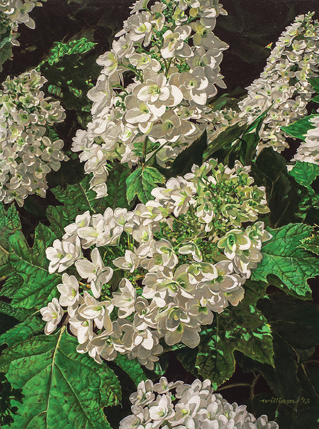
The ‘Snowflake’ Oakleaf Hydrangea holds a special significance for my adopted hometown. This is the signature flower of Aldridge Gardens, in the city of Hoover, Greater Birmingham, AL. The plant was once extremely rare, but native to the Alabama woods. Story has it that in 1969, Loren Aldridge, who owned a horticultural business, and his son Eddie were approached by a neighbor with a bloom from a hydrangea that neither had seen before. They asked the neighbor if they might be taken to the plant, which was in poor condition. Cuttings were taken, propagated, rooted and carefully nurtured, in spite of several near catastrophes, including the death of the original plant. After years of propagation and cultivation, they patented it in 1971. This artwork was painted from one of the original remaining cutting plants flourishing on Aldridge Gardens – William

Como Park Blossoms by Rick Hansen - www.rhansenstudio.com

Como Park Blossoms by Rick Hansen – http://www.rhansenstudio.com

RICK-HANSEN

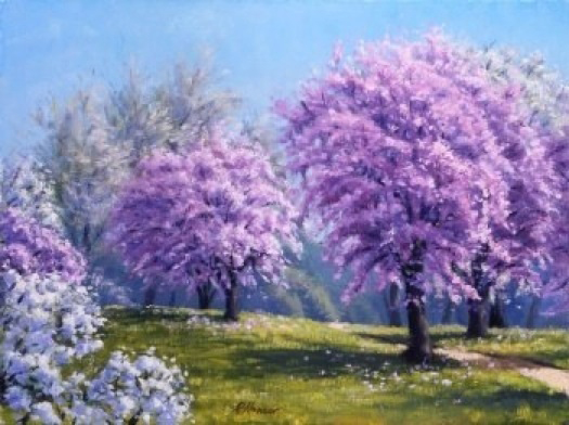
I start spring painting apple blossoms and plum blossoms. As the gardens come into bloom, I start painting them.  My favorite time of day to paint is in the early morning hours.  I paint with an open box M on either gessoed masonite or linen and canvas glued on wooden panels in sizes from 8″x10″ to 12″x16″.  I paint alla prima on my garden scenes, so I don’t want the canvas size too large.  I am trying to keep the painting vibrant and fresh with color where the only thing missing is the smell of spring! – Rick

Fourth Anniversary by Hans Guerin -16X12 - www.hansguerin.com

Fourth Anniversary by Hans Guerin -16X12 – http://www.hansguerin.com

HANS GUERIN

The themes for the fourth wedding anniversary are flowers and fruit. My gift for my Artist wife, Beth de Loiselle, on our fourth was this painting of Parrot tulips (her favorite) and strawberries.  I included 5 of both to symbolize the year to come.  The circular composition is designed to hold the eye with all lines converging toward the center.  As a fun detail element I included ladybugs to reference Ann Didusch Schuler, our mentor, and Beth’s inspiration for becoming a floral artist; she included insects into her still-lives to give something to find after the first impression. -Hans

Violet Edge by Ginny Lasco www.ginnylasco.com

Violet Edge by Ginny Lasco http://www.ginnylasco.com

GINNY LASCO

My floral trilogy is a distinct reflection of my emotions at the time each is put to canvas. Violet Edge was painted after losing my Mother to cancer. Another of my paintings, Crimson Dew, was a result of hurt and anger I was feeling from a particularly trying time.
My latest “work-in-progress” is a reflection of my faith in God….and perseverance – making it through life’s inevitable storms and coming out much stronger and happier on the other side. – Ginny

Tulips/Pewter Mug by Larry Preston -www.larrypreston.com

Tulips/Pewter Mug by Larry Preston – http://www.larrypreston.com

LARRY PRESTON

After setting up and photographing the still life I have chosen, I sketch from life and from my photos directly on the gesso board using charcoal and/or graphite.  Once I am satisfied with the sketch, I underpaint with a combination of turpentine and burnt sienna.  Once the underpainting is completed, I begin adding multiple layers of color slowly reducing the amount of turpentine and adding more linseed oil in each layer.  I paint many layers—usually between ten and twenty glazes until I am satisfied with my result. — Larry

Golden Beauties by Joyce Lazzara - www.joycelazzaraart.com

Golden Beauties by Joyce Lazzara – http://www.joycelazzaraart.com

JOYCE LAZZARA

“The Hibiscus plant is believed to be native to China and most of the varieties grown in Florida are probably hybrids. Its flowers last one to two days maximum and they can be red, orange, yellow, white, lavender, brown or any of these color combinations. “These particular hibiscuses are from my garden in West Florida” – Joyce

Parrot Tulips by Beth de Loiselle - bethdeloiselle.com

Parrot Tulips by Beth de Loiselle – http://www.bethdeloiselle.com

BETH de LOISELLE

Parrot Tulips are one of my favorite varieties of flowers with their bright colors and delicate frayed edges. They symbolize a rite of Spring juxtaposed against a luminous sky with my signature intense colors. The composition ushers out the drear of winter by the dark cloud in the upper right. I placed the bouquet on a formal column for a more contemporary feel. I truly enjoy painting flowers and I enjoy conducting workshops on how to paint them. A one day workshop is available in April – Beth

Spider Lilies by Jeanette Chupack - www.jchupackart.com

Spider Lilies by Jeanette Chupack – http://www.jchupackart.com

JEANETTE CHUPACK

Spider lilies are often seen blooming on our Florida Rivers, but these were beautifully highlighted by a shaft of light.  When I painted them I worked in layers from a dark background to the bright white of the flower itself.  Working in acrylics made the process easier because the layers dry quickly.  The bright white took several layers to achieve the light effect I wanted. – Jeanette

Dahlias by Katherine Bleser - atlantaartgallery.com/bleser.html

Dahlias by Katherine Bleser – atlantaartgallery.com/ bleser.html

KATHERINE BLESSER

This painting shows a bouquet of Dahlias I saw at the flower market in Rome, Italy.  I was intrigued by the variety of shapes and colors of the flowers. Dahlias are native of Mexico and Central America and they were introduced to Europe in 1789. They can be red, purple, lilac or yellow. — Katherine
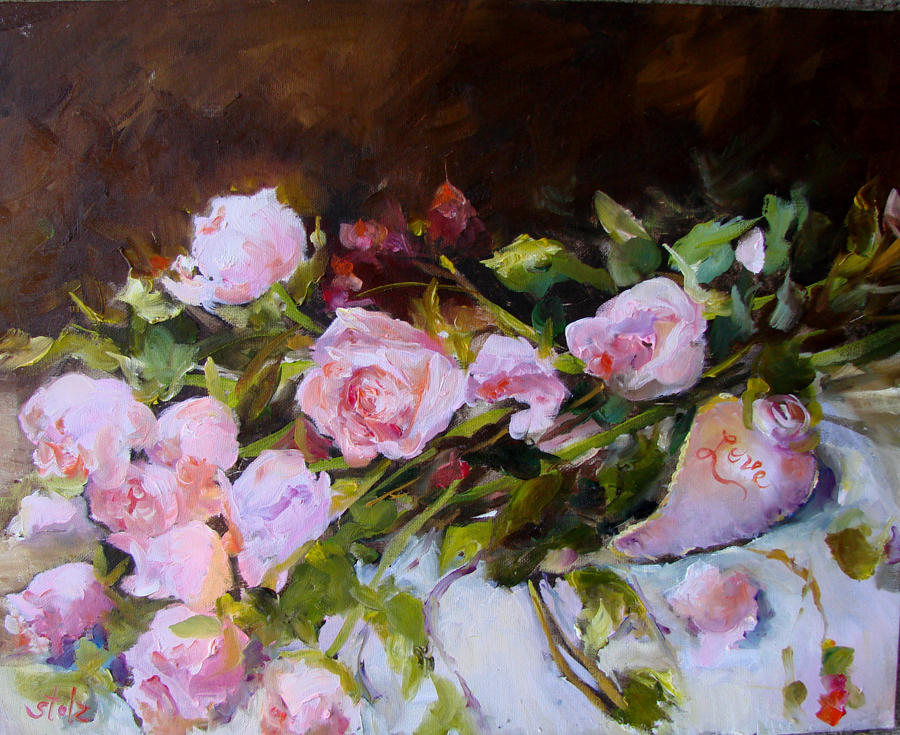
Celebration Series by Diane Stolz - www.dianestolz.com

Celebration Series by Diane Stolz – http://www.dianestolz.com

DIANE STOLZ

With such a harsh winter this year, I have been in the floral department of the grocery store where I have seen gorgeous roses …especially for Valentine’s Day… and I couldn’t resist the ‘pinks’ and/or ‘golden’ roses! The winter beauty and the snow are lovely, but I need those floral to keep me going. As a painter of flowers, trips to the floral shop through the winter become a necessity. — Diane

Garden Roses by Inna Cherneykina - www.inna-art.net

Garden Roses by Inna Cherneykina – http://www.inna-art.net

INNA CHERNEYKINA

Most of the time, I use Alla Prima technique for my Still Life artwork. I feel that the “direct painting” method or as the French call it ‘au premier coup’ (at first stroke) allows me to capture the essence of flowers. Working in one sitting helps me paint the floral still life more energetic and loose. I usually get inspiration by going to flower markets or looking at my favorite art books, and when an idea for a new still life comes to mind, I set it up in my studio and do several tonal sketches for composition and value studies. After the composition is laid out, it takes several hours from start to finish. Half way through it, I usually take a break, go away, and come back with a fresh eye. It helps me to refine the composition and to add the necessary details to make a finished painting. — Inna
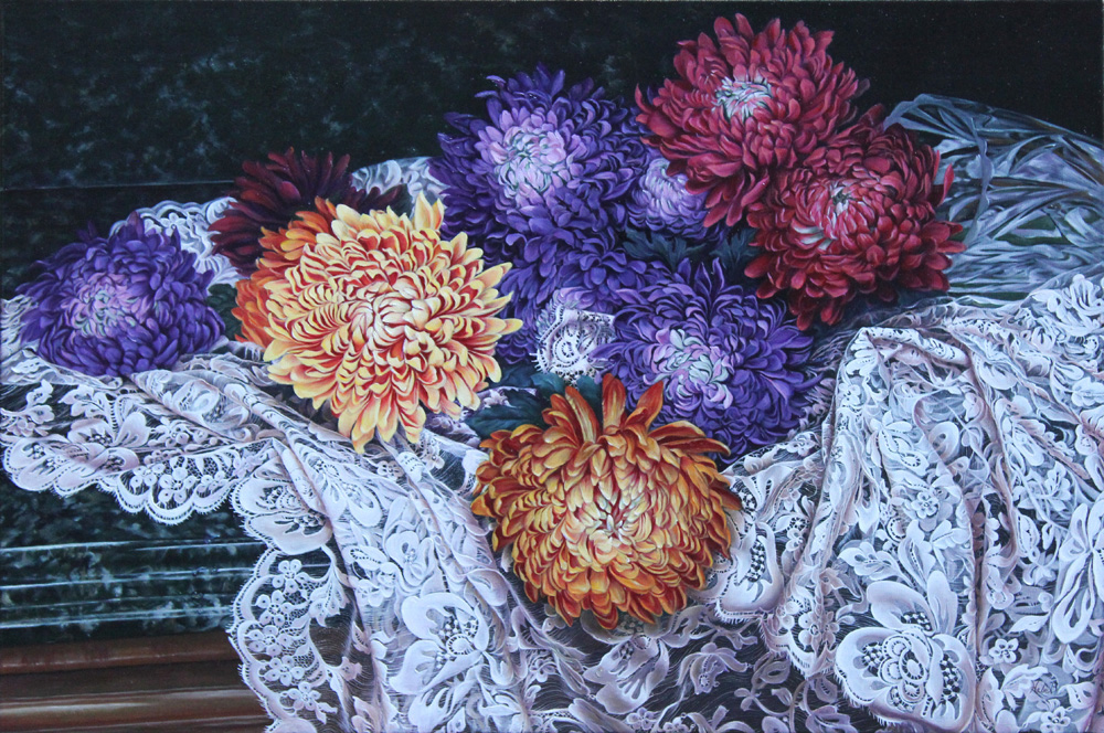
Spilled Dreams by Hebe Brooks www.artbyhebe.com

Spilled Dreams by Hebe Brooks http://www.artbyhebe.com

HEBE-BROOKS

Chrysanthemums originated in East Asia and nowadays there are countless varieties of all sizes and colors. Yellow, pink, orange, deep purple or a combination of colors help to make these flowers a desirable painting subject. The lace with the twists and folds is a common element in my paintings and the folds represent the turns and changes each of us faces in life. – Hebe

Morning Bouquet by Julie Gilbert Pollard - www.juliegilbertpollard.com

Morning Bouquet by Julie Gilbert Pollard – http://www.juliegilbertpollard.com

JULIE GILBERT POLLARD

This rustic and exquisite stone wall and flower garden, constructed by a friend, is brilliant for a painting subject. I added the morning sun streaming through to accent the dazzling yellow flowers. Although I normally use acrylic as an adjunct to oil and watercolor, for this painting I decided it would be acrylic all the way. I find working in different mediums to be a wonderful discipline and since challenging, it keeps me from getting as tight as I might otherwise! –Julie
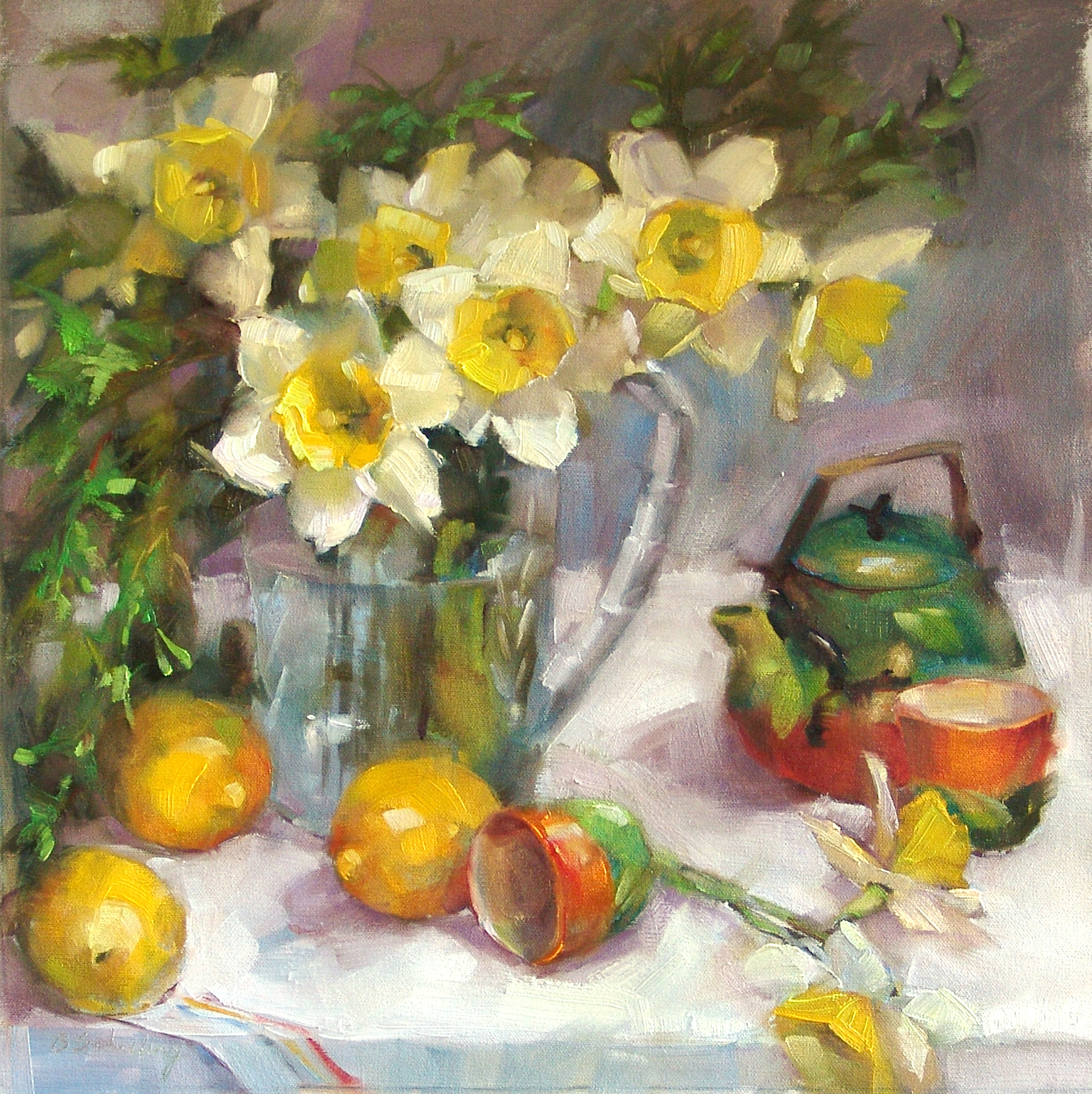
Daffodils at Tea by Barbara Schilling - www.barbaraschilling.com

Daffodils at Tea by Barbara Schilling – http://www.barbaraschilling.com

BARBARA SCHILLING

It has been a particularly long, hard winter in many parts of the country but certainly here in my home state of Michigan!  Spring has always been my favorite time of year and this year it will be even more welcome than usual!  I love Daffodils because they are, like Robins, a true symbol of Spring.  Little globes of sunshine sometimes peeking through the snow!  It seems to me that the loose and energetic style of Alla Prima is the perfect energy for a painting about Spring.  The transitions between the thick and thin layers, the lost and found edges…seem almost like a metaphor for Spring itself! — Barbara
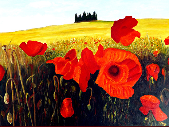
Poppies Under the Tuscan Sun by JoeRay Kelley - www.joesfineart.com

Poppies Under the Tuscan Sun by JoeRay Kelley – http://www.joesfineart.com

JOE RAY KELLEY

I love Tuscany. The landscape is an artists’ mecca! The colors change with the sun angel and the landscape varies with color, shades, and elevations. Spending a few weeks in the Florence and the Tuscany area provided time to travel and marvel at the beauty. Photographs can never really capture the true visual beauty.”Poppies Under the Tuscan Sun” was painted from photographs taken in the region in 2013. I sketch the outline on canvas, paint mostly with acrylic and detail with water-mixable oil to improve shading and texture.

Salamanca by Timothy Jones - www.timothyjonesfineart.com

Salamanca by Timothy Jones – http://www.timothyjonesfineart.com

TIMOTHY JONES

Flowers add softness and beauty to any subject; in this case, they might even add mystery.  The sharp edge of the blade juxtaposed next to the petals speaks of opposites. Salamanca, the name of the painting, also adds to the story. It is a city in Spain conquered by Hannibal in 220 b.c., it was captured by Moors in the 8th century and held by them until the late 11th century. Notice the small ant under the blade!
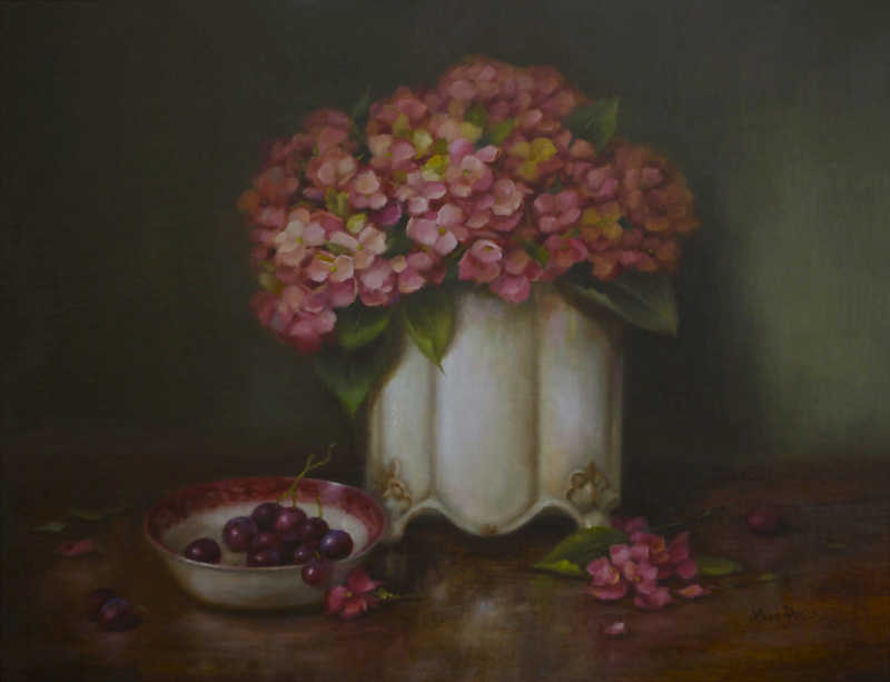
Spring Hydrangea by Lisa Price - www.lisapricefineart.com

Spring Hydrangea by Lisa Price – http://www.lisapricefineart.com

LISA PRICE

We love our hydrangeas in the south!  Once the warm weather returns, nothing signifies the arrival of spring like this beautiful multi-faceted flower that adorns gardens, dinner tables and mantles all over Dixie. With the varieties and colors available, the hydrangea provides the artist with many inspirational and compositional possibilities.  The hydrangea screams winter’s end, which is why I love this subject.  I’m ready for spring! – Lisa

Calla Lilly by Sarah Van Der Helm - www.noaps.org/html/master_artists.html

Calla Lilly by Sarah Van Der Helm – http://www.noaps.org/html/master_artists.html

SARAH VAN DER HELM

Sarah is an accomplished painter and one of NOAPS Master Artists. Only eight artists have accomplished the Master designation since 1991. A Calla Lily is a flower tied to magnificence and beauty. We thought it appropriate to finish our Spring display with this flower breaking through to show its exquisiteness. — NOAPS
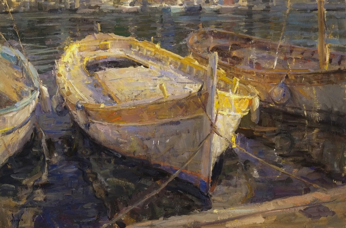
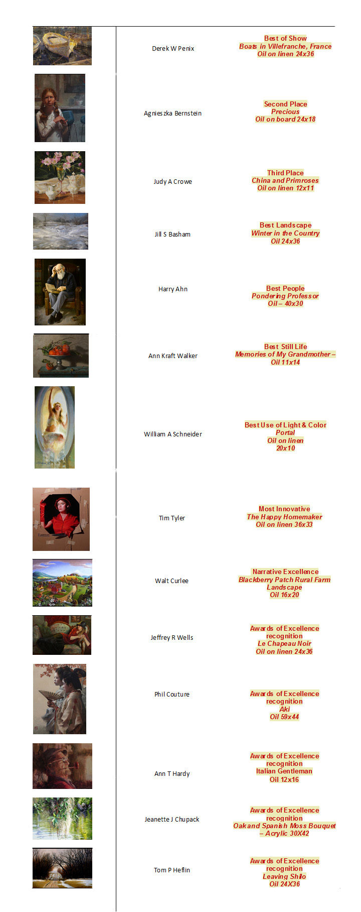
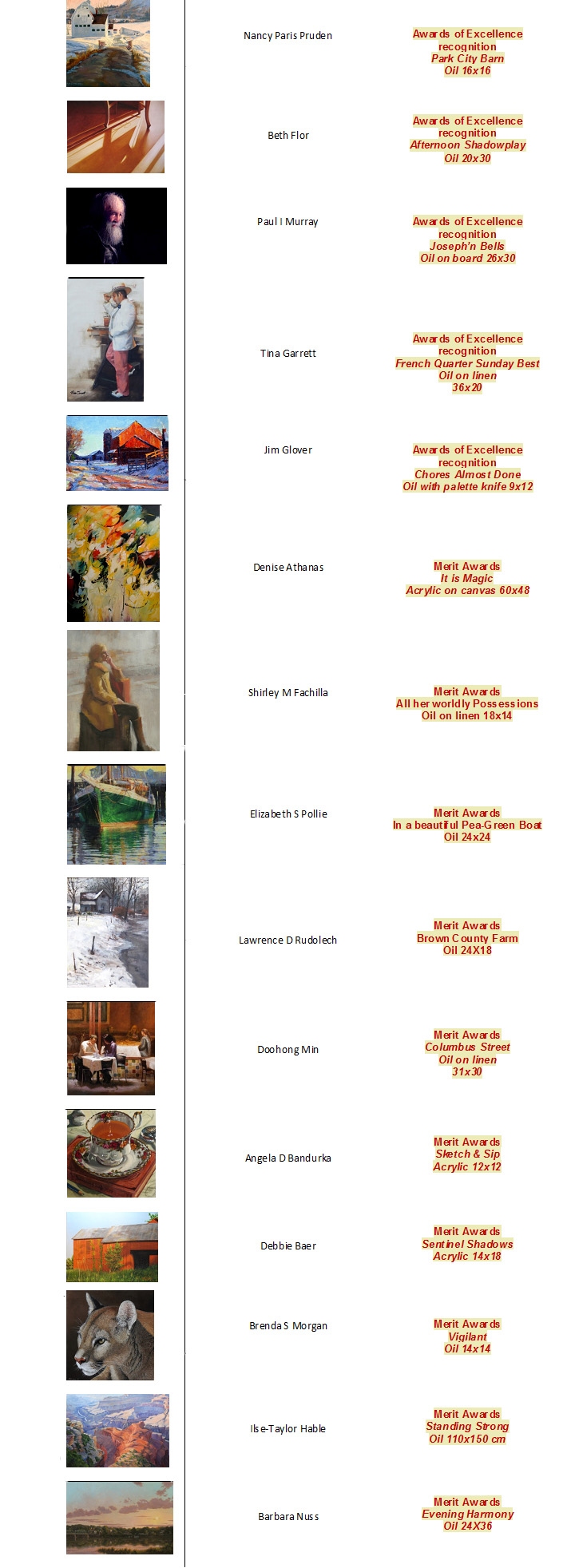
Posted in Uncategorized | 1 Comment

Secrets to Gorgeous Landscapes Revealed!

Secrets to Gorgeous Landscapes Revealed!.

Posted in Uncategorized | Leave a comment

Secrets to Gorgeous Landscapes Revealed!

Brighton Dam Azalea Gardens is one of my favorite places to paint in the spring.  These azaleas have been there for years and in the latter part of April and the first part of May the blooms are magnificent.  I try to go there every year .The gardens are adjacent to a reservoir which adds color and counterpoint to the many-colored flowers.

This is a recent plein air sketch and I thought it would blow up nicely into a larger painting.  The frustrating thing about painting azaleas (and perhaps most flowers) is that the tube colors will never match the vibrancy and intensity of the real colors.  I am going to make it a 24 x 30.  This sketch is 11 x 14.

Azalea Park, Step 2 – Photos from Brighton Dam Azalea Garden

These are three of the photos I took that day.  You can see how I took liberties with the scene, especially showing more of the water than I could really see.  I also accentuated the light on the path and the way it turned behind the azalea bushes.

The painting will be based on the plein air sketch but I will use these photos as reference information.

Azalea Park, Step 3

Sorry this is hard to see, but it is a gridded enlargement of my plein air sketch onto my 24×30 linen canvas.  With plastic wrap taped over my sketch, I ruled a grid of squares with a pen and drew a corresponding larger grid on my canvas with soft vine charcoal.

Then following the sketch, I enlarged it square by square, carefully wiping off the charcoal as I went along.

Even though this sounds like an extremely elementary step, I find that I must do it to retain the accuracy and feeling that I had in the initial sketch. It definitely increases my comfort level.

Azalea Park, Step 4

For the underpainting, I combined burnt sienna and ultramarine blue to make a dark, warm tone.  Then I carefully followed the charcoal lines, wiping them off with a rag as I proceeded.  I used a medium of Liquin and OMS (odorless mineral spirits) in a proportion of about 1:1.

For the lighter areas, I used more medium to thin the paint.  I paid careful attention to the light and shadow patterns so I could begin to get a sense of the sunlight on the azaleas and the path.

Working from back to front and top to bottom, I painted the sky, the far trees, and the water.  I used cool colors introducing some pinks here and there for the atmospheric perspective.

My limited palette consists Naples yellow dark, cadmium yellow light, cadmium orange, cadmium red light, permanent madder deep ( a more permanent color than alizarin crimson), burnt sienna, ultramarine blue, thalo blue, thalo green, and ivory black.

So I used a lot of thalo blue and thalo green.  I have learned to be judicious with these powerful colors, but they have a wonderful tinting strength.  Many times I dilute the thalo colors with pinks and reds.

Azalea Park, Step 6

Here I have completed the color underpainting.  I have roughed in the values and a variety of colors in the garden and on the path. I am following the plein air sketch fairly faithfully.

I have to stand back at least twenty feet and then squint to see the color and value masses clearly.  This is how I see what needs to be done.  For instance there are too many azalea bushes the same color and there is a stripe of pink ones on the right which looks dumb.  I like the little spots of red ones, but right now they stand out too much.

Azalea Park, Step 7

Working back to front, I have refined the background mass of trees, trying to keep the edges soft so they don’t attract too much attention. I want them kind of blurry since they are not the center of interest.

The reflections in the water suggest that there is some movement in the river.  The river would reflect the entire mass of trees if the water were calm.  I’ll add a few ripples later.

I  have also put in some foliage on the large park trees, letting my brush dance to shape the leaves.  I always enjoy doing that since it is lively and animated.  I think it makes the leaves look more alive.

This part is really fun, as I enjoy painting these beautiful flowers and making them look like azaleas.  There are areas of the shrubs that need to be massed but the branches go every which way.  I have found that it is important to make some areas ditzy or they won’t look like azaleas.
I enjoyed making the subtle color and value changes so you could differentiate one bush from another.  The foreground bush on the right was the most difficult to paint convincingly.  You can see from the photos what the bush really looked like.  All these foreground bushes had lots of branches and dead leaves showing, and I didn’t want that.  Fortunately, among all my reference photos, I have some shots of azalea bushes where the blooms go all the way to the ground.

I refined the shadows and colors on the path and added some “dirt” and weeds to the grassy areas. I also added some light areas to the tree trunks where the sunlight was hitting them.

Azalea Park, Step 9

This final step is where I start to tweak areas that bother me. Mainly I look at shapes and where my eye goes. I’ll walk away from the painting and come back and take a look. If my eye goes to a place that I don’t want it to go, then I know that’s a problem area.
One of the major things I did was make a more definitive light and shadow pattern on the light side of the trees where leaves were casting a shadow  I made them a little more distinctive.  I also lightened the light areas of the path which help make it sparkle more.
I added some pink above the background trees to add atmosphere and color in the sky.  I felt that some pink there would help move the colors around the painting.

This is the finished painting and the most difficult part was coming up with a title.  I have painted so many azalea paintings that I have nearly run out of ideas.  I settled on “Favorite Azaleas” as this is my favorite area to paint the flowers.

About Barbara Nuss

Barbara paints landscapes directly from nature and still lifes from studio arrangements.  She learned the nuances of color and light on every imaginable subject from the rolling hills of the countryside to the delicate petals on a peony. She shares her landscape painting skills through area plein air workshops. Barbara is also the author of the book Secrets to Composition, 14 Formulas for Painting Fabulous Landscapes and a 2 hour DVD where she completes her painting Tranquility.
For more information about Barbara Nuss: http://www.barbaranuss.com
Posted in General, NOAPS Signature Artists | Tagged , , , , , , | Leave a comment