Acceptance: the state of being accepted or acceptable, favorable reception; approval; belief.
Rejection: the refusal to accept or to discard as unsatisfactory.
We all would prefer Acceptance!
We must remember that rejection is not meant as a personal insult, but it is darn hard not to experience it as such. We must remember that what might be rejected in one show could be a winner in another. Maybe it didn’t fit into the niche of the show. Did you follow all of the prospectus rules? I actually did a sloppy job of submission and didn’t get into a Regional Show and later, I won “Best Landscape” in a National Show with the same painting. Keep on submitting, if you truly believe in the painting.
How do you live with the fear of rejection? It can be a self-fulfilling prophecy if you don’t take any action, meaning submission of work, because you are fulfilling the prophecy. It might even mean you want to be proved right, even if it is a bad outcome. “I told you I wouldn’t get in!” Start looking for the signs of what is working for you, instead of signs of what isn’t.

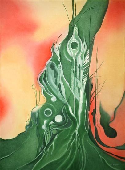
Samovar and Reflective Cup by Ann Hardy
Use the rejection to do some honest reflection and critique of painting. Being more confident in life means being less sure that you know what is going to happen, so you can relax and allow the possibility of both bad and good outcomes. Confidence will allow a more enjoyable life. At some point in life as an artist (and every other venture) a person has to come to terms with rejection. Your best bet is to paint what excites and moves you. In other words “stay true to yourself”. Give your best!
Rejection comes and goes. So does Acceptance!
ABOUT ANN
Ann Hardy is a NOAPS Signature Member as well as a Signature Member of several other organizations such as OPA, Texas & Neighbors, and Outdoor Painters Society. In her successful art career she has received acceptance and rejection into many art competitions. Her words of wisdom come from her extensive experience.
.
SOME TIPS REGARDING SUBMISSIONS TO AN ART COMPETITION:
Here are some common mistakes made in entries to art competitions that will result in lower judge scores or total disqualification.
- · Follow size specification. If the size is specified (EX Maximum: 30 X 40” = 1200 square inches) and the artwork entered is 32×40, your art will be disqualified regardless of beauty and mastery.
- · Complete all required fields in the entry: If all the art entered is for sale and the work entered does not include a sale price, the size, the title, or any other mandatory information, most likely your work will be disqualified and or rejected without even being scored.
- · Quality of the picture: If the picture of the painting is blurry or out of focus, it will have a tremendous impact on the score. Artists are concerned with copyrighted issues and often submit pictures with lesser pixels than required. That lesser amount of pixels does not project details or the quality of the painting and will result in a lower score when competing with hundreds of other entries.
- · Frames and walls: Pictures of the artwork showing the frame do not perform well. Do not include the frame or anything else around the picture of the painting. It is even worse if the entry shows the picture hanging on a wall or in another show. That practically guarantees a low score since it is difficult to judge the work
- · Artwork entered in previous exhibition: It is customary not to enter artwork in a competition that has been previously submitted and accepted in a previous competition for that same organization.
- · Select your best work: This is obvious but often overlooked by both well known artists and/or beginners and don’t forget to actually submit the entry and receive a confirmation of your transaction.