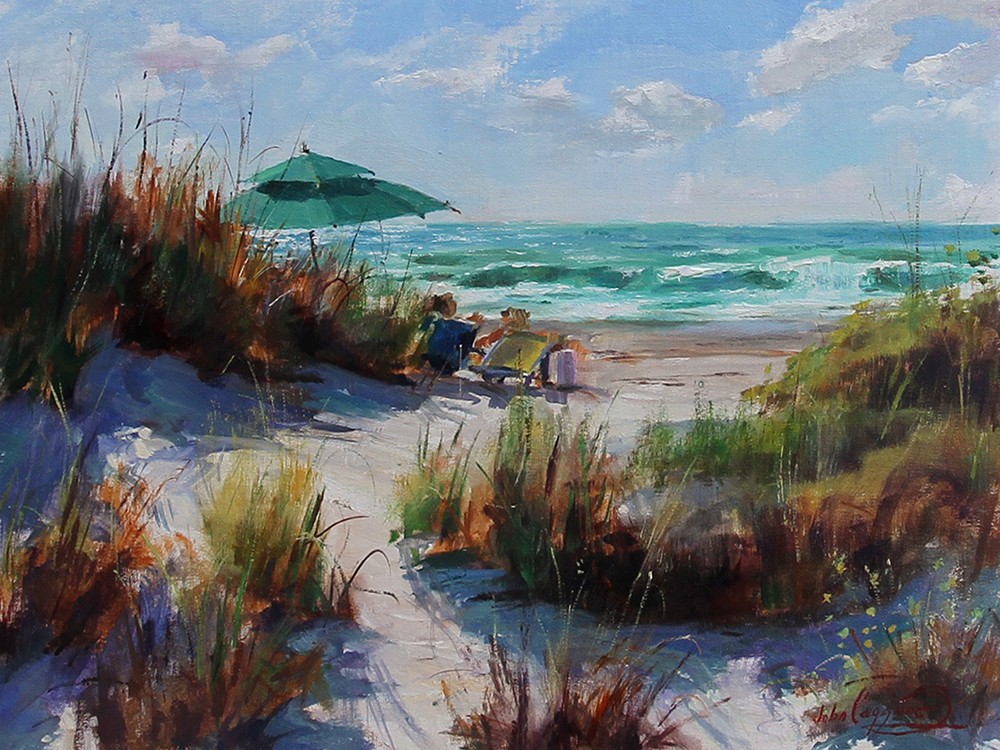
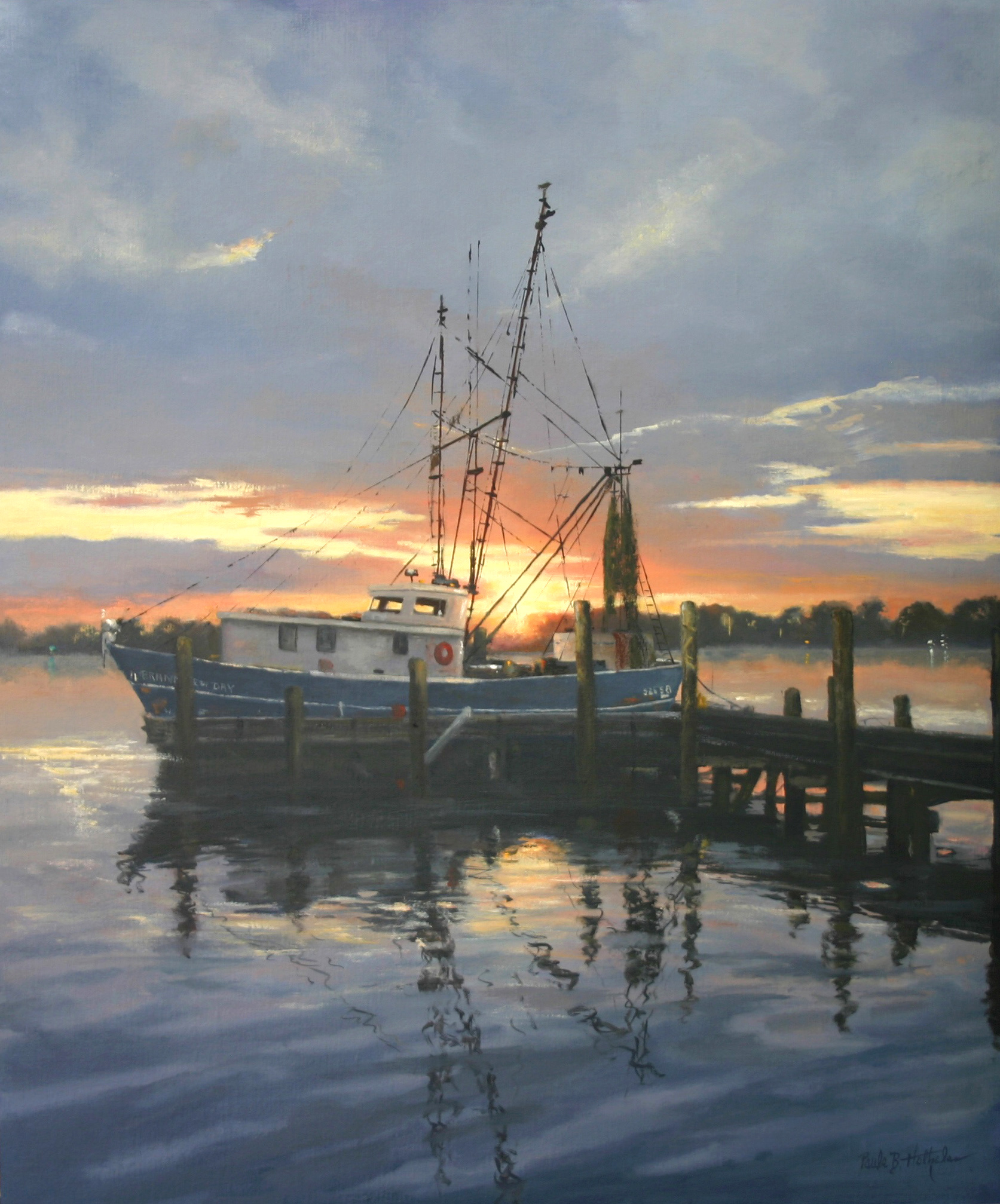
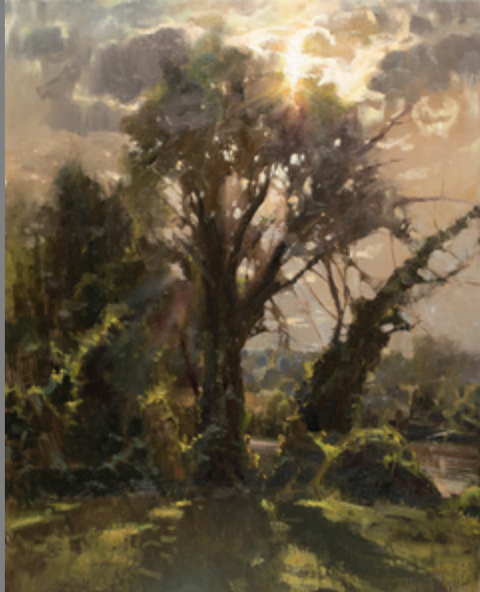
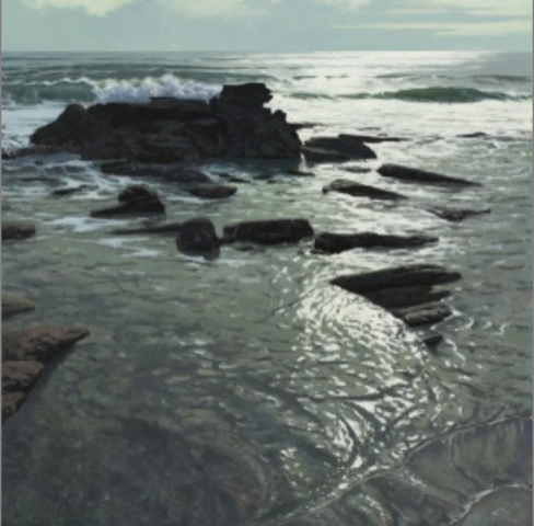
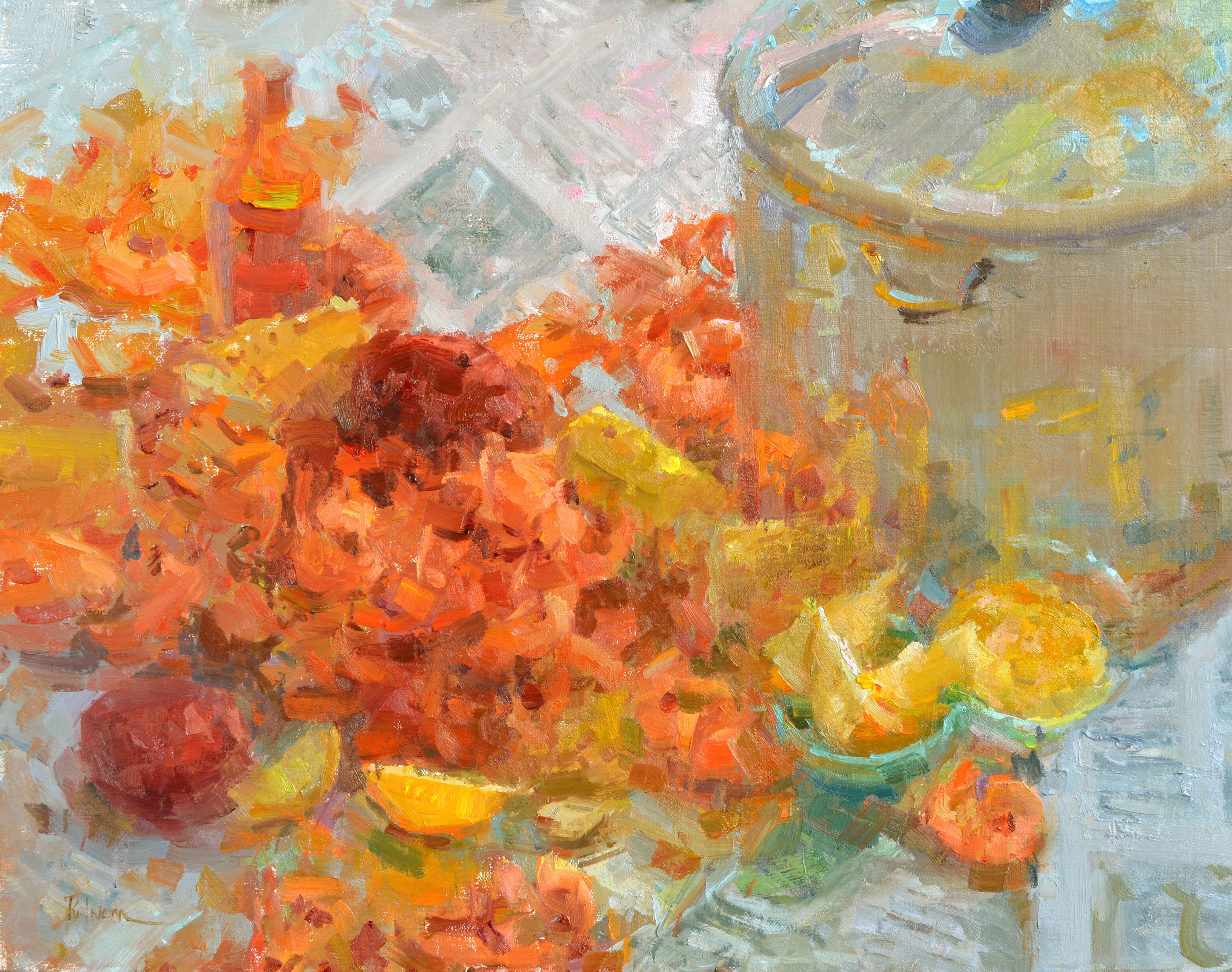
Linda Dunbar: The Search for Excellence

NOAPS Dunbarr Ricco of Black Wall Street 36x24 Oil RS Hanna  
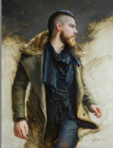
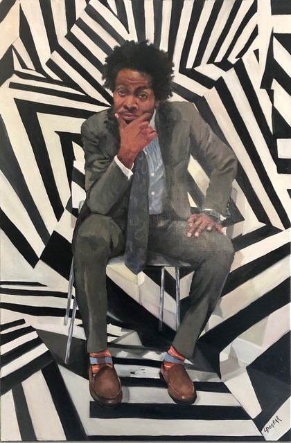
“Ricco of Black Wall Street”, 36×24, Oil, RS Hanna Gallery, Fredericksburg, Texas.  Winner of ‘Best People’ in the 2020 NOAPS Spring Online International Exhibition

The very best portrait paintings always have a story to tell.  In Linda Dunbar’s painting of Ricco, the story of the model is evident in his facial expression and gesture.  The background adds to the story with not only the colors but the repeated angles of the sitter and the hard edges.  The active background and position of the model are uniquely contemporary, and add to the complexity of the painting.

NOAPS Dunbar the Young Artist 48x36 acrylic CA  
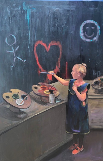
“The Young Artist”, 48×36, Acrylic, Collection of the Artist.

Linda Dunbar always had a penchant for art, but it was not until later in life that resources allowed her to pursue it full time.  Her search for knowledge led her to many workshops, including local artist Ross Myers, and later well-known artists including Derek Penix, David Leffel, Sherrie McGraw, Rose Frantzen, Jeff Legg, Kelli Folsom, Lori Putnam, Daniel Keyes and many others.  Her main goal is her search for excellence in her paintings, no matter the subject.  She is inspired by artists such Sorolla, Fechin, Zorn and Sargent, along with contemporary artists such as Richard Schmid and Quang Ho.

NOAPS Dunbar Smoke Em if You'be Got Em 36x36 Oil PC  
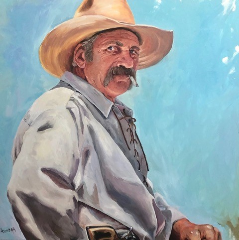
“Smoke Em if You’ve Got Em”, 36×36, Oil, Private Collection

Dunbar works mainly in oils, but also acrylics and watercolors.  the portrait and figure are her main genre, but she will venture into other genres for a diversion, most recently in abstracts.

Linda is currently focusing on a double primary palette, consisting of different versions of warm and cool colors.  She prefers Rosemary brushes, and uses a variety of oil paint brands.  The support she most favors is Centurion Linen.

The painting process for Dunbar begins with careful planning, thinking through the goal of the painting and the process and skills required to express it.  Although she prefers to paint the models from life, this is not always feasible, and works most of the time from photos on a tablet.  The tablet allows her to hone in on details of the models, a useful tool for today’s artists.

NOAPS Dunbar In Progress 36x36 Oil  
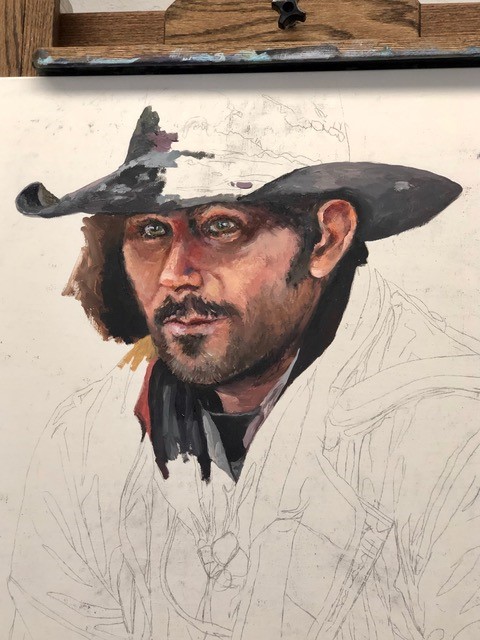
Unnamed Work in Progress, 36×36, Oil

Continuous learning is a constant for Linda; she takes time to study art through reading, visiting galleries and museums, and by just observing her environment.  Her advice to readers is to value that constant learning process, as she states, “there is no end to learning or improving and for that we all are grateful.”  Linda has also found great learning through teaching, and finds inspiration in helping others succeed.

For Dunbar, winning the NOAPS Award was a boon to her confidence; the validation for years of hard work and attained skill.  But her learning is not over; she encourages all artists to regard themselves as never beyond learning.  And once learned, to share with others that valuable insight and skill so hard-earned.

To view more of Linda’s work, go to www.LindaDunbar.com.

To view the 2020 NOAPS Spring Online International Exhibition, go to www.noaps.org


Posted in Uncategorized | Leave a comment

Cathy Pitts: Mixing Realism and the Abstract

NOAPS Pitts Light Tapestry, oil on belgian linen on board, 47x57 inches, private collection

“Light Tapestry”, 47×57, Oil on Belgian Linen on Board, Private Collection.  Winner of Most Innovative from the 2020 NOAPS Spring Online International Exhibition.  Contact the artist at cathypittsart@aol.com.

The swirling shapes of light and dark dance throughout the painting and immediately send our eyes moving.  As we investigate, we see the repetition of the image, with the division of space that beats at a pace we can literally match to a heartbeat.  The artist has revealed her technical skill, but also the ability to create an interactive painting which engages us at an abstract level.  The result invites the mind to inquire, over and over.

NOAPS Pitts Magenta Sunset, oil on canvas, 48x72 inches, collection of the artist  
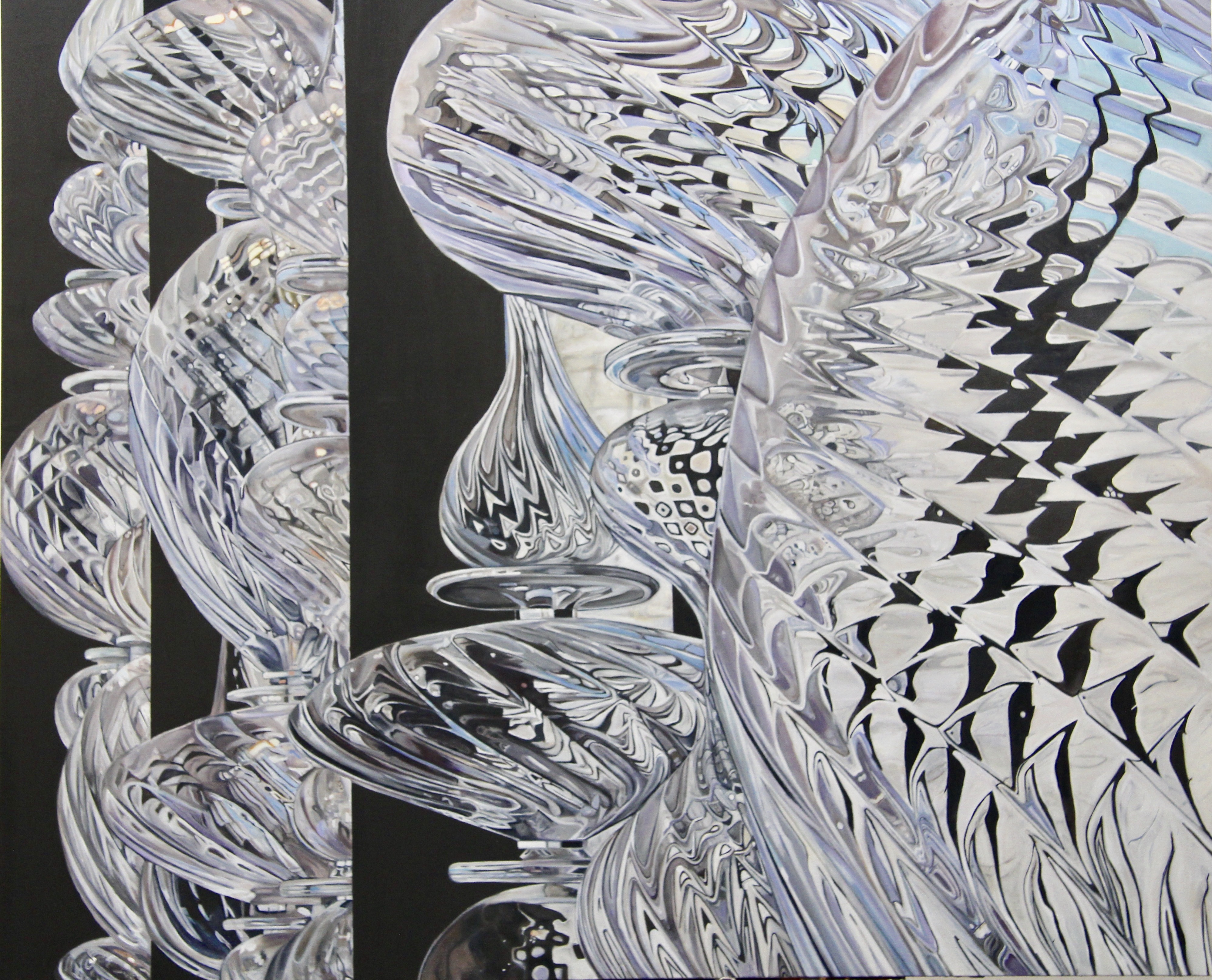
“Magenta Sunset”, Oil on Canvas, 48×72, Collection of the Artist

Cathy Pitts would describe herself as a Contemporary Artist, mixing representational images with the abstract.  She was educated at UCLA, graduating with a BFA in theater and set design.  This training led her to the visual arts, with a unique vision for conceptual work.  She worked designing sets for the Palm Springs Dance Company, then began a dedicated study and career in fine art.  She attended classes and workshops, and found a mentor in Kwok Wai Lau, from whom she has gained much insight over the course of 20 years.

NOAPS Pitts Her Majesty, oil on canvas, 48x72 inches, private collection  
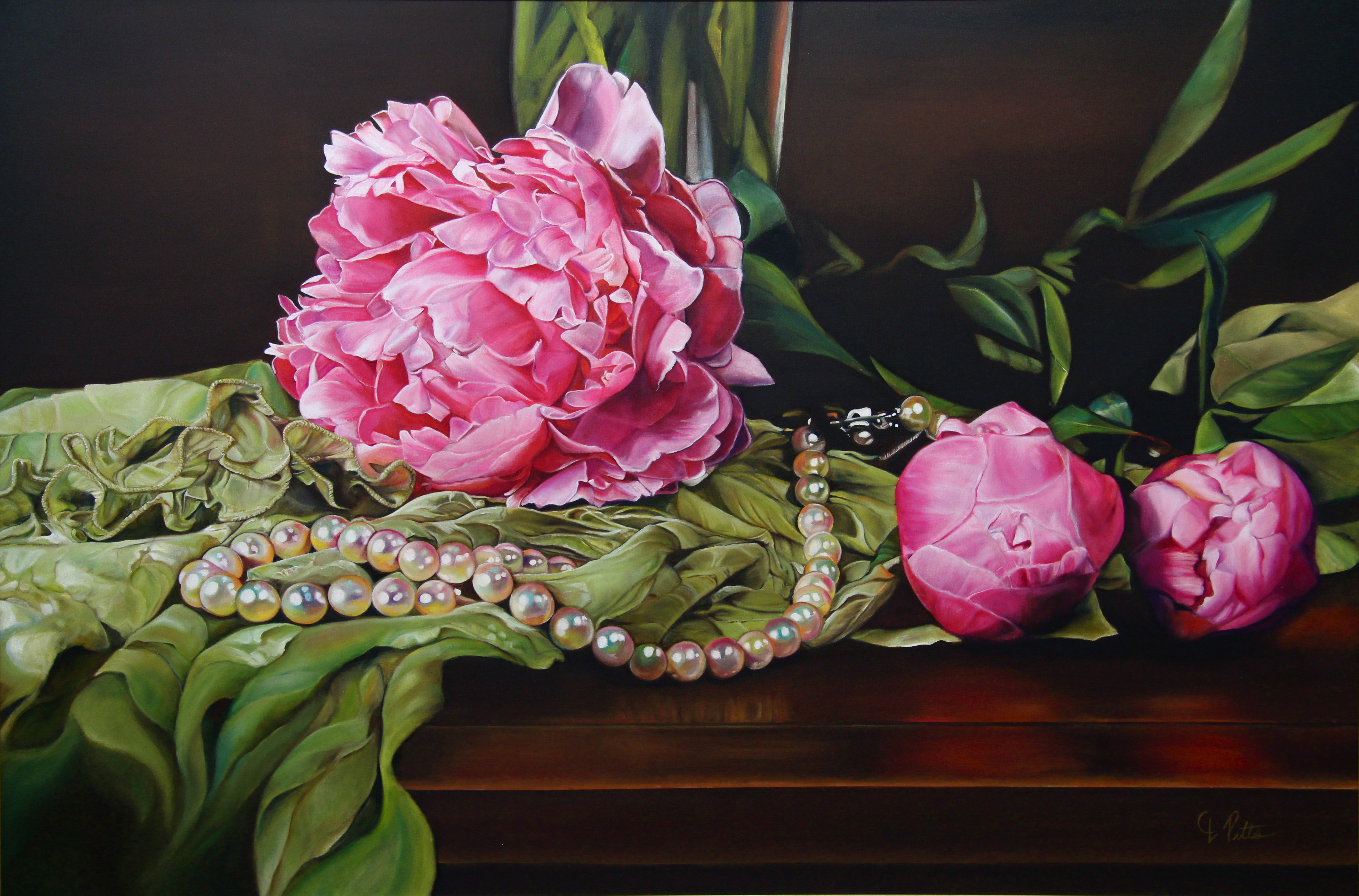
“Her Majesty”, Oil on Canvas, 48×72, Private Collection

Pitts finds her inspiration from many sources ranging from random streams of visual thought to the real life objects around her.  “Light and movement are the central themes of my work, as it represent life and hope.”  In her painting “Light Tapestry” she challenged herself to take an image, remove the color, repeat the image, all in many layers of paint and patience, to create a “vibration, or dance of the shimmering light throughout the glass landscape.”

NOAPS Pitts East Meets West-Chi Fusion Series, oil on canvas, 48x72 inches, collection of the artist  
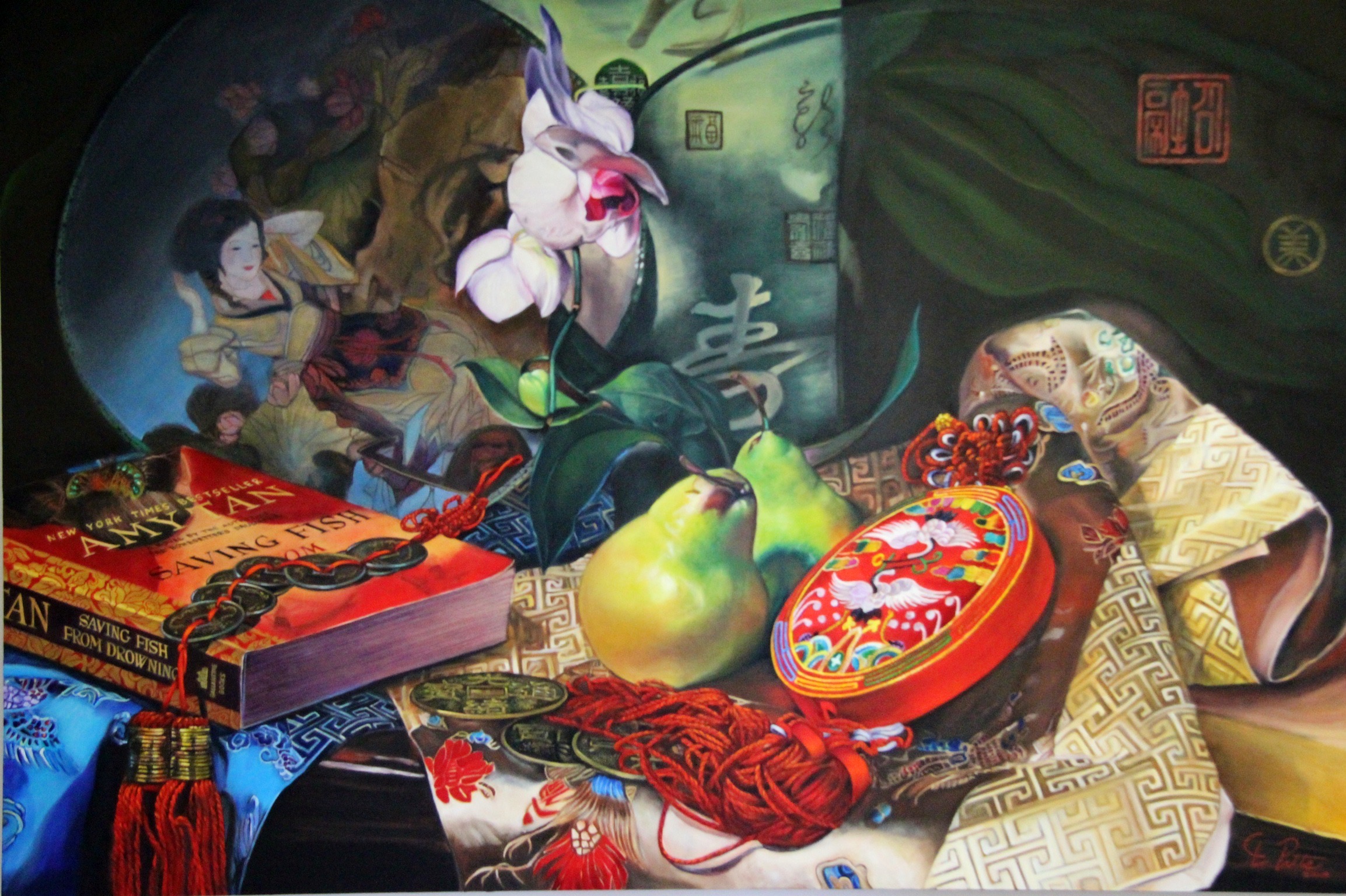
“East Meets West: Chi Fusion Series”, Oil on Canvas, 48×72, Collection of the Artist

Her work is not limited to one genre or medium, revealing versatility in her choice of subject matter and materials.  She also works in photography and mixed media, incorporating metals, acrylic, wood and neon.

Cathy Pitts is a disciplined artist; she works at her passion 7 days a week in the studio for eight or more hours.  She works from both photos and life, while planning her compositions with much deliberation.  The paintings then take on their own life, as she departs from the photo or still life set-up, and becomes immersed in the painting.  Her palette consists of a variety of colors, chosen for their intensity of pigment.

NOAPS Pitts Brave the New World, oil on canvas, 60x50 inches, collection of the artist  
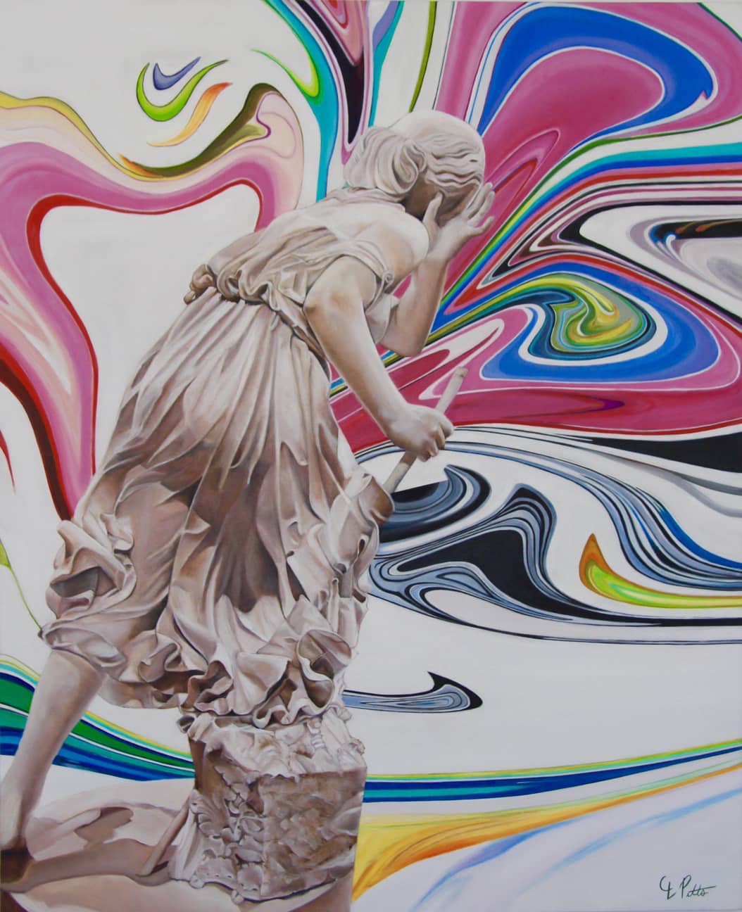
“Brave the New World”, Oil on Canvas, 60×50, Collection of the Artist

This accomplished artist has shown her work internationally, having created paintings for three shows for Art Revolution Taipei.  Sponsored by the New York Contemporary Art Fund, she was selected to represent the US in Taiwan.  Cathy has exhibited in over 40 national and international juried exhibitions, has won numerous awards, and has been published in many publications.  Her work is widely collected in the United States and abroad.

Cathy Pitts is a self-represented artist; to see more of her work visit  www.cathypittsart.com.

To view the 2020 NOAPS Spring Online International, go to www.noaps.org.

Written by Patricia Tribastone, NOAPS President and Blog Director

Posted in Uncategorized | Leave a comment

Lori Putnam: In Pursuit of Light

NOAPS Putnam Sicilian Roots

“Sicilian Roots”, 20×24, Oil.  Winner of Best Use of Light and Color in the NOAPS 2020 Spring Online International Exhibition.

It has been said that what makes for a good painting is not what you see, but what it makes you feel.  Without a doubt, this scene by Lori Putnam makes us feel the warmth.  With the sun behind us, we can imagine strolling up to the villa, and pausing to catch a breath.  The artist has given us this sense of warmth by the play of warm and cool colors in various degrees,  carefully placed to give us a moment to rest in the shadows.

NOAPS Putnam Close to home

“Close to Home”, oil on linen panel, 18×24, Illume Gallery of Fine Art

Coming from a career in graphic design, Lori left her own freelance business in 2005 to pursue art full time.  Since then she has studied with many artists, among them Dawn Whitelaw and Quang Ho.  She has traveled extensively for her art, and in 2008 she spent 8 months living and painting in Italy, taking time to fully absorb the lessons of her mentors.   She continues to be inspired by both contemporary artists and artists from the past, such as Scott Christensen, Carolyn Anderson, John Singer-Sargent, Sorolla and Nicolai Fechin.

NOAPS Putnam Safe Harbor

“Safe Harbor”, 30×40, oil on linen panel, Meyer Vogl Gallery

The genre that Putnam paints is not necessarily the point of her work; she is painting light.  She explores the “medium itself, using shapes, rhythm, color, patterns and pieces that weave in and out to create a painting that is, to some degree, representational.”

NOAPS Putnam More Precious than Rubies

“More Precious than Rubies”, oil on mahogany panel, 8×10 LeQuire Gallery

Putnam’s work is mainly in oil, though she also enjoys using gouache for it’s versatility.  She usually works on a panel; either with linen or gesso.  Her brushes are by Rosemary and she mainly uses Gamblin oil paint.  In the studio she tends to work with a variety of colors including: Cadmium Yellow Light, Cadmium Yellow Medium, Indian Yellow, Cadmium Orange, Napthol Red, Brown Pink, Quinacridone Magienta, Dioxazine Purple, Ultramarine Blue, Payne’s Grey, Cobalt Blue, Phthalo Green, Permanent Green Light, Cadmium Green, Warm White, Radiant Blue, Radiant Turquoise, and Titanium White.  En Plein Aire, her palette is minimized to only Cadmium Yellow Light, Napthol Red, Ultramarine Blue, and Titanium White.

NOAPS PUtnam New Dawn

“New Dawn”, 12×19, oil on stretched canvas, 1225 Gallery

Her working process varies, sometimes working out thumbnail sketches, color sketches, and preliminary studies for the final painting.  En Plein Aire her work begins with a thumbnail which denotes light and shadow, from which she stains the canvas.  From there she works from large shapes to small shapes, paying attention to retain the sense of value and color.   At other times, the painting is done more loosely, painting directly from the scene.  She prefers to paint from life, and if a painting does require use of a photo, Lori feels that her life painting experience enables her to do so successfully.

Lori is a well-known instructor, often taking her students as far as New Zealand for plein air painting.  When not teaching out of town, she enjoys her own spacious studio, replete with soaring ceilings and north light.

To work hard and enjoy the work, setting aside the ego, self doubt and fear in order to make room for honest criticism and growth… that is Lori’s best advice for success.

NOAPS Putnam Low Country Boil

“Lowcountry Boil”, oil on linen panel, 16×20, Meyer Vogl Gallery

Putnam’s work is represented by Illume Gallery of Fine Art, St. George, UT; LeQuire Gallery, Nashville, TN; Jack Meier Gallery, Houston, TX; Meyer Vogl Gallery, Charleston, SC; RS Hanna Gallery, Fredericksburg, TX; and 1225 Gallery in Charlotte, TN.  To view more of Lori’s work visit www.loriputnam.com.

To see the NOAPS 2020 Spring Online International Exhibition visit www.noaps.org.

Written by Patricia Tribastone, NOAPS President


Posted in Uncategorized | Leave a comment

Linda Besse

NOAPS Besse Ice Bear

“Ice Bear”, 22×36, Oil, Winner of Best of Show from the NOAPS 2020 Spring Online International Exhibition.   Collection of the Artist.

This engaging scene presents us with a story for the viewer to create…the nearly monochromatic painting presents us with an image that impresses both with detail and weight.  We can feel the weight of the bear, the force of the impending growl, and the icy cool water.  Amid the mass of ice the bear is painted slightly warmer, giving us the impression of life.  The challenge of this painting is expertly met with the artist’s use of values and temperature, creating an immensely successful painting.

NOAPS Besse Shore Leave  
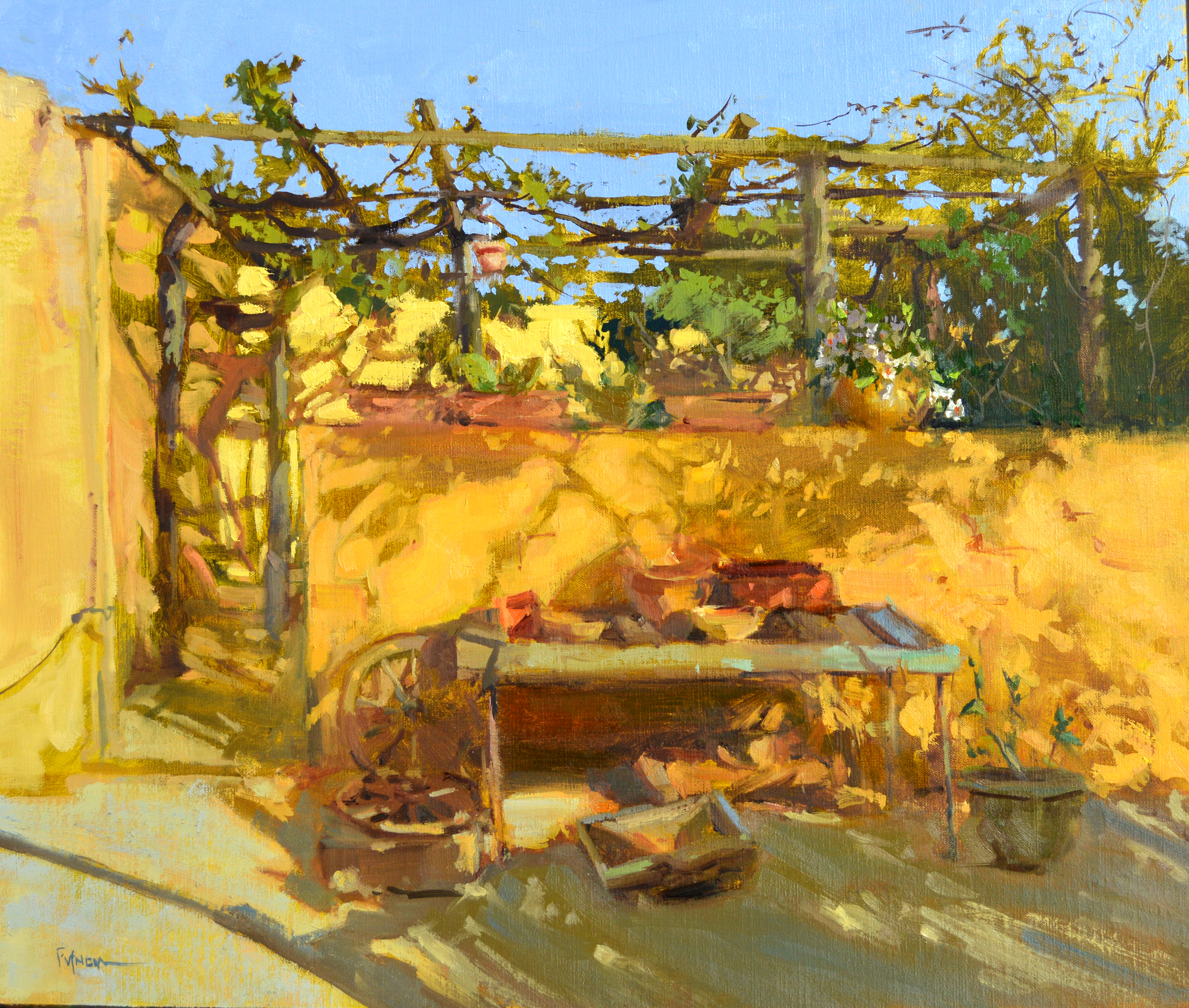
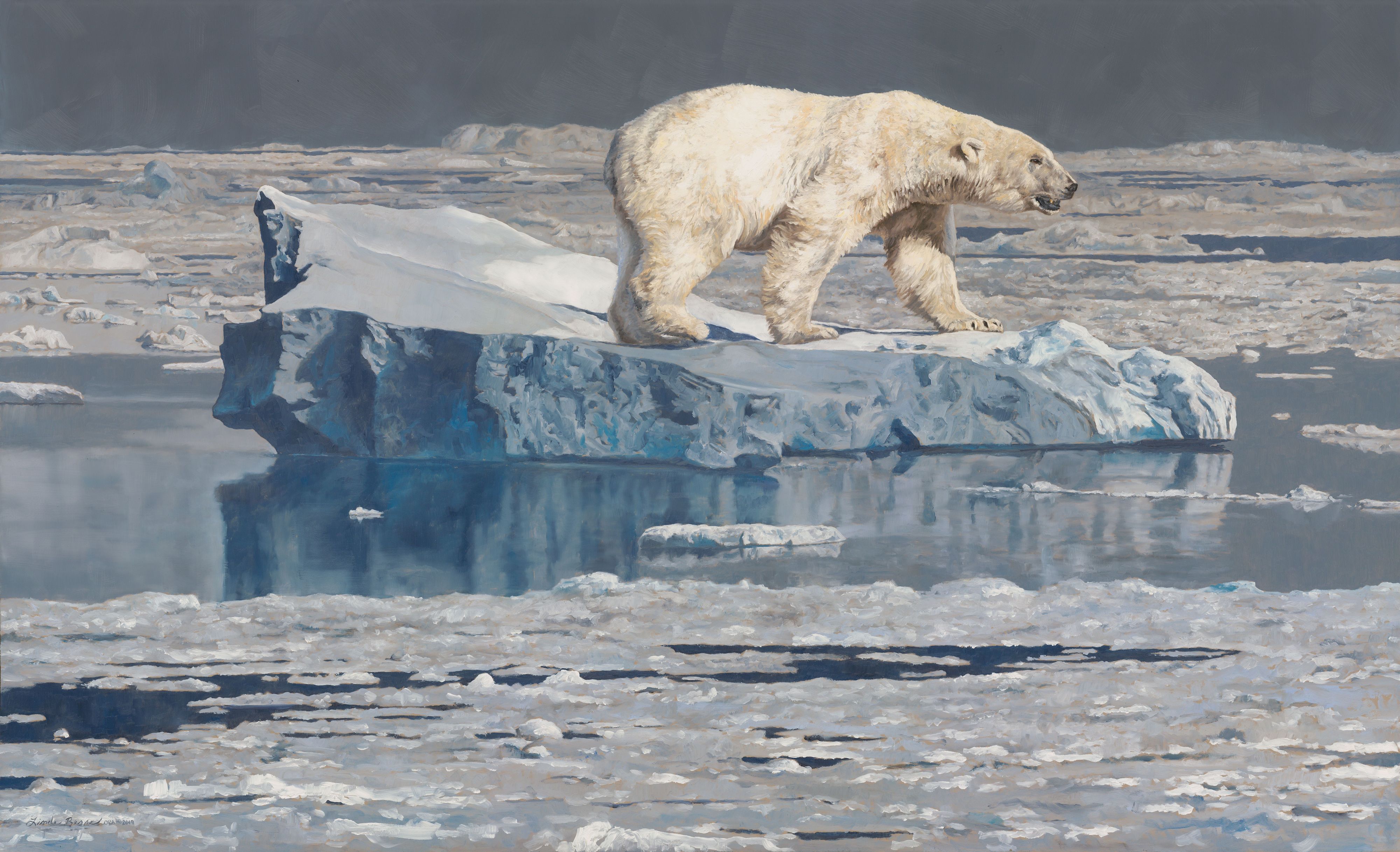
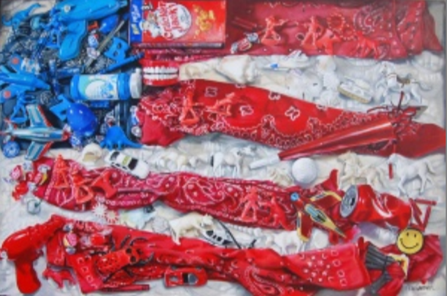
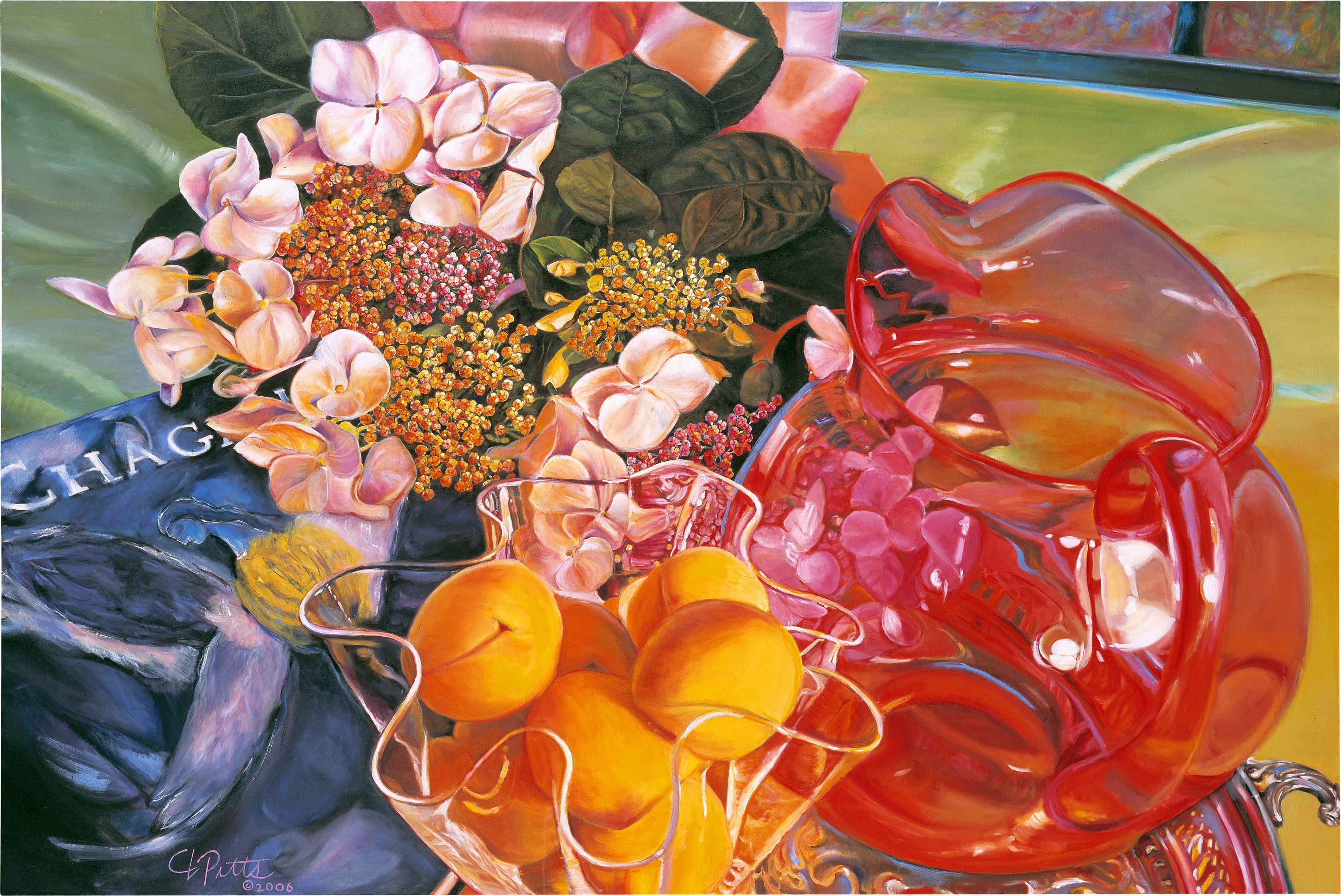
“Shore Leave”, 30×24, Oil, Private Collection.

Linda Besse is best known for her renderings of animals in their natural habitats.  Though trained as a geologist with a Master of Science degree specializing in geochemistry, Linda became intrigued with painting while observing another artist paint.  Her dedication to the craft has spanned 20 years, with much self-study along the way.

NOAPS Besse Stealth - Amur Tiger[27730]  
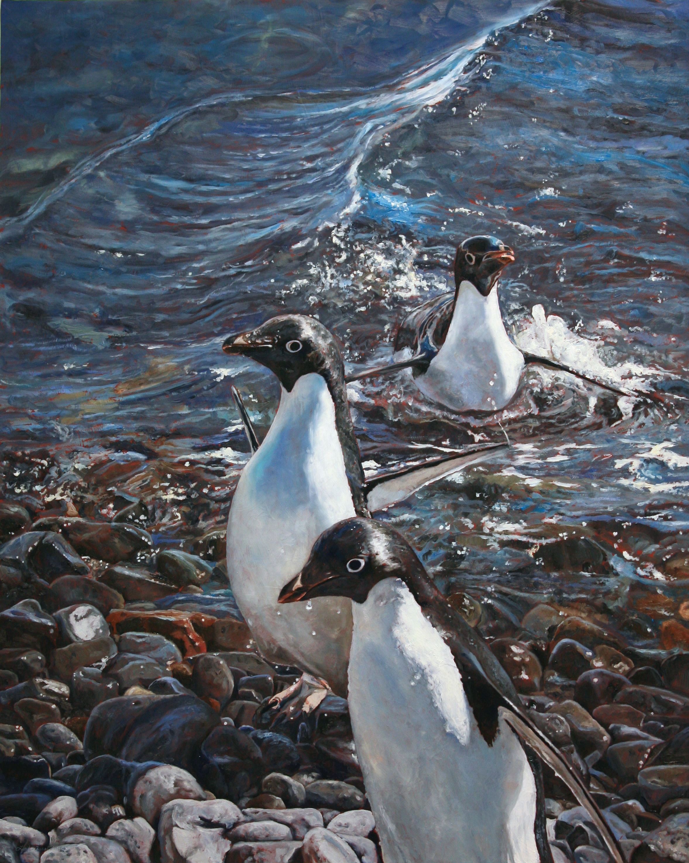
“Stealth”, 24×34, Oil, Collection of the Artist.

Linda has found her subject matter traveling to all seven continents and 40 countries…though inspiration can come watching the birds and animals from her kitchen window.  For her winning painting, Besse states: “I’ll spend hours in a small willow blind scanning the horizons for polar bears.  Just when I know I’ve spotted one, a quick look through the binoculars will reveal a large shiny…..boulder.  But, when a polar bear comes into view, it is so obvious.  Their white hollow fur almost glows and there is nothing quite like it.  Then I wonder how I could have ever mistaken a glacial erratic for this magnificent creature.  It is that glow which the background is designed to enhance.”

NOAPS Besse Woven  
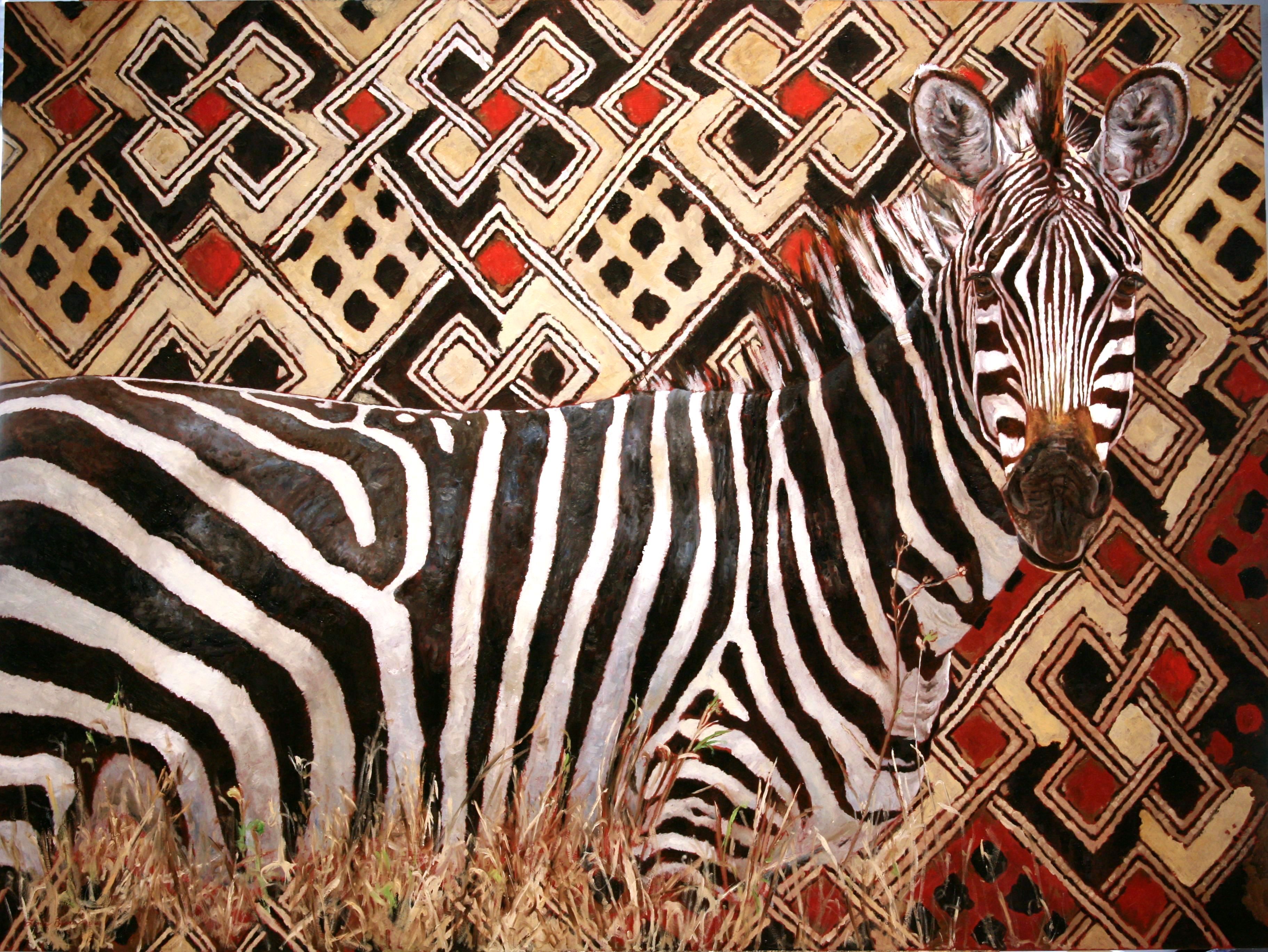
“Woven”, Oil, 33×44, Collection of the Artist.

Besse works exclusively in oils for their luminosity and depth of color.  Her palate consists of titanium white, cadmium red deep, cadmium yellow deep, Naples yellow, yellow ochre, sap green, viridian green, ultramarine blue, cerulean blue, Paynes gray, raw sienna, burnt sienna, raw umber, burnt umber, Van Dyke brown, and lately Crimson Lake and Phthalocyanine Blue Lake (Michael Harding brand).  Besse paints on gessoed boards, either commercially made or hand painted.

NOAPS Besse Painting in Progress  Painting in Progress, Oil, 13.5×20 (also see on artist’s blog: www.besseart.blogspot.com)

Due to the nature of her subject matter, Besse works from photos, using up to 15 different shots to compose her painting.  Though the painting is done in the studio (along with her two cats), Besse always takes the time in the outdoors to take in the surroundings, memorizing the colors and feel of the place.  She draws directly on the gessoed board, and then paints alla prima, starting at the top of her painting and working downward, background to foreground.

Though she had won numerous awards for her paintings,  her greatest goal is striving for continuous improvement.  Growth for the artist is a lifetime study.

Linda encourages other artists to tell their own story, in their own way.  “Push yourself artistically.  Be bold and take chances and your work will continue to grow.”

The work of Linda Besse is represented by the Louisa Gould Gallery, Vineyard Haven, Massachusetts (Martha’s Vineyard)

To view more of Besse’s work visist www.BesseArt.com

To view the NOAPS 2020 Spring Online International, go to www.noaps.org

Written by Patricia Tribastone, NOAPS President

Posted in Uncategorized | Leave a comment

2020 Best of America Small Painting Exhibition: Virtual Critique 2

It is said that the artist creates the art but once it is finished, the art belongs to the viewers. The viewers will respond, react, feel and see the art according to their own experiences, their background and their own life stories. They will come up with their own conclusions which might or might not match the original reasons or desires that led the artist to create the piece of art.

1f11c2_a9dd76e9291d4f9d9a60ceb07caec89e~mv2.jpg

A Little R and R, 12×16 by John Caggiano

The beach grass shadows in this painting by John Caggiano immediately caught my eye. From a soft violet to a luminescence turquoise green, they are not only pleasing but they create a powerful statement in harmony and in unity with the colors of the ocean.  These shades also help to create a compositional line that starts at the lower right of the painting and takes us along a zig zag path to the ocean. The two chairs, while important in their meaning, are merely part of the zig zag line and their blue and yellow seem to be a pick of the surrounding colors. Adding to this feast of blue/green hues, the complementary color red towards the foreground creates energy and perspective. The white sand is actually a multitude of pastel colors. An impressionistic sky full of light and the bright colors in the ocean tell us the time of the day. It is probably a peaceful midday at the beach.
The brushstrokes are fast and loose adding to the vibrancy of this 12×16 soothing yet  dynamic painting.


1f11c2_4877c5c97a9c443a8b2701c701ab3231~mv2.jpg

Street Life, 10×8 by Donald Curran

Street Life is a 10 x 8 inches painting and it is amazing how much this small painting can tell us about contemporary life in the city. Imagine this painting being viewed 200 years in the future and gather all the information it would convey about our city life. Of course, the buildings, the traffic signs, and the cars are all there. Stores, light posts and even what looks like a garbage can or a fence are visible; however, the figure would give an entire narrative. Positioned at the center like in most classical portraiture, this figure and its background is very much from our times. A young man dressed in black with probably a t-shirt underneath and an open jacket with a hoodie. The beard is the style of many young men nowadays. The backpack over one shoulder hints a nonchalant approach. The cup in his left hand indicates he probably stopped to get some coffee, common practice of our days. On the right arm a skate board speaks of youth and of a carefree spirit “surfing” along city sidewalks. Even the face expression, captured in the eyes, would speak to each individual in a different way.
NOAPS Master Artist Donald Curran tells us much more in this painting. He makes us feel the cloudy weather of a snowy day. The edges are softened and broken with white speckles and even the skin has a tint of red from a cold day.
To top it all, Curran signed his painting in the top right corner but wait, is it his signature or a store sign?


1f11c2_5c7e5d3eb91f474db4692c7fb52e2245~mv2.jpg

Summer Afternoon, 14×18 by Barbara Nuss

In certain way, Summer Afternoon,  by NOAPS Signature Artist Barbara Nuss brings to mind the pastoral landscapes of the Dutch Golden Age. It was back in the 17th century when landscape became a genre of its own and it has been a favorite subject for both artists and collectors since that time. Barbara places the viewer on a hill providing a semi-aerial view of the meadow. The break of shadow and light further emphasizes our location as a viewer. It is like  viewing the scene through a lens.
The diagonal line of the hill creates interest and the trees on both sides frame the focal area. Dutch artists often placed cattle or horses at a distant and Barbara placed three horses leading the viewer’s eyes through an unmarked path from the first horse to the other two, then to the water, continuing to the distant forestation and finally to a cloudy sky. From our perch on the hill, we can easily deduct the time of the day given by the bright sunlight. Barbara even gives us an indication of an early Fall through the placement of colors around the canvas. Perspective is very well achieved with details and brighter colors in the foreground and a softening in the background.
This landscape makes me want to sit in the shade at the edge of the hill and from there be one with Nature and the pastoral life.


1f11c2_84a32872e4aa439f96fe61bf6455ac20~mv2.jpg

Yield, 14×6.50 by Blair Atherholt

Did you know that Still Life, while existing since ancient time, also became an important and distinct genre during the Dutch Golden Age? Artists create the Still Life paintings in their studio paying much attention to lines, shapes, color and of course light. In Yield, there are several interesting lines composed by NOAPS Signature Artist Blair Atherholt. While organic, there is no doubt that we see a vertical line in the small hanging branch. Its suspension in an apparent stopped fall adds mystery. Does it carry a symbolism? The title itself might Yield or imply a deeper meaning to this composition of course opened to the imagination of the viewer. Doesn’t the word Yield mean cease to argue, give right of way, relinquish possession as well as produce or provide? The apparent vertical line is stopped by the horizontal line of the ledge suggesting a feeling of stability and rest; however, not before the circle of the very well rendered plum is placed in between the vertical and horizontal lines.  We cannot miss the arch line at the bottom creating energy. The design carved in the stone also creates direction with a pointed leaf leading to the most illuminated part of the painting. All these different compositional lines make this painting. Imagine these same lines in different places and you will see that the entire feeling of the painting would totally change.
The chiaroscuro adds to the mystery and drama of Yield. The small details draw our attention and the light in each rounded fruit is treated with perfection taking into consideration the reflective light and the different changes in value to create a true three dimensionality for each shape in this painting.


Written by Hebe Brooks, NOAPS Master Artist and NOAPS Membership Director


Posted in Uncategorized | Leave a comment

2020 Best of America Small Painting Exhibition: Virtual Critique 1

NOAPS 2020 BOAS Eisele

“Melancholia”, 11×14, Oil, by Nick Eisele, Winner of Best of Show at the 2020 NOAPS Best of America Small Painting National Juried Exhibition.

The seemingly simple arrangement of objects seen in Nick Eisele’s painting becomes more complex as we look more deeply into the scene.  Although the objects are separated by large amounts of space, they are united by the path of light and the unified color scheme.  The blues of the small vase are repeated in the foreground and on the silver objects; and the warms of the brass are carried through in the background and the surface of the table.  The value structure, established in dark tones, presents us with the small vase as the focal area.  The highlights on the objects then lead us around the painting, keeping us engaged as we delight in the mysterious shadows.  The drawing is superb, and the careful rendering is offset by the loose brushwork in the foreground.  Reminiscent of artists such as Chardin and American painter Emil Carlsen, this painting is a worthy choice for Best of Show.

NOAPS 2020 BOAS Farnsworth

“Stepping Out”, 16×20, Oil, by Bill Farnsworth”

The painting by Bill Farnsworth is an excellent example of atmospheric perspective.  The foreground is described by dark shadows and bright lights, while as the scene recedes the values are closer together along with more muted colors.  The viewer has a place to stand, and is given the sense of being part of the scene.  The composition is well constructed, with the linear elements and shadows on the left leading us to the chickens in the foreground.  Our eyes then move to the middle ground where the fence leads us to the background and back to investigate the shadows in the barn.  We have the sense of a warm, comfortable day, inviting us to linger and enjoy the peaceful scene.

NOAPS 2020 BOAS Hendricks

“Lunch at the Brown Dog, (Telluride, CO), 12×16, Oil by Laurie Hendricks

This painting by Laurie Hendricks is a great example of not only light and shadow, but also of warm and cool colors.  The cool colors of the interior contrast the warm light spilling in from the windows, casting the figures mostly in shadow.  The viewer can feel the cool air in the space as a moment in the busy day is captured.  The brushwork gives the feeling of movement, and as we view the painting we can imagine the next movement, the clink of the glassware, and the hum of lively talk at the bar.  The impressionistic style of the painting is a perfect choice to give the viewer just a glimpse of place and time.

NOAPS 2020 BOAS Hughes

“Rocky Creek”, 16×20, Oil, by Neal Hughes.

This plein air painting by Neal Hughes is a contrast of stillness and movement.  The peaceful pool of water allows us a place to rest after the rush of the stream above.  The artist used texture to give his focal point volume and movement, while the calm areas are smooth and flat.  We have a sense of light and shadow, with hints of blue indicating the sky above.  The stream comes flowing out of darkness, giving the feeling of a dense and damp forest, from which the water escapes with joy.  The trees create a framework for the composition, and the foreground rocks give the viewer a place to stand.  The colors on the rocks are anything but grey, with hints of muted blues, violets and pinks.  The sure strokes of the artist have given us a true impression of this fleeting moment, allowing us to share the beauty of nature as it hurries past.

Written by Patricia Tribastone, NOAPS President

Posted in Uncategorized | Leave a comment

Capture the Best High Res Image of Your Painting

There is a wide variety of good information available on how to best photograph your own artwork, should you decide to do it yourself. A simple google search will direct you to several great sources. That’s not what this post is about. Instead, this article is about how to obtain the best High Res files to use for accurately reproducing and representing your artwork in print.

Also, since many painting organizations, including the National Oil and Acrylic Painters’ Society (NOAPS), pull the image submitted with the entry through Juried Art Services for printing the exhibit catalog, it’s important to upload the best High Res image you can when submitting to an exhibition.

Before we delve into the two basic methods for capturing a High-Res image of your original artwork, we first need to introduce a must-have accessory — the Color Calibration Chart.

NOAPS Blog picture 2 March 2020

CAPTION: Color Calibration Chart, front and back with color recipes listed.

Color Calibration Charts or Guides have been around for a long time but in today’s fast-paced technology-driven world, its use has fallen to the wayside. And that’s a shame because there really is nothing better to assist in color correction and adjustment.

How does it work?

First, the chart should be placed alongside your artwork (so it’s under the same lighting conditions) and included in all High Res images. Do not crop it out of the shot. The chart can be cropped out of images for use on websites and entry submissions.

The chart includes squares printed with 100% Cyan, Magenta, and Yellow ink, the inks used in most four-color printing processes, as well as 100% black, white and a value range between which is helpful in correcting for white balance and exposure.

The squares of color in the chart are a “known” and provide a frame of reference for use in adjusting an image for accuracy before printing.

Color Calibration Charts vary greatly in price, here are links to an affordable option, and a professional version available through Amazon.


Methods for Capturing High Res Images

High Res Scans

Scanning is by far the best option as far as image quality and clarity, every inch of the painting will be in focus and under the same lighting conditions. Scanning original artwork is not always practical especially if your work is large and has lots of thick paint creating a very textured surface.

300dpi is considered High Res, but when scanning a painting — I always scan at a higher dpi. How high? It depends on the capabilities of the scanner. My artwork is scanned at 1200dpi. Why so high? It offers more flexibility down the road with the option to reproduce it much larger or select a detail area for print and not have it pixelate as a result.

Remember, an image can always be reduced in size/resolution but not the other way around. Read “Answering the High/Low Res Question” for more on that topic.

The size of the painting isn’t a total deterrent to scanning because portions of the scanned artwork can be stitched together using Adobe® Photoshop® or a similar photo program.

Many printers offer High Res scanning and have large bed scanners.

High Res Photographs

Traditional film photography is rarely used these days so I am only going to talk about digital photography. Some things to keep in mind are:

Ask for the raw files in addition to the traditional images provided. Some photographers automatically include these while others do not.

Ask for the largest file size their equipment will provide. Some photographers, as a courtesy, provide 300dpi and 72dpi versions.

Ask for uncropped versions that include the Color Calibration Chart/Guide.

Most importantly, talk to the photographer about how you might be using the photos. High-quality giclée prints, exhibit catalog, promotional materials are all good examples. I say might because we don’t know what the future holds for us and often the High Res images are all we have after a painting has (cross your fingers) sold!

The bottom line, leave it to the professionals! With the cost of the equipment, their knowledge, and the fact that technology is always advancing, it’s worth it.


Using a Smartphone Camera

The entry deadline is tomorrow, there isn’t enough time to get the painting scanned or professionally photographed, so we snap a picture with our smartphone. Sound familiar?

I almost hate to mention this because it truly is not the best option but I’ve done it and I’m betting you have too — so let’s talk about the best way to do it.

Most smartphone camera apps take photos at 72dpi, with the only variable being image dimensions. My iPhone images automatically open in Photoshop® to 52×46 inches at 72dpi.

Creating a SMALL High Res from a LARGE Low Res Image

NOAPS blog picture March 2020

Before taking the photos, make sure the setting in the camera app is for the largest image size possible. Take photos of the painting and open in Adobe® Photoshop® or other photo editing software.

  • Crop the image to just
  •  the artwork, it’s important to make all edits before saving as a High Res image file.
  • Check the image size to
  •  see what the new height and width measurements (dimensions) are after being cropped.
  • Using a photo editing program,
  •  set the resolution to 300dpi and reduce the dimensions of the cropped smartphone image. A rough guideline to use is
  • 72dpi x width ÷ 300dpi = minimum reduced size.

In the above example, the math works out to be 72dpi x 20 inches = 1440 pixels ÷ 300dpi = 4.8 inches for the minimum reduction in size. Therefore the image would need to reduce to at least 4.8 inches wide or smaller at 300dpi for it to be an acceptable high res file.

This only works because you are shrinking a large size (height x width) Low Res image to a small size (h x w) High Res image. It’s not the best method but it works in a pinch. However, this method should not replace the more effective methods mentioned earlier for generating the best quality High Res image of an original painting.

Whether a painting has sold, been given as a gift, donated to raise money for a charity, painted over, or possibly damaged due to a natural disaster — in the end, photographs (or scans) are often the only visual record we have. As artists, we owe it to our future selves to capture the best High Res images we can today. And don’t forget to back up the files, computer’s fail too.

Written by Nancy Murty, NOAPS Publicity Director
If you found this post helpful and would like to learn more about reproducing your artwork head over to my blog, there are more great posts on RGB vs CMYK color reproduction, Getting the Color Right and on Answering the High/Low Res Question.

Posted in Uncategorized | Leave a comment

Tim Breaux: A Tip and a Tool for 2020

Do you want to paint better in 2020?

Is that your resolution?

Well, you are not alone.  Whether you are a part time beginner or a full time pro some things are universal.  Deep down we all want to paint better.

Today I want to share one of my new tools and a useful tip that will get your new year off to a great start.

The Tool:
My 24 x 30 inch glass palette broke recently.  I had painted hundreds of paintings from it so it was really past its prime.  Years of scraping and cleaning left it scratched and pitted.

The untempered replacement glass cost about $13 from the hardware store.  This time I painted a nine step value scale on the back side using painters tape and cheap bottles of black and white acrylic paint. Since it was untempered I had to be very careful not to break the glass throughout the process.

Now I can place spots of color right on top of the value scale to test the value.  No more holding the palette knife or brush up to the painting and guessing.

The Tip:

Color is composed of hue, value and chroma. We typically name colors according to the hue component: red, green, yellow, brown, grey. That is how we are taught and how we are wired. But colors are actually the hue in the context of a certain value.

I Utilize this new palette to follow a two step process when choosing a color.

Step one – Name the hue of the color.

Step two – Name the value of the color by placing it in the correct value space.

Safety tip -If you do this yourself keep in mind that you will constantly be working with a large sheet of sharp and dangerous glass. Safety is paramount.

What if there was just one thing you could learn today that would allow you to paint the way you always wanted? That is my goal for all of the information I share with you in these newsletters. The truth is we usually need several “just one things” that build over time, eventually leading to revolutions in our work. I have had several of those a-ha moments over the years. They were hard fought battles at the easel, on the computer and through interaction with artists I admire and trust. I want to share that knowledge with you here.

Written by Tim Breaux.  To see more about Tim, visit his website at www.timbreaux.com.

For a copy of his free e-book on value and color, go to:

https://mavenmethodtraining.lpages.co/secret-language-to-painting-art-that-sells/

Posted in Uncategorized | Leave a comment

Dan Gerhartz: Balance…Poetry and Structure

  “Clematis” 30 x 40, Oil

When I have been most moved and impressed by artwork, music, or any expressive art form, it has been when the work has first grabbed my soul with its poetry, then amazed my mind in its structure and construction.

Throughout my development as a visual artist, I have found my greatest struggle in the making of art is to balance the crafting of accurate, solid forms while retaining the lyrical nature of the visual world. So often in my efforts to capture the exactness of what I am seeing, I lose the poetic beauty and essence of the elegant, peripheral line.

For me, the balance comes when I can relax enough while in the throws of building the solid structure of the forms to absorb and feel the rhythm before me. Certainly this comes with experience, but to be aware of the end goal during the early stages of development is critical in not becoming too stiff in your approach. While working and studying the subject, to feel the connectedness of the forms, the living, breathing life of our subject makes a clear difference to me in the end result. I have found that it is having faith that the poetry will come and manifest itself if I am true to the beauty and strength of the construction, being careful not to overthink the problem.  Allowing all of your senses to take part in the mechanical process is the beginning of where the poetry begins.

I wish you great success as you strive to bring your paintings to life in poetic strength!

To view more work by Daniel Gerhartz, please visit http://www.danielgerhartz.com

Dan Gerhartz will be the Judge of Awards for the 2020 NOAPS Small Painting National Juried Exhibition at the McBride Gallery in Annapolis, Maryland April 5-May 3, 2020.  Dan will also conduct a 4 day workshop, “Training the Eye to See”.  To sign up for the workshop go to www.noaps.org.

Written by Daniel Gerhartz, 12-19-2014

Posted in Uncategorized | Leave a comment

Neal Hughes: En Plein Air

NOAPS Hughes Olsen House 20x20

“Olsen House”, 20×20, Oil, by Neal Hughes; Winner of Best Landscape in the 2019 NOAPS Fall Online International

The soft lighting in the “Olsen House” makes the viewer begin to imagine…we first wonder what is the time of day, and then if the house has inhabitants.  Then our minds begin to wander about the painting, creating it’s story for ourselves.  The artist has given us hints; the slightly unkempt foreground, yet a door through which we can enter.  Our eyes travel around stopping where we think we find a clue as the dance of warm and cool colors lead us through the painting.

NOAPS Hughes MimsCreek14x18  “Mims Creek”, 14×18, Oil.  Painted during the En Plein Air Texas Competition, San Angelo, Texas.  Private Collection.

Neal Hughes has been an artist for his entire life.  He started at a young age, and continued at the Philadelphia College of Art with a degree in illustration.  His illustration took center stage until he began his current focus on fine art.

NOAPS Hughes DreamBoatNocturne18x24  “Dream Boat Nocturne”, 18×24, Oil.  Winner of First Place at the Cape Ann Plein Air Competition, Gloucester, MA.  Neal Hughes Studio (Collection of the Artist).

Hughes has garnered his wealth of knowledge from different sources: museums such as the Brandywine Museum and the Philadelphia art museums; and the many books in his personal library.  Among his favorite artists are Sargent, William Merritt Chase, Thomas William Dewing and Childe Hassam.

NOAPS Hughes RiverPalm20x16  “River Palm”, 20×16, Oil.  Painted during the Lighthouse Plein Air Competition, Tequesta, FL.  Neal Hughes Studio (Collection of the Artist).

Working exclusively in oils, Hughes’ favorite genre is the landscape.  He can often be found at plein air competitions; his painting ‘Olsen House’ was awarded First Place at the Grand Traverse Plein Air Competition.  He often includes man made objects in his paintings; boats and architecture are favorite subjects.

NOAPS Hughes ChurchNocturne20x20  “Church Nocturne”, 20×20, Oil.  Painted during the Wayne Plain Air Competition, Manyunk, PA.  Neal Hughes Studio (Collection of the Artist).

Hughes paints with oil primed linen, which he stretches for large paintings, or mounts to Gatorboard for smaller paintings done en plein air.  Using bristle brushes, his palette consists of primary colors and a few earth colors: titanium white, cadmium lemon, cadmium yellow, Indian yellow, cadmium red, alizarin crison, utltramarine blue, pthalo blue, yellow ochre and terra rosa.  He begins by carefully planning his composition and value structure, then blocking in the large shapes.  For his block in he uses a mixture of ultramarine blue and alizarin crimson for the darkest areas, then adding terra rosa for a slightly lighter value, ending with cadmium yellow or red mixed with titanium white for the lightest values.  After the block in he continues by adding more color and making further adjustments.

NOAPS Hughes MorningMist30x40  “Morning Mist”, 30×40, Oil.  Studio painting based on plein air study, Rockland, ME.  Neal Hughes Studio (Collection of the Artist).

Neal encourages the artist to paint as often as possible…”the most important ingredient once you get past learning the basics is just hard work.  Experiment with techniques…..the more successful artists are constantly working and challenging themselves to make progress.”

To see more of Neal Hughes’ work go to www.nealhughes.com.

Neal Hughes is represented by the Sylvan Gallery, Wiscasset, ME; The Maritime Gallery at Mystic Seaport, Mystic, CT; J. Russell Jinishian Gallery, Stonington, CT; Susan Powell Fine Art, Madison, CT; the Hughes Gallery, Boca Grande, FL; the Chestnut Hill Gallery, Philadelphia, PA; Warm Springs Gallery, Warm Springs, VA; Design Domaine Gallery, Spring Lake, NJ.

To view the NOAPS 2019 Fall Online International Exhibition go to www.noaps.org.

Edited by Patricia Tribastone, NOAPS Blog Director


Posted in Uncategorized | Leave a comment