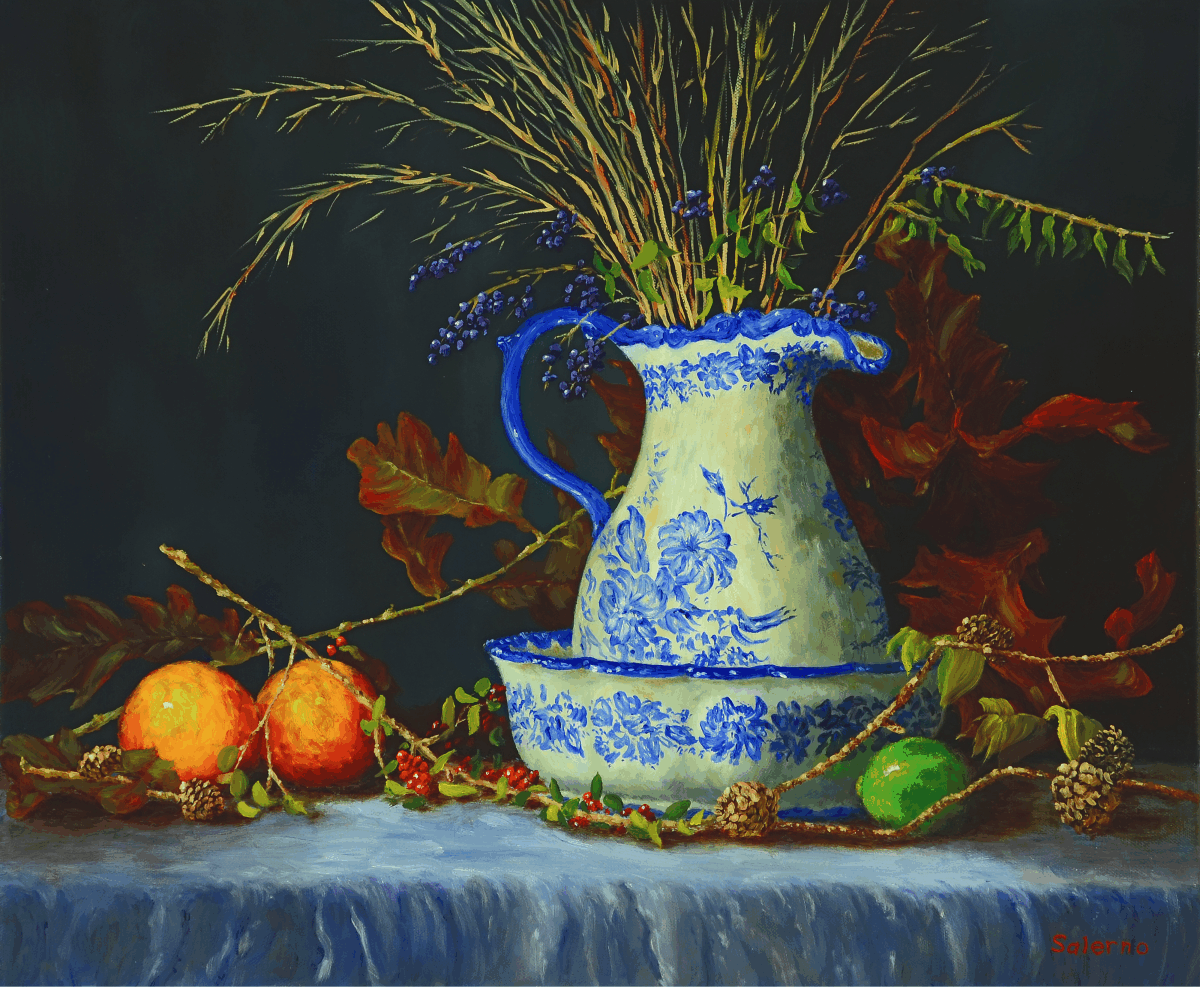
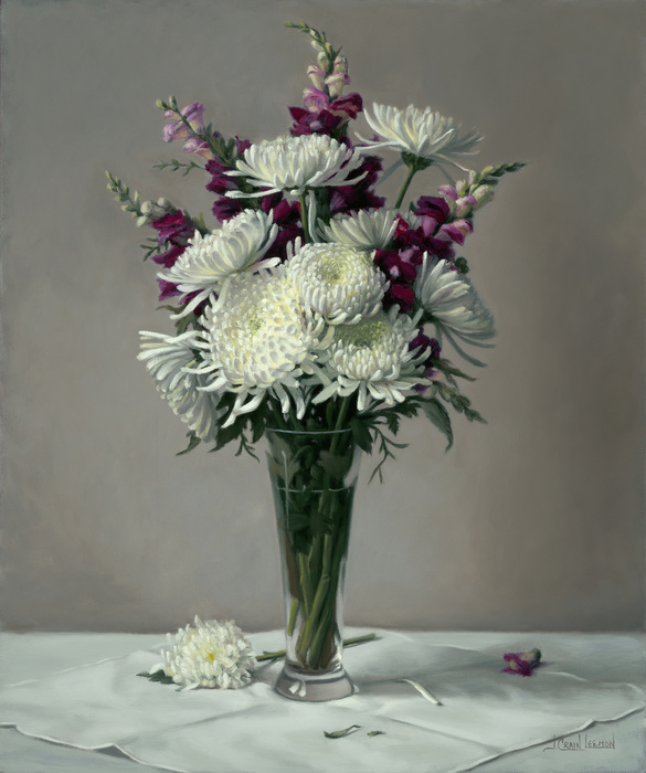
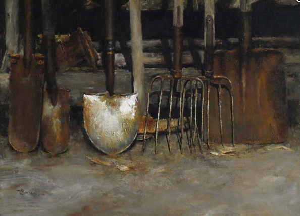
Mums & Snap Dragons by Leemon Jeanne Crain – Oil 24X20
Award of Excellence Recipient in NOAPS Fall International Online Exhibit
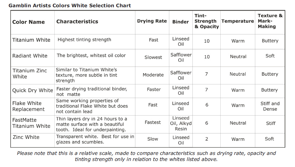
Getting the White Right
by Robert Gamblin
The most important color choice we make is the white we bring to our work. The white we choose determines to a great degree what our experience of painting will be: how our colors will tint and mix, how they will feel under the brush or knife, and how opaque our paint layers will be.
There are important differences between whites. For example, Titanium White has an opacity and tint strength that influences color like no other. Being the best-known white does not make Titanium White the right choice for every artist. You might prefer a white that’s more subtle in mixtures.
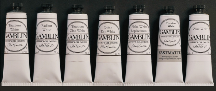
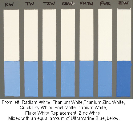
When I first started making color in my studio I began by making whites, there were three at the beginning. Over the last 30 years, we’ve expanded and refined our selection of whites. We now have seven to serve your needs across the spectrum of artistic possibilities.

From left: Titanium White, Radiant White, Titanium Zinc White, Quick Dry White, Flake
White Replacement, FastMatte Titanium White, Zinc White.
Part One: Getting the White Right
The right working properties for your artistic intentions
A good place to start in choosing your white is to think about the white you are currently using, why you chose it and how you might like it to feel and perform differently. Identify the working properties most important to you. Is it the Texture or feel of the paint and its Mark-Making qualities? Dry Time? Tint Strength and Opacity? Or Temperature?
Texture and Mark-making
This is both the most personal and the most important characteristic. For most painters, it is the feel and mark-making possibilities of their white that is most important to their work. Our whites range from soft and smooth under the brush, to buttery, to stiff and dense.
Our softest is Radiant White. Without modification, it is the most brushable – meaning it has the least amount of resistance under the brush or painting knife.
The buttery whites, Titanium White and Titanium Zinc, are in an ideal middle ground of texture. Straight from the tube, both have a “short” texture – meaning they break cleanly and quickly from the brush and make a beautiful, crisp impasto mark. Neither is too stiff under the brush or knife. And both can be nudged – with just a little medium – to be made softer. With just a little fluid medium, brushability is increased; the paint becomes softer and has more flow.
Our stiffest and densest white, Flake White Replacement, exerts a greater amount of resistance under the brush and palette knife. Flake White Replacement handles like lead white. This means it is “longer” in texture – with more pull, or drag, on the brush. This specific quality means it can easily replicate the impasto of a thickly painted Impressionist painting.
The texture of FastMatte Titanium White occupies a unique space. Its quick setup time means artists can add layers sooner and create broken marks without readily picking-up or mixing into the wet paint layer below. Out of the tube, FastMatte Titanium White will feel grittier and a little denser than our traditional Titanium White. The stiff and grittier texture allows for more broken mark making and defined brushwork – qualities prized by plein air painters.
Drying Rate
In general, whites made with linseed oil will dry faster than whites made with safflower, poppy or walnut oils. For even faster drying, our specialty whites, Quick Dry White and FastMatte Titanium White, are formulated to dry considerably faster than traditional oil colors. Our FastMatte Titanium White dries in 24-hours. Its drying rate and matte surface make it ideal for underpainting. Quick Dry White retains the working properties of our traditional Titanium White, but will dry a day or two quicker.
For painters that wish to work wet into wet, or otherwise desire more open time without
using mediums, we recommend using Radiant White. Radiant White is not modified in any way to be slow drying; it is just naturally the slowest drying white in our range, at about five days in thin layers.
Tint Strength and Opacity
 If your goal is the same as the Impressionists: to simulate the light of the world whether it is landscape, still life, or portraiture, then opaque whites will support this direct painting style.
Titanium White and Radiant White do this better than any of the lead whites the Impressionists had to work with. Our opaque Titanium White and Radiant White carry higher loads of titanium and, in turn, reflect back 97% of the light that falls on them versus 93 95% for the lead whites included in our test.
On the other hand, highest tint strength and opacity are not for everyone. Renaissance style figurative painting, which strives to show the translucency of skin, is handled best by a more translucent white. Flake White Replacement, an exact copy of lead’s working properties, is most valuable for these sophisticated techniques. It can simulate the translucency of skin in a way that the more opaque whites can’t. Unlike lead whites, Flake White Replacement is non-toxic and can be disposed of without violating either local or national laws for the disposal of hazardous waste.
Zinc White is at the end of the spectrum of Tint Strength and Opacity. Zinc oxide is the only transparent white pigment. It can be used successfully as a white in glazes and scumbles where the glaze needs to modify light or atmosphere without “whiting out” what is below. Think of depicting the mist where the ocean meets the land, the transparency of a woman’s veil, or the flare of light coming off glass. Zinc White makes this easy to depict where titanium based whites makes this exceedingly difficult. A note of advise concerning Zinc White: unless you are painting on a panel, Zinc White should not be used as the primary white in an oil painting. Further discussion of zinc below.
The Temperature of your White
Linseed oil whites are warmer; safflower oil whites are cooler in color. For most oil painters, the color temperature of the white, which is determined by the oil the white is made with, is not an important consideration. But this will be an important consideration for artists who routinely paint passages of pure white. This is especially true for abstract artists who use white as a color and not as the light within a painting. Upon aging, safflower oil whites hold their color the best: for abstract artists this also means that all colors mixed with safflower whites will also hold their original color the best. If this describes you, we have Titanium Zinc and Radiant Whites for you to choose from.
A Great Place to Start: Titanium Zinc White
If I had to suggest a single white to consider for all-around use, it would be our Titanium Zinc White. This is my current favorite. Expressing color is primary for me and Titanium Zinc White lets that come through. It has a beautiful neutral white color, and its tinting strength is not super high, so colors mixed into it are not overwhelmed by the power of the white. In addition to all this, it dries pretty close in time to linseed oil whites and dries flexible.

Part Two: A Study of Whites
Synopsis after One Year
· Whites made with linseed oil are generally the most flexible, and whites made with safflower are the whitest whites. The white with the best balance between the two qualities is Gamblin Titanium Zinc White
· All oil paintings stored in the dark will lose a little brilliance and yellow to some degree, yet the color will recover when the painting is brought back into strong light
· Titanium White is superior to lead white in opacity and whiteness and equal in flexibility
· Pigment loading has a greater effect on flexibility than choice of pigment
· Whites are at their whitest when used alone. The more medium that is added, the more their color will change. Binder changes color as it ages, not the pigments
· Zinc White is too brittle to be used as the primary white in a painting on flexible supports
·
Common Questions from Painters and Findings
.
Which are the whitest whites and what oil are they made with?
The flax plant has been the heart and soul of oil painting for 550 years. It has given us both the linen we paint on and the linseed oil we paint with. We know from this long and rich history that linseed oil dries the fastest, the hardest and is the most flexible among all drying oils.
All vegetable oils are made up of unsaturated fatty acids (linolenic, linoleic, oleic, etc.). Linseed is the only oil with a high percentage of linolenic acid. This material gives linseed oil its superior drying qualities. Linolenic acid also gives linseed oil its color. The yellow color of linseed oil precipitated to the use of alternative oils throughout the history of oil painting. At various times poppy and walnut oils were used. Now the preferred alternative to linseed is safflower, due to its pale color and consistent drying qualities.
Our study verified that safflower oil makes the whitest whites, whiter than poppy and walnut oil. Three of the four top results in terms of brightness were made with safflower. The fourth was our very lean Flake White Replacement based on linseed; this sample had very high brightness, but was not as neutral in color as the safflower whites. All of these four paints reflected back more than 97% of the light falling on them. All of them were titanium based whites. All of the lead based whites were far down the list in terms of light reflectance (Gamblin does not use lead in any paint formula).
.
What whites are the most flexible?
The degree of flexibility of a painting is important because the more flexible it is, the more it will resist cracking in the decades and centuries to come as the painting ages and is subject to the stresses of moving, storage, changes in temperature and humidity. The flexibility of the white is therefore important to study since in the typical painting 50-90% of the paint on the surface is the white.
With one exception, all of the study samples passed the flexibility test of bending over a 1” mandrel without cracking. The one exception was an expensive European paint based on linseed oil that had a very heavily loaded binder. As we progressed to tougher flexibility tests over increasingly smaller mandrels, the study samples made with safflower oil consistently cracked before the linseed oil samples. All of the drawdowns with 20% Galkyd added, showed greater flexibility than test samples without the addition of Galkyd. We will repeat this flexibility test in future years using extra drawdowns.
Concerning the European paint that failed the flexibility test, there simply was not enough oil to create a flexible paint film. Over-loading the binder is a way for a manufacturer to create stiffer whites. With this comes a price to pay in terms of permanence.
At Gamblin we work to strike a balance between some artists’ desire for the stiffest of whites and what we know to be a correct binder-to-pigment ratio. It is a myth that the stiffest of oil colors are somehow more traditional. Nothing could be further from the truth. True handmade paints from the Renaissance and the colors used by the Impressionists were both far softer than most any artist grade oil color available today.
If you are using some of the stiff paints described above you may consider also using a painting medium. The use of medium adds binder into the paint film and therefore increases flexibility.
.
How do Titanium Whites compare with Lead Whites (Cremnitz White)?
Throughout all of the tests, all of the titanium white samples were brighter and more neutral in color than all the lead white samples. After being aged for one year, the titanium white and lead white drawdowns were equal in flexibility.
For techniques where the artist wants a high degree of opacity, or to reflect back the maximum amount of light (Impressionism, or Plein-air painting) then titanium whites are best.
For techniques where the artist wants more translucency, such as classical portraiture to show the depth of skin, then Flake White Replacement or lead white are best.
As described above, there are great textual differences also. The titanium whites will be softer, or more buttery, the lead whites, and Flake White Replacement, will have the densest and heaviest of textures. I have heard many times over the years from artists who use lead whites that they choose it because they believe it is less prone to cracking over time, with the implication being that titanium somehow is more prone to cracking. Our study to date shows this is simply not the case. Through my 25 years of work with conservators around the world, I can also tell you that the artist’s technique and supports, as well as a painting’s storage conditions, matter more to the health of the painting than precisely which white pigment was used.
Another important consideration when thinking about titanium whites vs lead whites is the toxicity of lead.
Disposal of the lead waste from the painting process is also problematic. Throwing lead out within the garbage, or burying it in your back yard, is prohibited by law. Lead paint, the tubes it came in, as well as rags and solvent used for cleaning when working with lead, are considered hazardous waste and have to be disposed of at hazardous waste sites.
In contrast, the pigment in our titanium whites, titanium dioxide, is widely used in toothpastes, as a food dye, and in sunscreens. Since our founding, we have been dedicated to making artists materials true to historic working properties, yet safer and more permanent. By our standards, whatever perceived or actual benefits there may be with lead white are far outweighed by the detrimental environmental impact and health hazard.
.
What is the role of zinc oxide in white oil paint?
The adding of zinc oxide to whites most likely began around 1850 shortly after it was invented. Adding zinc oxide to lead white significantly improved its working properties, taming the long, snotty texture of pure lead white. In addition, the texture of zinc makes Titanium Zinc whites softer under the brush or knife. In contemporary times it is easy to trace the making of titanium zinc white to the 1950’s when Henry Levinson used it in his oil color line Permanent Pigments. Levinson was a renowned paint chemist and found that a percentage of zinc oxide helped titanium whites to stay whiter:
“The yellowing of whites is popularly presumed to be a function solely of the oil. That is true with Zinc
White and with Flake White, but not with whites containing titanium dioxide…In titanium whites zinc
oxide can be a major factor in the reduction of yellowing and to some degree in aiding recovery from the
loss of whiteness after being kept in the dark.”- Henry Levison, Artists’ pigments: Lightfastness tests and ratings, 1976.
Zinc oxide, however, has its limitations – too much zinc makes for a brittle paint film. These issues have been studied in depth over the last 15 years by Marion Mecklenburg and Charlie Tumosa of the Smithsonian Center for Materials Research and Education. Mecklenburg was the first to warn that zinc oxide levels were getting too high in many brands of oil paint.
I visited Marion and Charlie in their lab at the Smithsonian in 2000 and discussed their research. Since then, we have followed their guideline to hold the zinc content below 15%. Zinc levels in our Titanium Zinc White are well below this 15% guideline. This percentage also happens to match well with the levels Henry Levison used in his studies.
Zinc White has important uses as the best white to create various forms of transparencies: such as in glazes or scumbles when there is a generous amount of medium to keep the structure flexible. As a general rule, we recommend not using Zinc White as the primary white in a painting unless working on panel.
.
How does exposure to light and dark affect the color of whites?
The colors in an oil painting are constantly changing, shifting slightly back and forth over a mid-line in response to changes in light on a daily basis. So it stands to reason that oil paintings change color when stored in the dark, and you may actually notice the changes. In the dark, paintings usually yellow or darken slightly, but then recover their color when brought back into the light.
We want to stress that most of this color change would not be noticeable in a painting since the whole painting reacts this way to light and dark storage conditions. The whole painting recovers its color when brought back into the light, not just the white oil color.
.
The best part of our work is seeing the potential of our materials realized in your hands.
Robert Gamblin, Founder
____________________________________
NOAPS Note
We thank Gamblin Artists’ Oil Colors for this interesting article and for being one of NOAPS Sponsors